Personally I’d really like it if all the UI and controls were sitting on top of something that looked like a window background. Then, yeah, clicks on that thing would do nothing, and clicks outside of it could dismiss the whole screen, and this would be more obvious.
3 Likes
I find the current design suitable as some of the actions can be potentially destructive (shutdown, reboot and logout) as you could have unsaved work. I’d rather users easily accidentally cancel a potentially destructive action than easily undertake one.
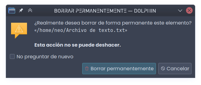
It’s the same logical as the Trash for files. It allows the user one last chance to undo something that could be potentially bad.
1 Like
It is not the same logic. If it were, the space directly around the “permanently delete” button should cancel deletion.
1 Like
What I mean is it’s a measure to prevent the user from doing a potentially destructive operation. Not the exact user interface elements.
As I understand it, the existence of the additional fullscreen dialog we are discussing, fulfills that role. And it’s existence is not the issue.
The issue is that, the empty space around the buttons is coded as a cancel. And if it followed the same design criteria, as in the “permanently delete” dialog, it would be indifferent to a user clicking on it.
1 Like
Indeed. I’d rather a user accidentally click cancel than accidentally click shutdown.
By that logic, why not have 20 confirmation dialogs in a row? Or have the user solve a maths problem or a maze puzzle? I’m being facetious, of course.
I’m not bothered by the outside area of the shutdown screen invoking the same action as the cancel button – for some reason, it feels like expected behaviour to me, even though, when I think about it, it is inconsistent with any other pop-up dialogue in Plasma.
What I’m pointing out is that “what if this was not what the user wanted” is a flawed excuse for the UI getting in the way of user’s action. Erroring on the safe side is just not good enough. Of course, if it happens once, it’s not a big deal, but if it happens consistently to the point of being annoying, it is a problem. Same thing for permanently deleting files. If that is something the user wants to do, the UI should not get in the way (that is why there is the “do not ask again” checkbox).
Personally, I think the behaviour @johnveness suggested above is the optimal one.
2 Likes
Doesn’t seem like a worthwhile change to me, it’s 98% the same as currently. Feel free to put in a feature request.
I agree with you, I do not find it worth the bother of putting in a feature request, but the OP might.
That dialog drives me nuts too.
In my experience the chance of accidentally invoking the dialog is virtually zero, so I usually always want to perform an action on that screen. Now if you’re somewhat distracted e.g. because it’s late at night, you talk to somebody while leaving the desk, … and then god forbid you click one pixel outside the button the whole fricking dialog cancels.
Nooo! Give me a second chance to hit the button! Just do nothing! Doing nothing is also “non-destructive” and avoids the mystery meat background navigation.
5 Likes
Schlaefer totally gets it.
Somehow I feel like many of the replies are falling for the false dichotomy or false binary fallacy.
The situation is not an A vs B situation, in which A is “accidentally click cancel” vs B “accidentally click shutdown”.
If the empty space is unresponsive, there is C “accidental click does nothing”. Which by the way is also in line with the design used in most if not all of the dialogs previously discussed in this thread.
2 Likes
Yes, if the empty space did nothing, I don’t think that would actually increase the number of accidental shutdowns. It would only mean that the user has 30 seconds to find the Cancel button and click on it to prevent shutdown, which is more than enough time to prevent any accidents.
Therefore, I see no problem with that suggestion.
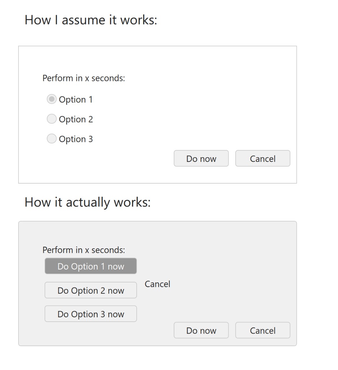
And yes, I agree with @Schlaefer’s image: the options should be a selection, clicking on any of them should just select it (basically, you have 30 seconds to make up your mind), when the time runs or the user clicks on the OK button out the selection is executed.
Clicking outside should either do nothing, or cancel. I’m fine with both options, but thinking about it, the suggestion @Schlaefer and @fbm224 put forth, that it does nothing, actually makes a lot more sense from the accessibility point of view: if the user’s clicking is imprecise, missing the OK button gives the user a chance to try again, and there is plenty of time to hit the Cancel button.
Maybe the OK and Cancel buttons should be farther apart, so that there is plenty of empty space between them.
2 Likes