There so much padding before text so that all checkboxes align exactly vertically. This is so horrible, it even looks worse for languages that their text description would be longer than English, see Arabic below the first English example.
This would probably go under “brainstorm” instead of “help”.
Still, here’s my two cents:
IMHO, having the labels to the left, even with the padding it adds, isn’t actually that ugly.
I can see that moving them above would be more horizontally compact, at least. Though most desktop/laptop screens have ample horizontal space, and I think a completely different settings app is used for the experimental Plasma Mobile, so saving horizontal space isn’t an issue anyway.
As for trying to replace a majority of checkboxes with toggle switches, I have no idea if KDE plans to implement that. Certainly KDE is not GNOME, and does not follow the GNOME HID.
to me it seems the UI and use of checkboxes in the example you cite is perfectly fine and easily groked… it even follows the guidelines mentioned in the gnome link (im sure kde has similar).
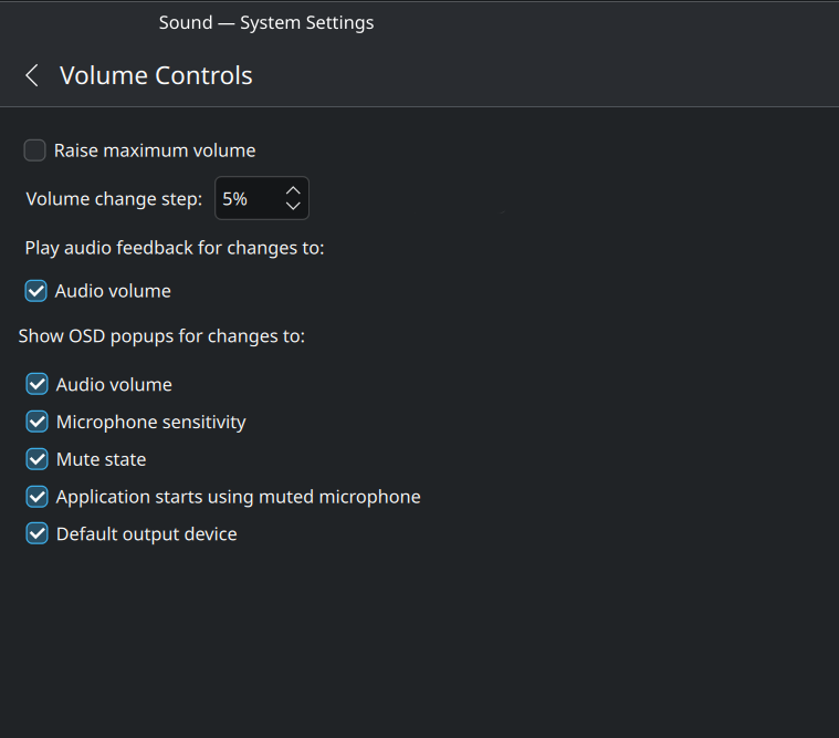
there are also settings for each of the items in that image, but not all in one spot.
using the keypad to move the pointer and locating the cursor are found under accessibility
focus on hover is available under window behavior
the double click speed should be in workspace > general behavior but it is not present on my plasma 5 install
Ok, about the switch part. But the sketch I made makes it a lot more readable, the most criticized aspect of KDE is the design of UI. Simple changes like that would be a huge improvement.
Could you try to describe specifically what the problem is with the current layout?
You say “This is so horrible” and “I don’t even know what I’m looking at” but I’m having a hard time understanding why the layout isn’t working out for you. Maybe I’m just blind to it. Can you be more specific?
You can’t tell which option belongs to which label. Compare it to the sketch I have done.
If you can’t still see it somehow… then show both of these images to people you know or anyone from the community and tell them which one they think is clearer.