Kndelive user interface (and program also) is very very simple… first time i used a video editing software was the 2000/2001 and the software was Ulead mediastudio PRO… looking at the gui was a semplified version of kdenlive gui (and this is why i’m using Kdenlive) i learned “how to edit a video” on 2 years at the time. right now seems an “era” but it probably takes some time to (completely) master the functionality of a certain software and start understanding the principles on how to record RAW footages to speed up post processing using a software.
Hah, yes it does, but it’s not grey, really: it’s a less saturated version of the same colours. Grey would be more noticeable, but so would a more different disabled icon (which would be my preference because it would be so easier to see things disabled in one central location). All I can say is this caught me out several times. When I disable a track now it seems obvious, but maybe it’s less obvious when lots of tracks are showing vertically and maybe the clips on the track are not in view (somewhere else on the timeline). I am not entirely sure how I missed it, but miss it I did, multiple times.
With that said, what I discovered the other day was that the ‘disabled track’ icon was more different to the non-disabled track icon on another kdenlive install I have on another laptop, so my settings / themes between the two must be different because there is a red slash on a disabled track on my other laptop, which is a lot more noticeable than the pic below. I have to compare settings when I get access to the other machine.
Your suggestion is a good one for rendering, but for me it was more about wondering why my track was not playing 'cause of the similarity between the two icons, still in the creating stage.
Oh, I hadn’t considered some themes may make this less obvious than others … I’ve only noticed the red highlight version, I think, so that’s definitely low hanging fruit we can fix - but it is still a very tiny icon in a very busy UI, which does inherently limit how effective anything we might do there could be.
There’s a slow but steady stream of ‘revelations’ that occur as common operations move into muscle memory and people start to notice (and want) more things. Even the most experienced users here still stumble on things they hadn’t noticed before from time to time, some of which can seem brutally obvious after they have been pointed out - which is part of what makes sharing experiences and tips here such a valuable thing. We all get to find our blind spots much faster than we otherwise might. And we often can’t just make them all More Obvious, because adding emphasis to one thing somewhat by definition will de-emphasise other things around it.
Our brains are really good at filtering out things we don’t expect to exist or need attention, so knowing that there even is a difference to look for can immensely improve your chances of not missing it - but we still have written checklists for things where mistakes have dire consequences because forgetting things you shouldn’t is a very human trait.
If you’ve not seen or heard of it before you might find this: https://www.youtube.com/watch?v=vJG698U2Mvo a fun revelation of just how much there is no amount of grey or red or obvious which can help when the answer you need has slipped out of your cone of attention, which was the hard to avoid problem I was flagging in the earlier reply.
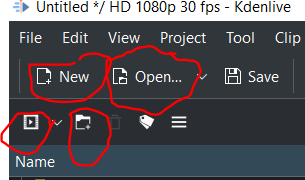
There are four buttons here I get confused, especially because they are small.
Which button do you think is for importing clips? It’s the one with the “movie clip” but nothing else on it!
I suggest reworking the “add clip” button to have a plus and moving hiding the “new folder” button. Here are some examples I found on google images of “import clips icon”. Even better, just have a button that says “Import clips/folder”
Thanks for the suggestions, but Kdenlive uses the Breeze icon set from KDE and is bound by that to a very large degree. The idea is that all KDE applications are easily identified and use the same icon set(s) for easy “navigation”.
I understand that the icons you circled in your first screenshot are rather close to each other. Please note that the upper ones are from the Main Toolbar which can be switched off or customized; the lower ones are from the header of the Project Bin which can be moved to another position if needed.
The icons in the Main Toolbar are for creating a New Project (as in File > New) and Open a project (note the small down arrow that when clicked opens the list of the 10 last used projects). The icons in the Project Bin header are for adding clips or folders (note the small down arrow that when clicked opens a list of all the possible asset types that can be added) and for creating a folder in the Project Bin.
I know that using a new application is confusing and takes a while to get familiar with. But I sure it’s worth the effort …
So when someone suggests a UI improvement, it turns out to be impossible because the project is bound to a bigger project with suboptimal UI. Great design philosophy, like GNOME…
Did you miss the part where this is a KDE project and you’re getting angry at people volunteering their time to engage with you on a KDE discussion forum?
Ok, then “while we’re at it”, maybe you can guess what the document-open icon is called and how many other applications use it?
Your example replacements look very pretty at 200x200 pixels. Are you really suggesting we display them at that size? Here’s an actual size shot of what that icon really looks like on my screen:
Call me a doubter, but I’m struggling to see how needing a much higher resolution monitor and a microfiche reader to see that additional detail is going to Make Things Simpler or more clearly self-explanatory than say:
Or the content of the clearly marked drop down menu.
And nobody is saying the breeze icons can’t be changed or improved - but I’ll hazard a wild guess that getting grumpy with people who don’t maintain them isn’t the shortest path to making that happen.
I will however put up my personal strong objection to removing the new folder button or making it less accessible. I use it almost as often as the add clip one, and very often together so having them right next to each other like that is somewhere on the spectrum near Perfect for my workflow. ymmv.
Your screenshot proves my point? At this resolution, all the other icons are clear: add folder, red trash, tag, hamburger something, filter (presumably), etc. The only icon that isn’t clear is the one that looks like it has something to do with media clips but not obvious what. All the icons I posted are designed for tiny resolutions to have a prominent arrow indicate import.
Also somehow the add clip icon looks blurrier than all the rest. Something strange with aliasing or what not.
And if the tooltip says “Add Clip or Folder”, then what is the one next to it with a folder and plus supposed to mean? Also “Add folder”?
I’ll give you that: Add Clip or Folder is not a good description. It should be Import Assets or Import Clips because clicking on the down arrow shows a list of all the things you can add to the bin. But then what about Create Title Clip, or Create Color Clip, or Create Animation? This is not an import per se. And changing it to Create Clip or Create Asset is also not good because importing a video clip or loading it to the Project Bin is not the same as creating, say, a color clip. It’s a conundrum that’s not easy to solve if you want to efficiently use scarce UI real estate: How to keep the number of icons low without losing functionality or compromising too much on accessibility or easy of use.
The Breeze icon set can be added to for very application-specific functions as you can clearly see. But it must conform to the overall style of Breeze and therefore needs a lot more thought and work.
You can blame windows for calling directories ‘folders’ or just the english language for its love of overloading terms as an exercise for the reader to interpret.
One of those adds a clip, or a ‘folder’ full of clips, to the bin. The other creates a new tree-node ‘folder’ in the bin.
You can make that sound more confusing than it is - or you can just click on them and what they do is pretty self-evident even for that subset of people who don’t like to read documentation. Nobody is ever going to guess exactly what they really do just by looking at any icon we put there. That’s why there are tooltips, labels, and documentation.
I have no objection to making icons prettier or more distinctive - but let’s not pretend they are somehow magically self-explanatory - or that even svg can make an arrow in a 3 pixel diameter circle look legible - they are mnemonic placeholders that you will always have to learn, especially when they are application-specific operations.