Hey guys, I was enrolling a fingerprint in the KDE settings and noticed something a bit confusing UX-wise. There’s a pencil icon next to the fingerprint entry, and at first glance, I thought it was for editing the fingerprint name. Instead, it re-initiated the fingerprint enrollment process.
Wouldn’t it make more sense to use an icon that represents “redo” or “re-enroll” rather than “edit”? The pencil symbol usually suggests text editing, so it feels a bit misleading here.
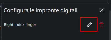
This is the icon I’m talking about