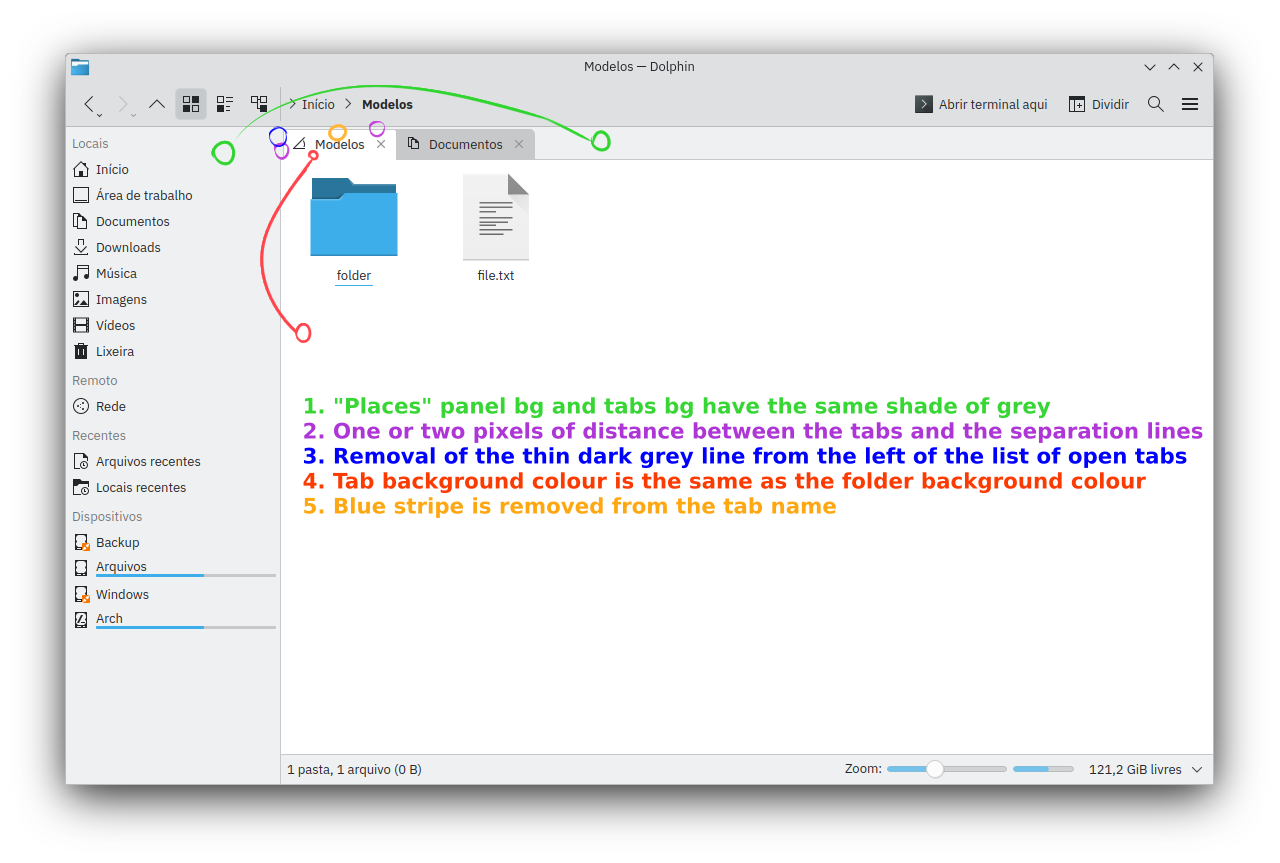
Hi, there’s a few small details in Dolphin’s main UI that bother me, so I would like to propose a few small changes just to make it look a bit cleaner and more consistent.
I made some edits to a screenshot to help people visualize it:
It’s neat but kinda ignoring people with visual impairments. To much blending whitch can look nice can also be hard for some to discern. On the other hand I feel you could do all that with a theme or kvantum.
But that’s just my take.
Well, I only used the same colours already used in the Breeze theme, none of the shades of gray were changed, just copied over from another element in the UI. Plus, I’m actually proposing changes that give a better separation between the tabs. But if you’re talking about the blue tab removal, here’s another version but with the blue tab added back. Plus I also rounded the corners of folder view area and added a 2px border to the right, I think it looks nice
Personally I fully agree with your changes for 1. and 4. i feel 2. could be useful until it extends longer then the width or the window. kinda like browsers do it.
But I also have a family member that is visually impaired an they like anything the can be touched moved or modified gui wise to have, how can i say. Thicker an more apparent design qs.
This why i feel it could be more of a kvantum/plasma 3rd party theme then a overall change. Also rounded is always good.
But I’m not saying its a bad idea at all it looks good!
Unfortunately I think these require structural code changes and I don’t think a theme could change them, aside from the colours I think?
But yeah I think 1 and 4 would be the bare minimum because it just looks more polished, specially the difference between the selected tab and the BG of the folder view looks quite jarring the way it currently looks in the release.
I think 2 is also necessary because the top of the tabs touching that line above them doesn’t look right. All other changes aren’t necessary but I like how they look.
I like the folder view + the selected tab to look like a single, whole element inside the window, it kinda has the same shape of a real life folder.
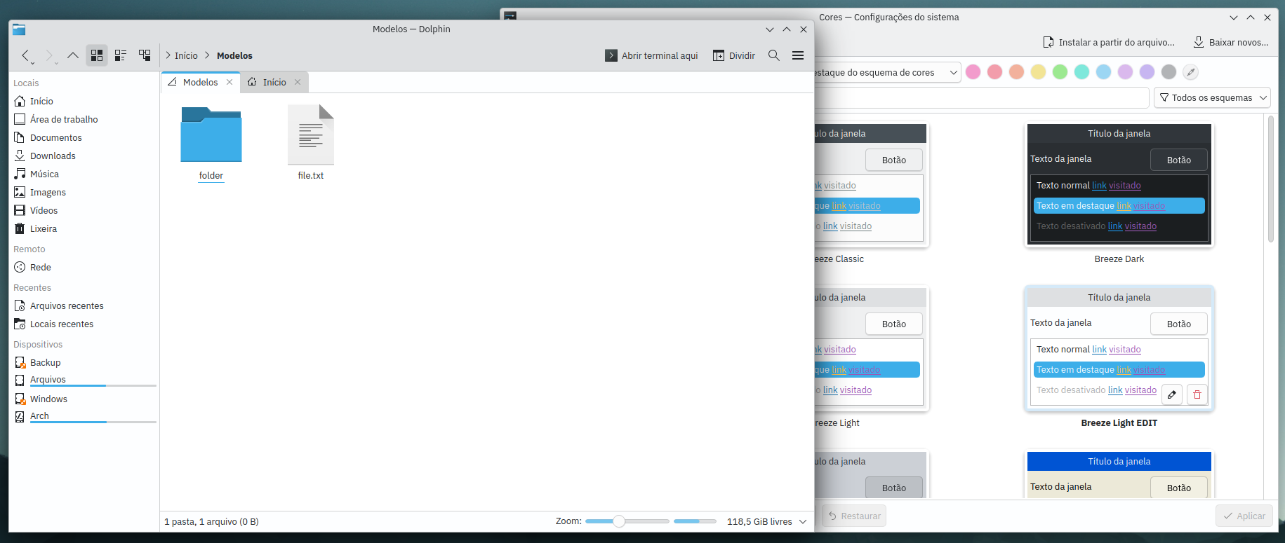
Simply changing the “window background” colour to white in the breeze colour settings already makes the tab the same colour as the folder view but it also makes the side panel and the colour surrounding the tabs also white.
I downloaded the Dolphin source code but I really don’t know how to code so I can’t find a way to change this stuff or else I’d do the changes for myself
it would probably be some QT stuff i would imagine, an that’s its own rabbit hole.
Maybe there could be a bounty set up for a theme or mod like this. Or maybe though I haven’t messed with it the lightly theme engine or kassy but its a long shot.
This might come as a surprise, but none of these are about changes in Dolphin. That’s also why @MarkB97 had little chance to change this through the Dolphin source code.
Dolphin’s tab bar is taken from Qt. The styling of the tab bar is defined in the Breeze style. Dolphin is simply using the same tab styling as other KDE applications. The places panel is not implemented in or for Dolphin either. It comes from a KDE framework and is used in multiple applications like Gwenview.
I agree with your suggestions, however the difficulty is that we try to do as little custom things in Dolphin as possible. We want to avoid changes that look good in Dolphin but don’t work for other applications. I assume that for example suggestion number 2 would not work well with other applications. Instead, there are attempts (e.g. by @carl ) to improve the tab styling for every application. In the styling discussions I am a vocal proponent of your suggestion number 4.
I see, I think if we could get just change #4 it would already be a very good improvement.
I think the way it looks now is a vestige from the plasma 4 days because of the gradients and it worked great back then but now it just looks inconsistent.
The other changes would be nice too but I wouldn’t mind giving up on those if only #4 is implemented.