I think it might be a nice idea if the Breeze theme got a makeover, can we expect a new theme with plasma 6?
I agree with Hikari, a new visual theme is needed. Similar in “good design terms” to the one used in Windows 11.
ControlKit, based on Kirigami, developed its own Qt Quick Control Style.
Check Qt/QML technologies:
Silica, MauiKit, Plasma Components, QML-Asteroid, Fish UI, Lomiri UI Toolkit, Dtk Declarative, ControlKit, Kirigami, Eos QML framework for webOS and more.
We may tweak it over time, but there are currently no plans for a major overhaul. We’re mainly concerned about making the transition from 5 to 6 as smooth as possible.
I don’t think we can’t do more than 1 task at the same time, I guess KDE is more than 1 person.
It is perfectly possible for KDE to develop a Qt Quick Controls Style theme if you don’t impose limits.
With the greatest respect.
It’s not as possible as you think, developing a new Qt Quick Controls theme takes time and effort (not to mention, I haven’t seen anyone interested in “revamping” Breeze to begin with). I actually just finished developing a new QQC2 theme for $work, with a fraction of the controls that Breeze uses. That took a good amount of effort and time (and even then, their requirements were extremely simple).
It’s also worth mentioning that KDE actually maintains two different QQC2 themes, qqc2-breeze-style and qqc2-desktop-style. On top of that, we still have to maintain the Breeze QStyle for applications that use Qt Widgets. This limits us somewhat in what we can accomplish, and I’d rather we spend time fixing the myraid of bugs with our existing styles ![]()
It is not true, ask for collaboration, add people for design and implementation.
If you make an announcement and request collaboration, even on linux news sites, no problem.
Something similar was done for the contribution of wallpapers by the community.
Nobody inside KDE?
Anyone outside of KDE?
It is possible if you don’t look for the problem.
It’s not a problem.
Honestly I think Breeze can be more modern with small amount of tweaks. I think there are some Figma files which named “Blue Ocean”? I think? Can’t find that file anymore though. But anyway that seems really good evolution and I think much more easier to do than making a completely new theme.
The advance should not be small, but big. The goal should be high and reach the level of Windows 11 applications.
A big change is not necessarily a good change. Breeze is really customizable and a lot of design is not implemented properly. From what I have seen different apps like different iteration of Breeze theme within them. I think the main focus should be on making it more consistent across all the apps. I don’t know much frontend I have seen many KDE Kirigami apps having different font sizes, padding or other design choices which I think should be standard.
Honestly KDE definitely should have a really well documented design like Microsoft Fluent UI. Also the KDE kirigami Gallery app deserve much more love. It could be really usefull tool for beginner to get started with components.
I think I have explained myself well, an improvement is always a good change.
The discussion doesn’t make sense. Wanting better has no discussion.
Why the excuse search?
Why the search for justification for not doing it?
I agree here. Breeze is absolutely a competent theme and does not need an overhaul, but some common design tokens like padding values, text sizes, et cetera, as a part of a well-documented design system would be great for consistency.
Most complaints about Breeze from users seem to have no technical grounding; I get the impression that people just want Breeze to look like Fluent / Material / Apple, etc, but frankly, that’s what theming is for. Nobody wants to have to revamp their widgets each year because digital brutalism / glassmorphism / skeuomorphism / whateverism isn’t trendy any more. ControlKit is pretty for now, but squircles and big background gradients are already starting to feel played-out.
This isn’t to say Breeze is perfect; it isn’t. But it is a competent, complete theme made by a team who have clearly put a lot of thought into usability.
The biggest sticking points for me are (and some of these are probably more to do with individual apps than the Breeze theme):
- Lack of design tokens as mentioned above
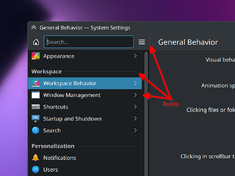
- Use of rules to communicate visual hierarchy where spacing and type could communicate it without adding cognitive load.
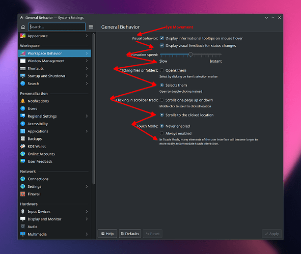
- This weird flush-right / flush-left justification combo that prevents the user from having a consistent visual anchor-point to begin reading each new setting label (labels above widgets would be much, much better, using text styling & spacing for visual hierarchy):
- Hamburger menus. Just because they’re popular, doesn’t mean they ever stopped being mystery meat navigation.
But over all, I like Breeze just fine, and I will never understand the jumping up and down that users do over it when not only is it an outstanding project developed for free by volunteers, but you can change almost anything you want about it!
Edit: Some more information on why KDE makes some of the decisions it does with relation to design.
Please NO HAMBURGER Menus.
i do not know much about Window 11’s Fluent design, but as much as i have seen about it, it seems to heavily use blur. An excessive amount of blur (in my opinion).
That depends on the app developer.
The design philosophy of Windows 11 applications is right.
I agree with this, i ended up phrasing this question really badly. What i really meant was that Breeze should be given a bit of a “cleanup” for plasma 6. I absolutely adore Breeze and the problems you listed out about it are valid. I also for some reason find Breeze Light more attractive than Breeze Dark, which i cannot explain. Just these changes alone could make Breeze overall a lot better.
Breeze requires a lot of effort to get a decent app. Anyway, to see the difference, check Windows 11 apps:
There is no problem to obtain in KDE that style or any other, as well as applications in that same aspect or whatever is chosen.
Left: Calindori (Kirigami)
Right: Calendar (ControlKit)
Calindori > Calendar
You can check that the folder name is the same: Calindori
More:
It’s important to distinguish between style and function/layout. Breeze is just a style. Hamburger menus and FormLayout control arrangements aren’t related to Breeze; they’re functional/layout choices made by the app’s code, not something determined by the visual styling. Those things can and must be changed independently of the style.
At the moment there are currently no plans for a major visual overhaul of the Breeze widget/app style itself. We will continue to incrementally evolve it over time as we have been doing, though.
There are currently developer desires for larger changes to Breeze icons, though. For example:
- Removing the 45° shadows on colorful icons
- Broadly overhauling colorful icons in general
- Increasing stroke widths and corner roundness of monochrome icons
- Deleting the 22px icon size and using 24px icons instead, for better compatibility with GTK icon sizes
At the moment it’s mostly about finding people with a combination of the technical competence, artistic ability, and interest in helping to make these changes. Overhauling a whole icon theme–especially one as complete as Breeze Icons–is a monumental task. There are literally thousands of icons that need to be done, and you need to land the changes all at once; you can’t do a few in this release, a few in the next release, and so on.
It’s important not to underestimate how much work it takes to make large-scale visual changes to icons and app themes. It is thousands of person-hours. It’s not the kind of thing you just do because you feel like a change or because industry trends have shifted.
I don’t think that there’s any need. It was recently improved substantially.
@ngraham, is there an issue anywhere about that that I can follow? I can’t agree more.
Yeah, @Nathan, agree. I hope that we’re transitioning to labels above widgets rather than the other way around. Have you made an issue (or know of one) about that?

