I agree here. Breeze is absolutely a competent theme and does not need an overhaul, but some common design tokens like padding values, text sizes, et cetera, as a part of a well-documented design system would be great for consistency.
Most complaints about Breeze from users seem to have no technical grounding; I get the impression that people just want Breeze to look like Fluent / Material / Apple, etc, but frankly, that’s what theming is for. Nobody wants to have to revamp their widgets each year because digital brutalism / glassmorphism / skeuomorphism / whateverism isn’t trendy any more. ControlKit is pretty for now, but squircles and big background gradients are already starting to feel played-out.
This isn’t to say Breeze is perfect; it isn’t. But it is a competent, complete theme made by a team who have clearly put a lot of thought into usability.
The biggest sticking points for me are (and some of these are probably more to do with individual apps than the Breeze theme):
- Lack of design tokens as mentioned above
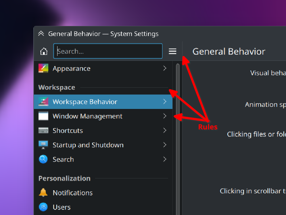
- Use of rules to communicate visual hierarchy where spacing and type could communicate it without adding cognitive load.
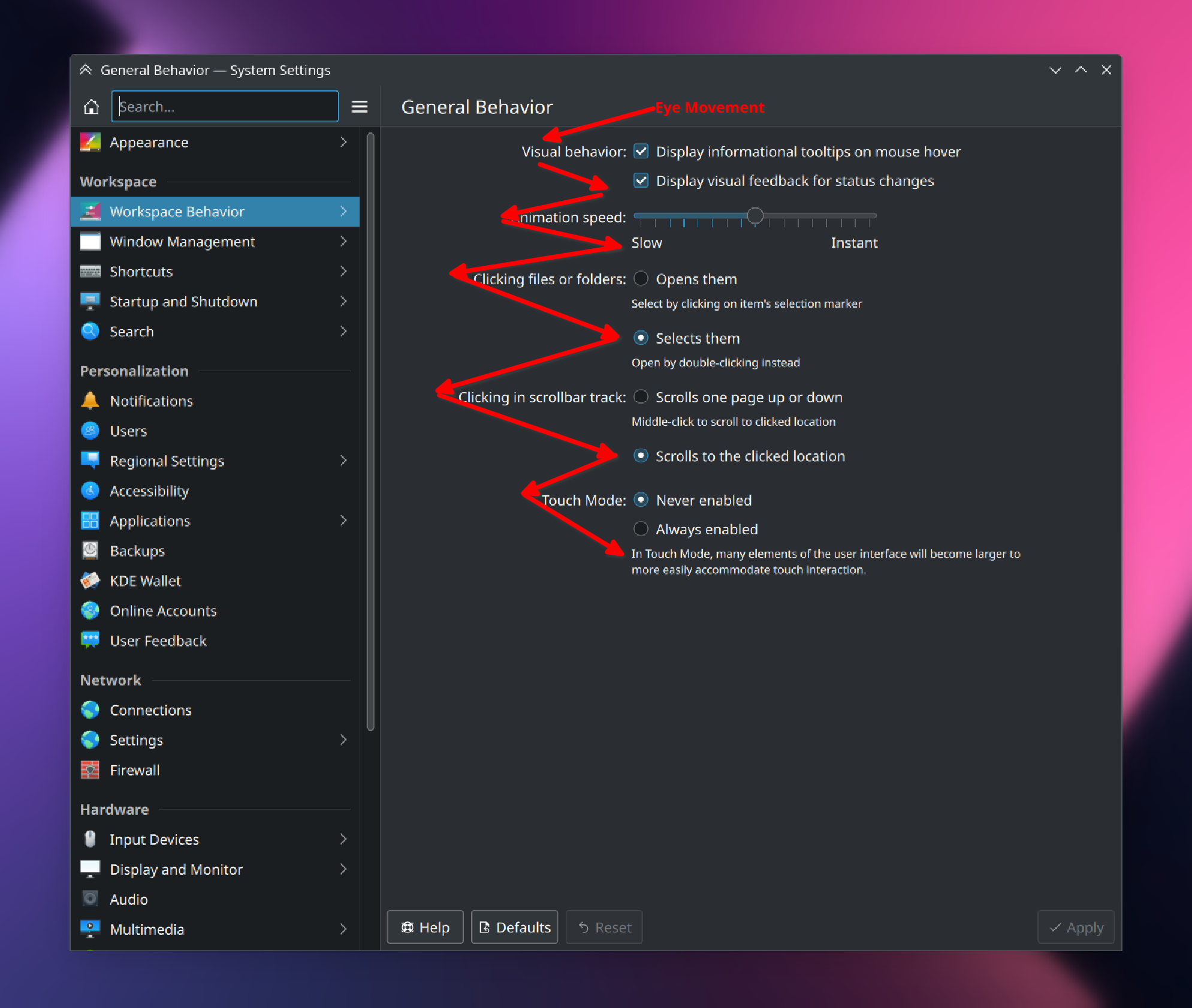
- This weird flush-right / flush-left justification combo that prevents the user from having a consistent visual anchor-point to begin reading each new setting label (labels above widgets would be much, much better, using text styling & spacing for visual hierarchy):
- Hamburger menus. Just because they’re popular, doesn’t mean they ever stopped being mystery meat navigation.
But over all, I like Breeze just fine, and I will never understand the jumping up and down that users do over it when not only is it an outstanding project developed for free by volunteers, but you can change almost anything you want about it!
Edit: Some more information on why KDE makes some of the decisions it does with relation to design.