In System Settings > Bluetooth, the icon for forgetting a device is an “X”.
But on Android, the icon for disconnecting from a device is an “X”, and the icon for forgetting a device is a trashcan.
I don’t generally think Plasma should copy Android’s icon design language, but I get confused because I accidentally click the “X” in Plasma Bluetooth settings because I’m used to clicking the “X” on Android to disconnect a Bluetooth device. This opens a confirmation dialog on Plasma that I have to cancel out of, interrupting my flow state.
It’s a good thing you don’t have to drive a manual shift in the UK or the US and vice versa. Imagine the… confusion.
But I think we should let the iphone users have a say as well cause they might have a more i-phonish wish. In either case, why use the design language of something that started in 1992-ish if it can be replaced by something…“less confusing” that started in 2007-ish, right. We can’t have interrupted flow states and all that , can we.
But hey, that’s just me, a forgetting type.
I agree with respect to iPhone users. I think any change should take into account users of both major mobile OSs (Android and IOS). Especially because many Bluetooth devices (earbuds, keyboards) are commonly switched between people’s Linux desktops and mobile phones. I don’t daily drive an iPhone myself, but I believe their Bluetooth settings simply use text that says “Forget This Device” rather than an icon.
To clarify, my concern isn’t about stylistic differences between icon designs. It’s about functional confusion - the same icon (X) means completely different things between Android and Plasma. On Android, X = disconnect, while on Plasma, X = forget device.
I’m not sure what percentage of Plasma users also use Android or iPhone, but when the same symbol performs dramatically different actions across systems, it creates genuine usability problems.
That’s also why I mentioned the interrupted flow state. I frequently find myself having to cancel out of the “forget device” confirmation dialog because I instinctively click the X expecting it to simply disconnect, as it would on Android. It’s a friction point that other users probably encounter and I think it risks making Plasma less intuitive than it could be.
Why should anyone have to adapt? Ideally shouldn’t everything just be intuitive? Adaptability in this context doesn’t seem like a virtue, it seems like a burden.
By my first statement “…I don’t generally think Plasma should copy…” I mean that I recognize that Plasma is not Android or IOS; Plasma has its own design language and icons that I really enjoy and I don’t want to substatively change that.
By my second statement "…any change should take into account…”, I mean that if the Plasma designers decide that the existing Bluetooth icons are actively misleading because they don’t match users’ experiences across platforms, then I think that any change should take into account those platforms. I think it was presented out of context.
I think my original two statements are consistent with each other.
Hi @librick ! One thing I noticed in thinking about your post is that it seems like the kind of thing that might confuse me, too, but that I hadn’t run into. It then hit me that when I’m looking to disconnect a device, I’m almost never navigating all the way into System Settings > Bluetooth to do so - I’m typically doing that from the System Tray applet.
Are you using the applet to manage active devices, or are you heading into the full-on Bluetooth settings typically?
And separately from that - I probably partially agree about the X icon, in that I’m not a big fan of icon-only X buttons to begin with. They seem like they could mean so many different things: Stop, Cancel, Disconnect, Delete, Forget, probably others - so I always end up hovering over such an icon to get its tooltip. Maybe the solution here, whatever the icon, is to add text on the side of the button - especially since there’s a good amount of horizontal space in the System Settings view
I usually head into the full-on Bluetooth settings via System Settings. For two reasons:
I frequently connect bluetooth headphones for online meetings and I tend to change my sound settings to configure things like external microphones at the same time. It’s easy to get to the “Sound” menu in System Settings from the “Bluetooth” menu in System Setting, so I just open System Settings to access both.
I actually see two Bluetooth icons in my tray. One is the Plasma/KDE one and clicking it opens the built-in Bluetooth menu. The other is from Blueman bluetooth manager, and clicking it opens a Blueman window. Maybe in an ideal world I wouldn’t see Blueman in my tray if I already have the built-in Bluetooth icon in my tray; it’s a bit confusing. My tray is pretty cluttered too so in general I just find it easier to open System Settings.
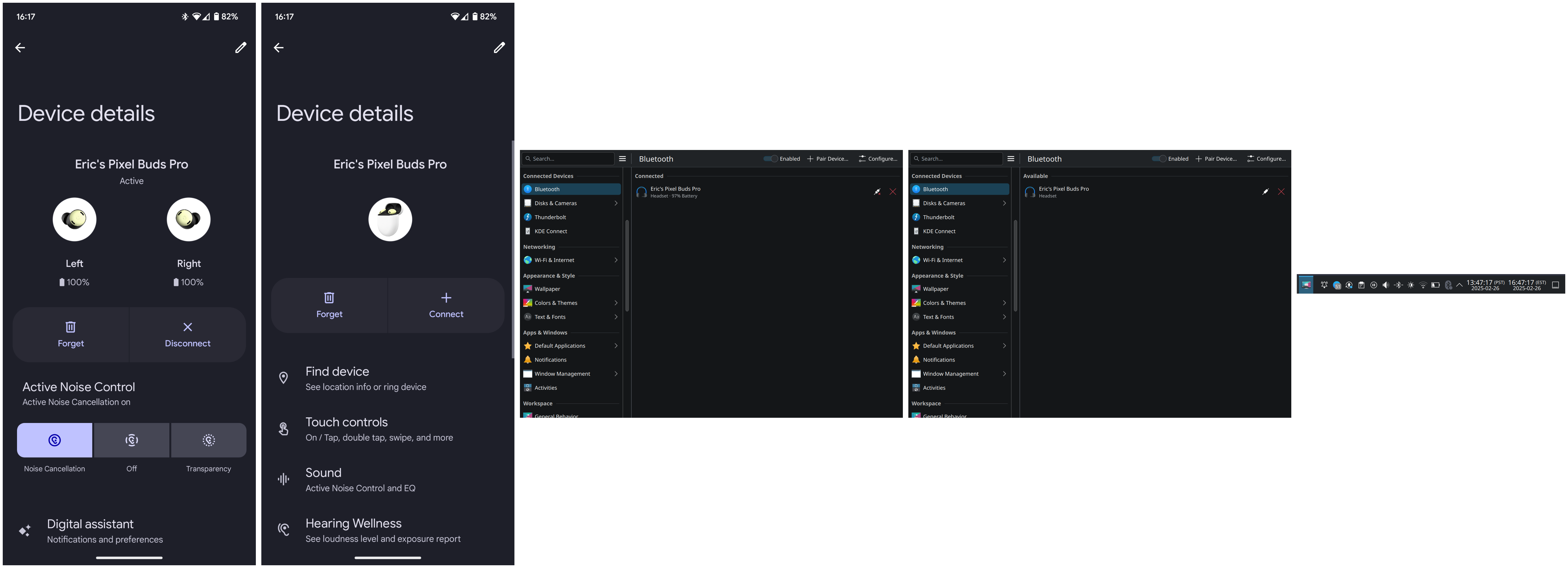
As for the System Settings Bluetooth UI, I’ve attached a montage of screenshots of what I see on Android and what I see on KDE (sorry for the janky giant image, I can only include one image as a new user). Note that the “X” icon means two different things across both operating systems, and that Android shows text alongside the icon that makes it clear what action it represents.
I do think adding text to the System Settings window would help reduce confusion. I also think the use of the “X” icon specifically should be revisited. If anyone has screenshots of the IOS interface please post it as a reply, I’d love to have more examples of mobile interfaces.
Plasma and Blueman Tray Icons
For completeness, I’ve also included a screenshot of my tray to show what I mean about the two Bluetooth icons (one from Plasma and one from Blueman). My tray might be more cluttered than your average install, but I think the screenshot demonstrates why I prefer just using System Settings directly. The Bluetooth symbol closer to the left is from Plasma, the Bluetooth symbol closer to the right is from Blueman. If I’m in a hurry to pair headphones for a meeting I’d rather just use System Settings then hunt through my tray.
Either in the System Tray settings or Blueman’s settings you should be able to hide/disable this. But you don’t need two potentially competing bt managers from two different desktop environments installed and running
at the same time .
I have one Bt device that will only pair on my desktop using Gnome’s Blueman for whatever reason, but is fine on all my other systems. I install, use, then uninstall it – it is far quicker than re-learning how to pair the darn thing on the command line.
I use multiple audio devices, including 2 USB heasets, up to three Bluetooth ones, plus external speakers and a webcam mic, not counting a mouse and keyboard(s). I switch between them fairly often, including sending specific sources to specific outputs. I usually manage both Bt and audio from the tray icon. I seldom ever need to visit System Settings for either, myself.
But as to the icon, meh, personally. Either I have been wrangling these things on both Android and KDE for long enough, or it simply has never ever been an issue for me personally, ever. But we never know what others see and experience without discussions.
I could see matching which button is on the left or right, to match things with Android and iOS, if they use the same side for the same actions. Android imo sucks in terms of switching individual devices off and on.
I was able to disable the Blueman tray icon by opening Blueman Device Manager and going to View > Plugins and then unchecking (disabling) the StatusIcon plugin.
Blueman was left over from when I used GNOME. Now that the tray isn’t cluttered with the Blueman icon, I’ll probably start using the (Bluedevil) System Tray applet more. Thanks for the tip
As for the UX, good point on the left/right thing. On Android the disconnect button is on the right and has an X. On Plasma the button that’s also on the right and also has an X is the forget device button, not the disconnect button.
It seems likely to me that the button order on Android is designed the way it is because users more commonly connect/disconnect from a device than forget the device. But I’m not strongly opinionated on what the “correct” button order should be in Plasma.
IMO the biggest UX benefit would come from changing the X icon to something more obviously associated with forgetting/unpairing a device and/or adding text alongside the button like @johnandmegh suggested.