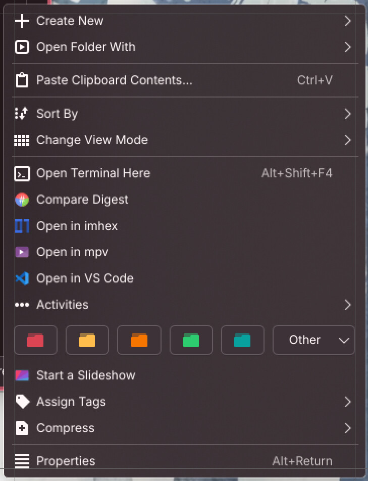
I just tested the Breeze 6.5.3-2 on Arch, with the applied fixes to the big padding in context menu. While it is still taller, it’s not as jarring as before, but there’s a little thing that’s been still bothering me, and I’m wonder if it’s by design or not:
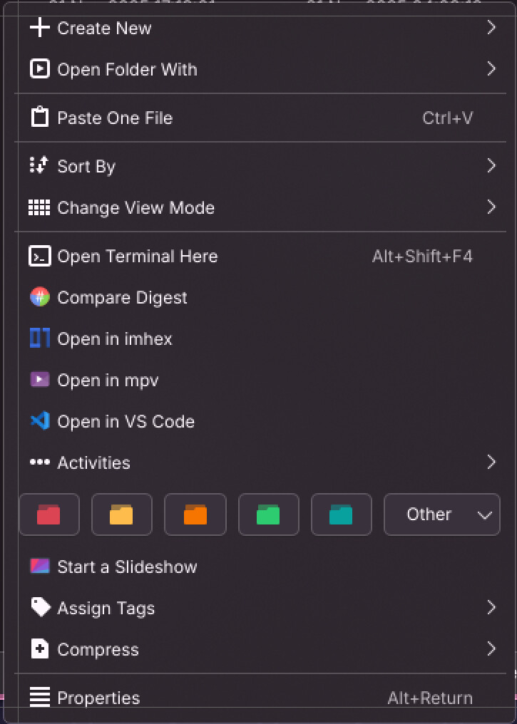
In the old Breeze’s context menus, the icons are aligned with the colored-folder buttons:
Yes, it matches the values Kirigami uses. If that needs changing, we need to change them in both.
I am actually fine with any future changes regarding this, as long as the changes are done in sync. (Though I hope to avoid touching these for a while because my butterfingers will accidentally merge to stable too early again lol)
Feel free to propose improvements! Compare the context menu styling with Kirigami applications and make sure they look as close to each other as possible.