Breeze Icons Update!

A few weeks ago, right before the holidays, some chatter in the VDG channel happened where the desire to change our icons to a 24x24px size came up.

Most modern interfaces use this icon size as a base. Plasma has been encouraged many times to adopt this size. However, manpower is always something not readily available.

The conversation picked my interest. In the past, I have worked making icons using Inkscape. At the time, the interface didn’t have all the shortcut helpers that it does today. Also, with the advent of UI-specific graphical applications like Figma and Penpot, I figured it might be much easier to edit icons today than in the past. I am talking many years, FYI.

With this in mind, I downloaded a copy of the most current Breeze icon collection, accessed the 22px folder for actions and begun editing.

At first sight, most might think this is just a matter of mass-resizing from 22 to 24 and merge. However, the reality is much different. These icons feature mostly 1px lines. They also contain pixel fractions that lead to misalignment and blurriness. Since we don’t have the actual graphical original files, as they have been flattened in export, the shapes are only workable through editing nodes, which is a pain!

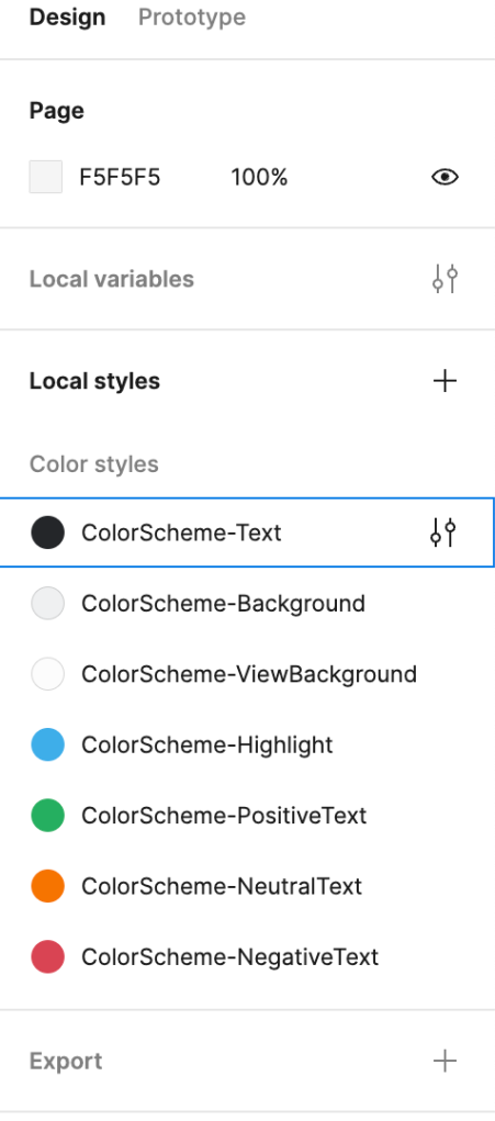
Another issue is that our Breeze icons contain a css sheet that correlates colors to colors in Plasma. This allows for easy color transformations on the system without much hassle. However, graphical applications like Figma and Penpot remove the css.

For this reason @manuelijin created a nice plugin for Figma called Icon Jetpack. This plugin will allow designers to export the updated icons with all the necessary pieces for production.

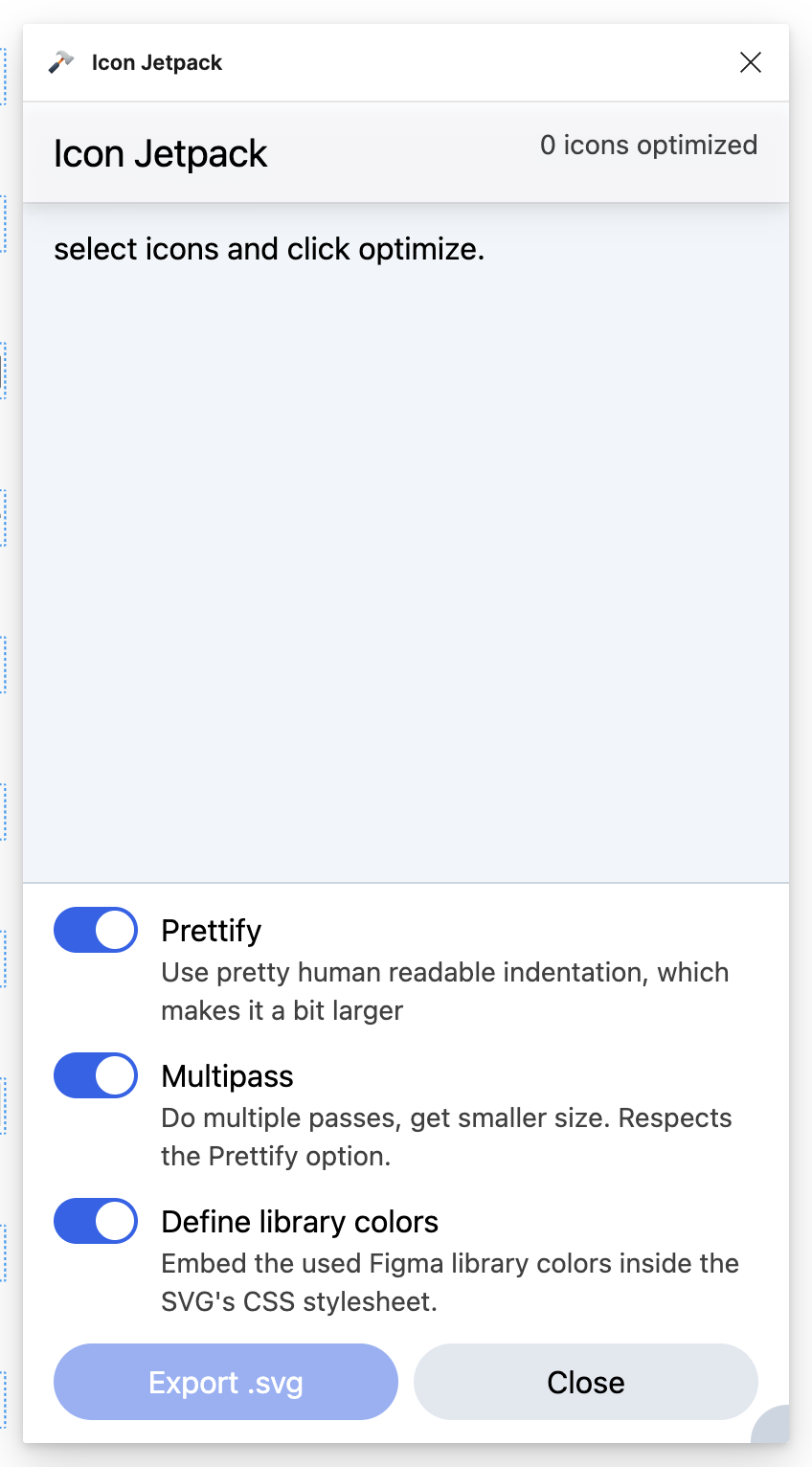
In the public Figma file, I created the colors needed for action icons and they are now embedded into the exported file.

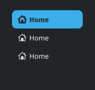
Another criticism of our current icons we would like to address is how thin they feel in high-DPI screens. To address this, we have been making our lines 2px (for the most part) where it makes sense.

Given this is an update, and who knows how long it will take for another time when an update is done, I also feel it’s necessary to update many of the shapes we have. We are using rounding for making shapes a little more approachable. Some icons have been transformed inspired by the original files. For other files, I usually check on other icon providers to see how different or similar we are to most icons today. That way, if there is a need for more editing, we can land on something recognizable.

The editing process that seems the fastest involves recreating the shapes, using an icon grid, aligning to the grid as much as possible, reusing icons for consistency. This should help future designers consult the Figma file and edit en-masse.

For now, we are in the middle of editing icons. My intention is that we do a first pass and seek feedback. Do another refinement pass and then see how the community reacts to the edits. Hopefully the work is useful and can be merged eventually.

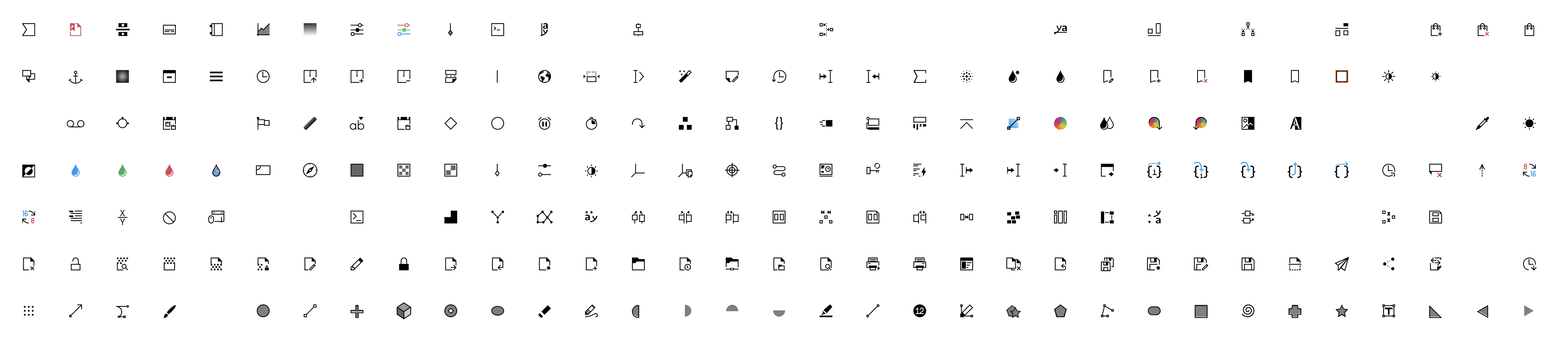
We have a total of 1206 icons. So far, we have edited 262.

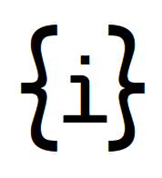
Here is a before/after:

There are some more edits at the bottom of the file that I didn’t include.

Hope you like.

I also made a couple of videos to show the process and see if any other designers would like to contribute some time to update the icons.

6 Likes

It´s awesome, the more pixel perfect for Plasma, the better. Is this also part of the work on the folder icons ? Upstream new Places icons and 256px size by Ken Vermette (!297) · Merge requests · Frameworks / Breeze Icons · GitLab

It’s not directly related. This work here is about adapting to a 24px size. The work on Ken’s icons are not about resizing. They are proposed as replacements for the current colorful folder icons. That collection still needs more work from what the MR shows.

Never realized so much manual editing is required for SVG icons. Seems it almost defeated the benefit of SVG.

Since most smaller icons are monochrome, perhaps we can pack them into a font, and let freetype do the pixel-alignment automatically (and perhaps also sub-pixel rendering)?

3 Likes

there has been some talk about that in the vdg

we’d love the subpixel rendering:

  • sharper for free
  • we can still optimize/hint for each size so it’s even sharper, just that the sizes in between are actually not blurry
  • we could even, say, make the icon weight variable and make it bolder on hover/active.

we have these concerns:

  • we have to be compatible with gtk & non-kde qt apps, so it’s double the work unless it’s generated by some script from the same source. (how would we define aliases?)
  • the learning curve for new contributors would also be increased tenfold
  • how could we add color versions of the icons? through a color axis would make the most sense, but then, what tooling do we use to make it? we can’t really use Glyphs
2 Likes

What if:

  1. We still use SVG as the source format, so the design process and tooling don’t change at all.
  2. At build time, we convert all SVG icons into a single TTF font, and ship it along with SVGs.
    2.1. There might be some way to automatically convert a colored SVG into TrueType.
  3. At runtime, when the user chooses a new global scale, we render the font into (scaled) PNGs, with auto-hint and sub-pixel, and replace all Breeze icon SVGs with them.
  4. Or, at runtime, only KDE apps render icons from the font instead of SVGs.

Problems:

  1. What to do with CSS in SVGs.
  2. If the user boots into another DE, with a different global scale, then scaled PNGS generated in Step 3 would be wrong.

Just wondering here, is there a system that does this?

The Web (icon fonts). But I don’t know any systems other than that.

  1. At runtime, when the user chooses a new global scale, we render the font into (scaled) PNGs, with auto-hint and sub-pixel, and replace all Breeze icon SVGs with them.

This sounds pretty viable until we hit the pretty common case of an icon in a selected list item: it inherits the current color of the text, so it gets inverted to white when using breeze (or whichever color is set by the color scheme).
This means that the CSS is actually dynamic at runtime, not static, and it’s not a matter of adding a hook when changing the icon theme, colorscheme etc.

  1. What to do with CSS in SVGs.

The font would be opentype-svg. that format still supports css. This is the approach used by noto-emoji, as far as I can tell.

Edit: noto-emoji actually uses COLRv1, using googlefonts/nanoemoji. This still allows for modifying the icon’s color through css. An example from the Chrome team:

@import url(https://fonts.googleapis.com/css2?family=Bungee+Spice);

.spicy {
  font-family: "Bungee Spice";
  font-size: 8em;
  font-palette: --colorized;
  color: #e67900;
}
  
@font-palette-values --colorized {
  font-family: "Bungee Spice";
  base-palette: 0;
  override-colors: 0 #00ffbb, 1 #007744, 2 #004433;        
}

To add support for 16px, 32px, 48px I was thinking about having a wght axis (since variable fonts are supported in Qt6), where:

  • wght(800) → 2px@12px; 3px@24px
  • wght(400) → 2px@24px
  • wght(100) → 2px@48px; 1px@24px

(600)16px & (200)32px would be interpolated, not handmade

There are some pretty serious limitations still, I feel:

  • Symlinks: some apps may have special icon names for common actions where icons already exist. To avoid duplication, we currently do a soft symlink with the app’s name. This is, to my knowledge, not really possible.

  • How to map the glyphs to characters:

    • Material Symbols approach: using ligatures.
      Pros: we would support XDG best match, AND keep using the XDG naming scheme
      fallback (explained below).
      Cons: there may be instances where edit-undo and cloud-sync may be implemented, but not edit-undo-cloud-sync, potentially causing n amount of icons (greedy instead of lazy matching). This should be fixable by limiting to the first ligature rendered.

    • Nerd-icons, FontAwesome etc: private use codes. Not a fan of this one at all

  • Fallback: Imagine there’s an app requesting the icon edit-undo-cloud to undo a just-synced change. We might not have that specific icon, but we can fall back to edit-undo, which matches the metaphor to the requested intent as close at possible.

Would it be possible to take one of the icons made so far and test? Also, some new icons are not consistent with the sizing. While most of the shapes and lines are 2px, some other symbols are 1px. Would that be a problem when resizing programmatically?

in this example, the masters are 100, 400 and 800. everything else is interpolated. there is no hinting yet, but I’ve played around with it and it works pretty well.

800
400
image

12px @ 800
image

16px @ (interpolated)600 (eq. to 2px width stroke)
image
(subpixel rendering really helping here! and this is without hinting!)

24px @ 400
image

32px @ (interpolated)200 (eq. to 2px width stroke)
image

48px @ 100 (eq. to 2px width stroke)
image

as you can see the border width has perceptually the same weight


it also allows us to change the weight on selected icons
image


the current workflow for a designer is:

  • importing svgs from outside to the fontforge project (or creating from fontforge if you prefer)

/!\ lines have to be turned to shapes, but the shapes themselves must not be merged, as that changes the amount of nodes between the different weights

  • set path starting point and direction inside fontforge for each shape. make sure they match across all masters
  • optionally, add automatic hinting by simply selecting a menu option (or manual, if really necessary)
  • File > Generate Fonts… > Format: UFO3 > Ok

and for a developer:

  • generating the designspace with fonttools
  • generating ttf/otf/… with fontmake or fontc fontmake -m test.designspace -o variable --production-names --output-path ./out.ttf

Wow, that’s impressive! Good work!

Another question. I have seen a few cool interpolations where line icons become filled icons. For example a house icon. Is this something that could also be done programmatically? Maybe that’s more complex. Just wondering. Some systems use filled icons to show that the button is selected.

should be possible. we could map the filled icon to wght 1000. problem is, the amount of nodes must match between all of the variants, so we can’t remove the counterform or invert it.

other option is to double the work and maintain two sets (what material does), which uhhh… yeah…

Yeah, that’s what I wanted to avoid. But I guess we would have to create filled icons eventually.

See all the drawbacks I mentioned a few hours ago? Well, Janet has solved them all pretty much. And like, two weeks ago. She’s amazing.

Not only that, but she has already begun implementing the font loading mechanism in this commit. As soon as that merges, we have everything, including color scheme support.

1 Like