I have worked on small consistency fix on Breeze themes across our systems, from QtQuick to QtWidgets and even GTK.
I felt like the current look of Breeze is a bit too industrial and serious. Changing it a bit more round made it look friendlier to me and many other devs.
Thank you, decent work and IHMO just about not too exaggerated (unlike the exaggeratedly rounded courners in Plasma 6’sOverview and Grid View…) - although I personally prefer the “more industrial and serious look”.
Please don’t become GNOME in the long run…
I think one of the major points is to be as consistent as possible throughout the entire GUI and I appreciate that you are working on this.
The point is not to become super round, just a bit more round. I was going to go even less rounder radius, but was convinced otherwise.
Basically update Breeze just a bit to make it look more friendly and new for Plasma 6.
And yes consistency, that is my pet peeve but there’s ongoing effort (not just from me) to make things better on that front.
These kind of changes are great ways to figure out where things are consistent and where they’re not. And since the values are consistent, it’s easy to change it in future.
5 (maybe 6) px is the absolute maximum imo. More than that it becomes kiddish and cartoony. It lacks professionalism. Example: If you are an architect and you want to present something to potential clients and to be taken seriously, you can’t go with a desktop look similar to GNOME and Pop! OS. These looks are for teens doing their homework for school and playing games.
P.S. OT: (I also find the default Plasma 6 wallpaper too cartoony and with too many edges and thorns and psychedelic colors (=psychologically not the best for creating a good/calm energy/vibe/zen/harmony) - not suitable for a professional/productive desktop as well- )
This isn’t even the new Breeze with 5px we are talking about, please open a new thread -which is pretty pointless anyway since you have created a bug report and it is confirmed already-
Something nice to come out of this work is that we now have a standard corner radius value we can easily tweak in the future, and also apply to other things current using a nonstandard corner radius, such as all the stuff in Overview. So if 5px turns out to be too much, we can go down to 4 without much trouble (except for those darn Plasma SVGs, but that’s a topic for another time).
I also think this is unnecessary (though if the single corner radius application style setting is indeed new then that is useful). I think the KDE Plasma project needs to mature. At a time when all the other major DEs including by the existing supposed “professionals” (Windows 11, GNOME, MacOS) resemble kids’ toys, KDE’s application style (mostly) seemed like one of the last hold-outs of something that IMO looked more sensible, space-efficient, and didn’t follow this strange excessively rounded fashion trend.
There is also a big opportunity for Linux desktop growth right now as Windows 11 is not as well liked as it could be; and there is an appeal to many, especially including businesses, for an open-source privacy-friendly, ad-free, cost-efficient version of a sensible traditional desktop. When things like floating panels, more rounded corners and decimated scrollbars are being made the default then I think KDE is lacking the leadership priorities to exploit this opportunity.
I’ve now got another task to do for Klassy - make the application style roundness configurable and have an option to make it vary in sync with the window decoration roundness. Sensible low corner radius by default, and changeable to very round corners for whimsical children to upvote and butcher my wonderful defaults on unixporn (in a few years time then it will be hip-to-be-square again and the children will then upvote 0-px corner radii as that will be what will be “new” and trendy). Only problem is you are now talking about also messing around with the svg-based desktoptheme corner radii - something that in theory is easy to change manually but actually will require a lot more work to change programmatically. I have already changed svg icons programmatically though, so should be something similar. Maybe that parameterisation work could eventually be useful in the long-run.
Ultimately, I think the best solution for theming as a whole would maybe to have a “Roundness” value in the Global Theme “defaults” file and then have all other theming elements derive off that. The wars over corner radii would cease as anyone could switch them with an easy switch to the global theme.
People seem to think that the rounded things take more space. That’s not necessarily true, the size of an item is based on multiple factors and how it was programmed in the first place.
But the click area is the same: It’s the same square 90 angles as always. Only the visuals changed.
(And if you spot something different, do make bug report!)
This might start a pointless “internet argument” but.. This does not make any sense to me. With same logic, MacOS looks like a children’s toy and it’s used by many professionals.
And if someone cares what the buttons on your desktop look like, it’s obviously their problem.
Yes I too prefer the ‘more industrial’ look.I dislike that round the corners on everything look of GNOME, that seems to be creeping into the Plasma 6 designs.
Having rounded corners on the Overview, and Grid Views, is an example of what I’m talking about. Plasma 5 got it right.
MacOS is not a children’s toy, nor a “tablet” environment, it is still a real “desktop” environment, infamous for its look which is meticulously designed around every possible detail that can exploit “human psychology” and addiction for decades already (with the help of psychologists too in the team obviously). It’s also appreciated by designers, architects etc because its design “inspires” them and prohibits “creative stagnation”. In the above example, 95% of clients are people who are used to the crappy Windoze look, so a desktop environment like MacOS adds “selling value” to an architect (as subconsiously they see someone who differentiates himself from the masses (=unique) and using something that is explicitly build to create a good emotional response (= architect has a good taste). You may ask any archtitect or any designer and they will tell you why GNOME and Cosmic are awful and in no way would help them “sell” their work.
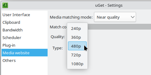
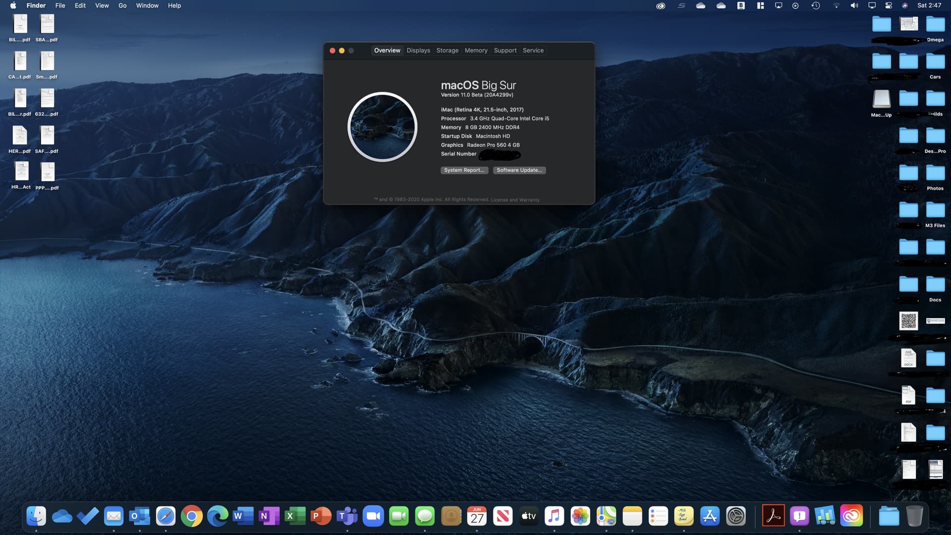
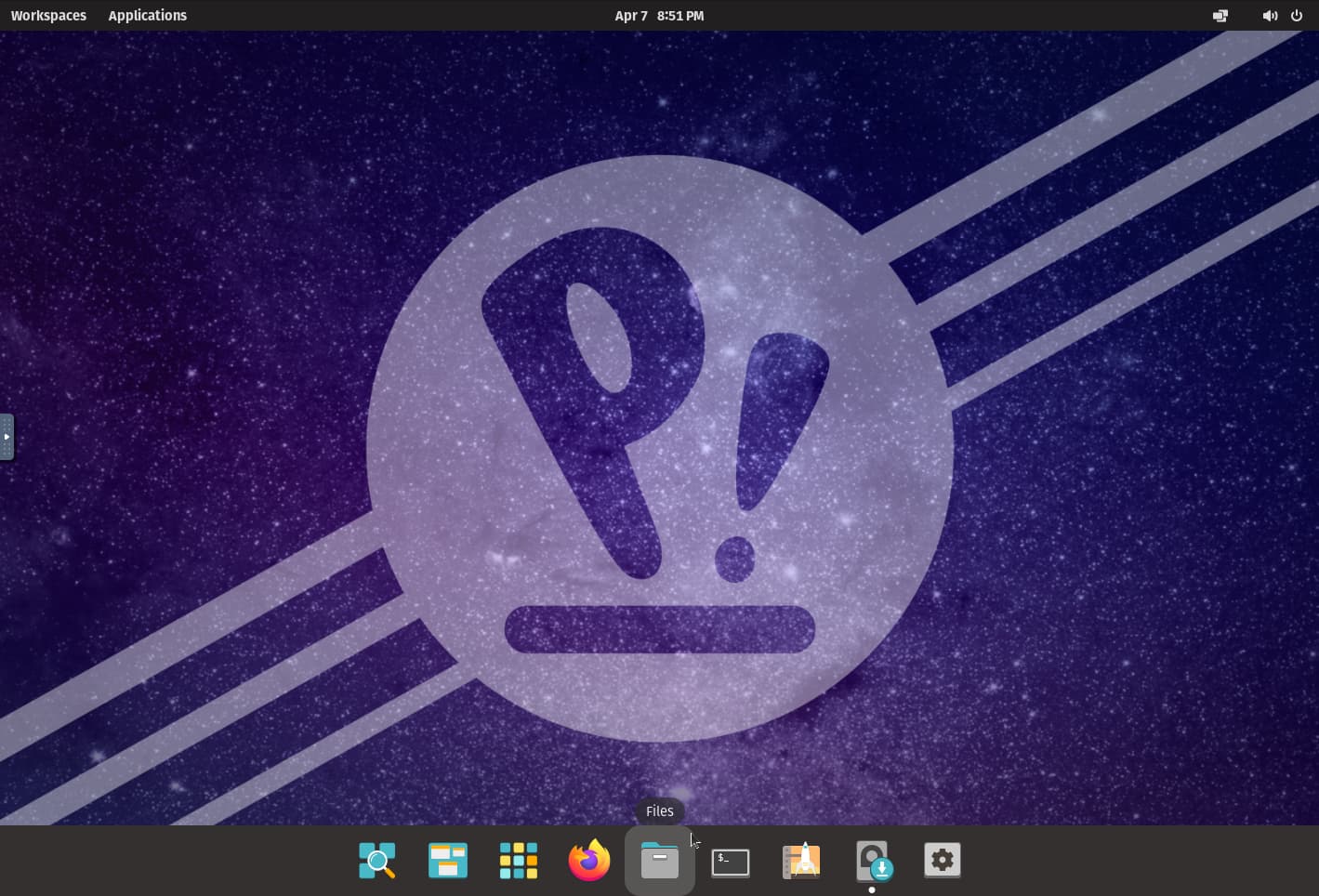
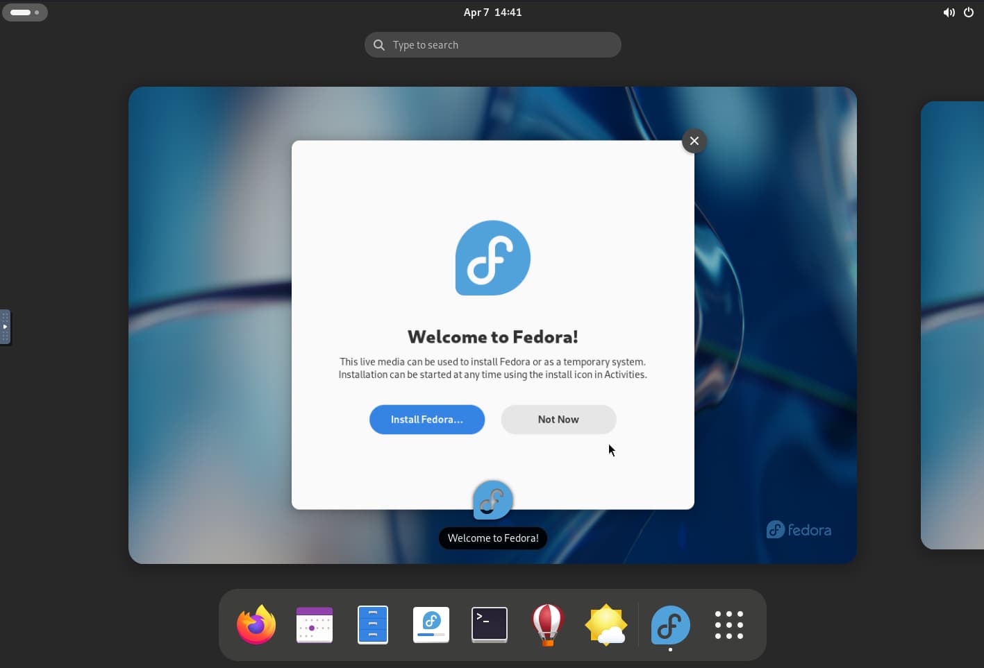
Since 1 image is 1000 words I’ll leave here 3 screenshots for people to compare and to show why KDE is superior and why it should not (ever) go the GNOME way (= I repeat → for teens and tablets) :
Nah, still don’t see the logic behind this. Guess we have to agree to disagree.
What I do know about GNOME though is that one reason items are big is for accessibility reasons. For example if you have quite shaky hands, smaller click areas are more difficult to use.
well I said what I had to say so I can’t help any further, so yeah. But reading what you say sounds relatively alarming to me. Fortunately there are alternatives if KDE loses its own distinctive language/path and ends up mimicking/copying/looking-like GNOME.
Not only the screen, but also the windows have square corners - so this looks wrong twice…
I really hope those corners in Overview and Grid View were just a bad blunder in a small (but for me important) part of Plasma 6 and are not the future of Breeze/Plasma.
Otherwise my solution would be e.g. to use LXQt with Kwin.
But this also is not at all what @akselmo proposed, if I understood correctly - so no need to panic yet. @akselmo’s goals seem decent enough to me.
Correct, thanks for understanding. My goal was not to mimic GNOME or other design. It was to just make Breeze look a tad friendlier. Basically freshen up the stale old look. I knew there would be bunch of people saying “ew no” but that’s fine. Most people won’t even care, and I’ve gotten bunch of positive feedback elsewhere. Funnily most negative place has been this thread lol.
But the big reason for this change was to make all the things follow same radius value. It’s easier to spot when making these changes when the value is different than the status quo.
If you reaaaaaally don’t like it, feel free to fork Breeze and Kirigami, then change the radius values from there before rebuilding Since all the things use same value now, it should be easy to get what you like by changing just two numbers.
And if someone sends me hate email for it like last time I worked on visual changes, I will make it one pixel rounder per mail.