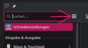
How come options keep getting nested/hidden away from? I am genuinely asking because I don’t get it. It started happening in Win8 and got out of control in Win11 and now I’m seeing it in KDE ![]()
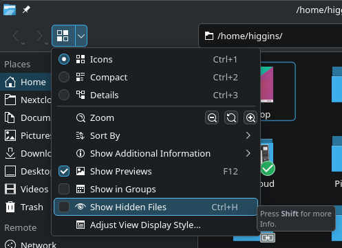
Look at the nesting just to show “hidden” files.
How come options keep getting nested/hidden away from? I am genuinely asking because I don’t get it. It started happening in Win8 and got out of control in Win11 and now I’m seeing it in KDE ![]()
Look at the nesting just to show “hidden” files.
I agree, but it seems people want everything hidden nowadays (they must love the extra clicking/tapping), anyway, when I re/install KDE or when things I use get hidden, the first thing I do is restore the menu bar, and edit the toolbar so Show Hidden Files is conveniently located (for me that’s the top right hand side).
no body is expecting that you would actually access Show Hidden Files by drilling down from the hamburger menu… at least i hope not.
if this is something you need to toggle, you will find it once and then either set up the toolbar to show the icon, or learn the shortcut Ctrl+H
I mean, in my defense I haven’t used KDE in nearly 20 years but I see a hamburger menu and I click it.. lol
You might think it a small thing, but this is but 1 of many “modern improvements” that drive me insane; this one in particular frustrated me enough to post about it.
Learning shortcuts is nuts. As you said, I’d probably only click that option 1 time.. Why would I memorize a shortcut? I’m too old to remember anything nevermind esoteric shortcuts lol.
I’m just curious why all of a sudden there is a push to strip options out of menus. I run a 1920x1080 monitor and I just don’t get it. What is the use-case for such limited menus? It’s like there is some sort of rule that a menu must not exceed 10 items (But a menu can link to other menus lol → no rule against 5 nested menus gg no re scrub!)
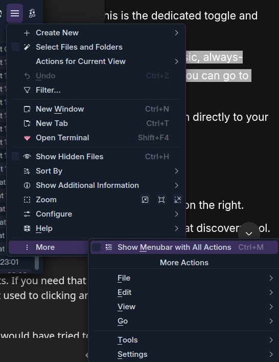
You can press Ctrl+M to turn the hamburger menu into a traditional menu.
Alternatively: open hamburger menu → More → Show Menubar with all Actions
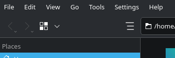
nested 3 menus deep ![]()
Would be cool to have a global setting for it, that apps use by default
Please bear with me here… I’m on your side.
There is a debate here, though I think the idea of ‘bringing back the long menus’ is misguided - and your point is that the menus can already get very long (the more compact ‘Hamburger’ starting point gets LONGER).
I do prefer the permanent menu bar; which is not permanent, it can be toggled (see later…).
Your concern is more about the broader ‘reduced discoverability’; endless frustration and pain about things that change; and leftover bile from the windows experience (I still have it many years later).
I also find the Hamburger to be a challenging addition - but I will keep poking at it from time to time.
F10 or Ctrl+M to toggle the classic, always-visible menu bar at the top (File, Edit, View, etc.). Once it’s visible, you can go to View > Show Hidden Files .I like hidden menus that toggle; I much prefer that to the ‘Global Menu’ option… but overall I mostly prefer the horizontal to the Hamburger which feels more like a McDonalds style solution to people using Mobile touchscreens ![]()
But generally, (prove me wrong) menus are always a bit of a nightmare when software gets more complicated. So your heading to this post ‘better the devil you know than a new solution that I’m not yet happy with’.
So again, after hitting F10, you can escape and press ^Ctrlh which is one of those keyboard shortcuts that everyone should learn - and today I was reminded of another one; I’ll get to that in a minute ↓
So Hamburger>More is legacy inclusion (which I think should never be removed).
It isn’t as bad as you think… try it again, press F10 then↑ because the UP arrow will take you to the bottom icon ![]()
Here again, the important detail; after pressing your → arrow, you see the shortcut CtrlM will show your beloved Menubar with All Actions We are also now in familiar territory, those underlined (accelerator) letters mean you can punch V for the View menu… sadly, from there, back to laborious navigation.
(right-clicking is a good way to edit the toolbar).
You can add a “Show Hidden Files” button directly to your toolbar for one-click access.
CtrlAlt, for shortcuts.
Try this (Dolphin can open with Meta_E, then Ctrl_Alt_,) and type ‘hid’.
There you can find two shortcuts (new one for me)
Alt. is another nice ‘default’ (Alternate ‘hidden’ dot files view) but the one I always remember is CtrlH (for hidden)
CtrlShift, is similar - brings up the settings panel.
So yes, I share your frustration. We must understand - ALL SOFTWARE SUCKS. Really, it does… but sometimes less than other software and often less than we think it does.
The BEAUTY in Plasma is that the more we use it, the more we learn, the more amazed we are.
Yes, I hope I covered all bases here. There are some new ones to learn with Plasma 6; but they lead to easier connections.
Especially the new Global ‘F10’ and ‘Ctrl_M’ along with ‘Ctrl_Shift’ or ‘Ctrl_Alt’ with comma to bring up the Settings and Shortcuts.
This is an interesting subject in itself; but please, don’t put it down to your age. That is not relevant!
I’m getting older now - even with glasses I can’t get a very sharp view of my screen.
I set up someone’s laptop three years ago with a Linux Mint install… they’re now almost 80 and happy with it and didn’t call me for help in over 8 months already… so you can’t say ‘I’m Too Old’.
Though sometimes we do feel tired that things change (when we think the old way was fine). I disagree in this instance; though if you brought up the subject of MOUSE GESTURES (you know, like they had in Opera, and still do in Vivaldi and Firefox with Gesturefly add-on)… that’s another story.
Think of it like buying a new car - go from a Camry to a Porsche - now you can adjust audio volume by speaking, or by waving a hand. Too hard to learn?
Ok, still in a car - don’t you just love well built knobs and switches? I hate poking displays. Many of these advances are simply about saving money (just one tablet does everything, but you need to go down three menus to turn off the damn fog lights).
So come on folks - let’s chill and try to be postive. It’s a well known fact that KDE Developers spend most of their time trying to make everything worse, more difficult, and less popular isn’t it?
But we can just pretend that sometimes, it’s just not that bad.
In general, Hamburger-menus are not just an issue in KDE. There is a general critic for usability. Allowing the switch back to classic menu bar does not remove the critics.
A good use of such menus is, if there are only up to 5 entries, maybe 6. The hamburger menu in System Settings is totally fine. It has 5 entries and no sub menu. But in Dolphin you see there are not just far more entries (12), but the last one also is just a menu bar less accessible. Searching for entries become a little nightmare.
I also do not understand the “space”- or “touchscreen” arguement. I’m using desktop Firefox on my phone and enabled the menu bar. Since this device has even more space vertically, the menu bar takes away less important space than the Hamburger-menu, which reduces the size of address-bar, which is already very small.
The only reason it is available: it looks more modern. Do I miss something?
As long as the menu bars on application as Dolphin with many entries are still fully supported, I do not complain too much about it. But looking on Firefox which also “keeps it supported” … yahh … but not fully. On touch screen devices I have to push these buttons 5 times and alike to open the menus, because nobody ever fixed them since I used them for the first time in FF ESR 102, now we have FF ESR 140/non-ESR 143 and it is still not fixed. And I’m still faster pushing that button 5 times than finding the entries of the Hamburger menu…
A question I really would like to get answered: what is the reason to use this Hamburger button to replace everything more complex than 5 entries? Is there at least one valid argument other than “more modern”? And no, touchscreen is no answer → the menu bar is also easily accessible if there is no such bug as in Firefox. Or better asked: what is the problem it wants to solve?
Bonus question: Why is the menu bar not the default and the Hamburger menu the alternative?
This is.. a big wholesale can of worms.
First off, the hamburger menu is a pretty old concept. It goes back to the 1980’s.
Strictly speaking, a hamburger menu is not necessary, and in many cases detrimental on a desktop with one or more screens.
It obviously gained a lot of traction on mobile devices with limited screen space where something like a hamburger menu helps make the design more clear and readable at a glance, which is important on a phone.
A lot of people have adopted the view that this is “modern” when in fact it’s just different UX for different devices (which is how you are supposed to approach design.) Combine this with laptops becoming the primary PC people buy and you’re in this weird space between desktop functionality and smaller screen real estate. While laptops do have higher pixel density, it’s usually scaled up so that the effective resolution is the same as a larger desktop monitor. Your laptop might have a 13” screen and your desktop a 27” screen, but they show roughly the same amount of information.
I hope you’re starting to understand why this is still a hotly debated topic even within design circles.
macOS sidesteps this problem by always having a menubar on top of the screen, so the information in the individual window has more space because it doesn’t require a menubar, just a toolbar if that. KDE allows for this but it’s not the default and not all apps support it, especially non-KDE apps.
There are other more ephemeral reasons people cite for liking hamburger menus, such as keeping the interface less cluttered, allowing them to focus on a single task at hand, etc. This differs from person to person, so can’t really be relied on as a quantitative measure.
The problem a hamburger menu is trying to solve is to keep the interface focused on the most common tasks and to leave the less necessary and less common tasks out of view. There’s another major DE that just removes these extra options and features since the idea is if they’re not being exposed, they’re not worth having. Again, back to the subjective “clean” look and single-purpose workflow.
But for certain apps, you need a menu bar. Imagine using something like Blender with a hamburger menu. The userbase would revolt because it’s a complex app with complex needs.
I’ll wrap this up talking about a common phrase in design, “Mobile first.” Because most people are on mobile now, they target mobile design. But what that leaves out is Desktop last or even not at all, because it’s cheaper just to throw the mobile interface onto the desktop and call it a day.
A company like Amazon, who I guarantee you has more research than either of us can comprehend, primarily uses a menu bar on their desktop site, with a hamburger as an option for site navigation, but what they want you to see is in the menu bar.
If that’s not an endorsement of having a menu bar on a desktop, I don’t know what is.
I don’t know this for KDE apps. But that’s not going to stop me from guessing!
For something like Dolphin, I think it could be because it’s primarily a file viewer, most common tasks are in the toolbar. Including showing hidden files:
But the reasoning probably is for 95% of users, this is going to be all they need to navigate files. The other 5% can hit Ctrl-M or use shortcuts.
And a lot of it can be done by right-clicking to get all the other options that reside in the menus.
All this can probably only really be decided after user testing, giving them tasks like “Show hidden files” and seeing how they accomplish it. Or testing to see if it’s even a thing people want to do. Hidden files are hidden for a reason, especially from the GUI.
Microsoft’s file viewer uses their patented (and I do mean that literally, it’s patented for several more years still) tabbed ribbon interface for primary usage, but it allows for easier discoverability of features. Menu bars tend not to be as good for that. (But way better than hamburger menus.)
I think it’s a balancing act between how much information can easily be shown up front and how much is in menus. If more features are in menus, then they should probably be shown by default. KDE, as a whole, is pretty good about this usually defaulting to menus with a handful of exceptions.
My personal feeling is if there’s a hamburger menu, it needs to be thought out and be simplified. Try to make it a single level. If it can’t be, then maybe a menu bar is the better option.
The was NOTHING wrong with this post and peeps know it.
And I was pulling out some of my remaining hair trying to figure out how I was 1000% positive that the ‘hidden’ toggle was easily accessible without drilling and side-stepping. I thought I was having memory issues, or maybe there was a bug from a recent update, things along those lines.
It never occurred to me to look at that ‘view’ icon, since that has historically been for …how you view the icons ![]() .
.
I will say I am one of those who much prefers NOT to have a menu bar, outside those things that have many tools that are used very often. So I like having a hamburger menu or some similar method, even though I have a multimonitor setup for some time now.
The problem in my view is that these hamburgers are simply places where the old school menu structures and formats dating back 25+ years have been shoved or crammed. In the beginning of the 3-bar era, this was quite literally what happened.
I am sure there is a better way to house, or present these menu items. Maybe less verticality, or something. I do not know.
Where did I say it is a new concept? “Modernity” has nothing to do with the real age. E-cars are also “modern”, but the first ones drove in the 18xx years.
Did you even read my post? I made an example about Firefox on mobile devices. And btw, to make Firefox UI working on mobile device, it has to be hacked via CSS code (and it is a lot of code). So their hamburger has even nothing to do with mobile at all. But this button steels space, because horizontal space is limited, not the vertical one. Another line does not remove much of the content. The additional button to address bar removes space for the URL itself.
Same with KDE, did you ever try Dolphin on a phone? I did 2 years ago and just deleted it one or two minutes later, because neither touch input nor layout matched the window size. It may is better these days, but still, when I look how much KDE software can be shrinked, the minimum size is often bigger than mobile devices have. But hamburger menus everywhere. Where is the mobile-argument matching this?
Btw I am using a 31,5" 4k monitor with native resolution. It’s like using 15,75" on FHD. Back in the 90s people even had just a resolution of 640x480px or similar and used all the menu bars. I cannot follow the space argument here.
enshittificates their platform. I guess such companies should not be allowed to talk about usability here. Try to read the second page of reviews below the articles without login. That was possible last year and isn’t anymore. They design the pages to keep you staying longer online, not to make you a better time using it.
That is a valid answer, but that does not answer why there is a Hamburger-menu as default or even required. Look, you want to find a very rare used item? Now you have to search through 3 levels of menus while before you just needed a single layer. Why not creating a button that is always present (without customization) and shows/hides the menu bar in similar manner Ctrl+M does? This way you combine a complex menu in a single button, without the flaws of the single button. (Made this part bolt that others will read it that would not want to read my whole post.)
No, definitely no. Ribbons made the whole experience finding stuff 5 times worse than it was previously. I was using MS Word before and after Ribbons got applied and had a much harder time to learn Ribbons (which I never really did) than using menus and toolbars. The main reason I switched to LibreOffice back this time. I knew nothing about free software and alike this time, so that all did not matter to me.
[Edit: Ribbons was the start point to me for the down path of Windows, which never ended.]
As I said, there are reasons to make Hamburger menus. But not for more than 5 or 6 entries.
Yes I did, but you are in a very, very small percentage of phone users. Effectively 0% use a browser on a phone hacked to make it function as the desktop version. Not saying it isn’t valid, but that you even know how puts you into a top-tier category.
No, I don’t really have much of a reason to manage files on my phone. (Unless you count syncing notes with nextcloud or something similar.) But nothing directly on the phone itself.
Just because you can’t follow it doesn’t mean that user testing wasn’t done on it. Both of us are in the top few percent of computer users. We don’t use computers (or mobile devices) like the vast majority of people. I use keyboard shortcuts. But I recognize 95% of people don’t. I’m not going to say that I don’t understand why people don’t use keyboard shortcuts, they’re well documented. Just do a search for academic papers on keyboard shortcuts in relation to UI.
To ignore what they do with UI in order to get people to buy things discounts a lot of research done into UI/UX. The patterns’ end results may suck, but they’re effective.
I was just pointing out one aspect. If the hamburger menu was more effective on the desktop site, they’d have made it a lot more prominent. They want people to discover specific things fast, even if those clicks take them to pages filled with annoying UX patterns. But that doesn’t make the whole site worth dismissing. For better or worse (likely worse), they’re one of the pioneers in web design.
For you. For the vast majority of people it helped them find features they didn’t know were present and made navigating easier. It’s been one of the most successful UI designs Microsoft has ever done. I know that’s not saying a lot, but it is a definitely a big W in their corner.
And just as a reference, I prefer LibreOffice’s dense icon interface and mostly use shortcuts. But I recognize the ribbon’s superior UI for average users. The number one complaint about LibreOffice is the lack of a good tabbed ribbon UI, which they can’t legally make. They can get close with their tabbed interface option, but they can’t mimic it with similar grouping and such.
Honestly this is a great idea! Perhaps even replace the hamburger icon with it. I feel that’s worth trying to some degree.
Even plays into KDE’s strengths allowing easy customization since the only other way to get the menu bar is through obscure shortcuts or right clicking multiple options in the (sometimes difficult to click) tab bar. Almost perfect progressive disclosure. And it’s a toggle so it’s easy to reverse.
Of all the ideas in this thread, I think this one of yours is the best.
I want to see this happen even if it’s just a test.
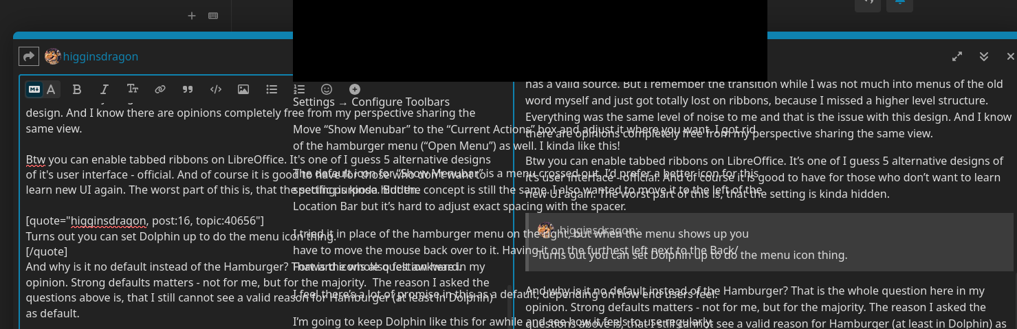
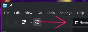
Turns out you can set Dolphin up to do the menu icon thing. Yay for KDE customization!
Settings → Configure Toolbars
Move “Show Menubar” to the “Current Actions” box and adjust it where you want. I got rid of the hamburger menu (“Open Menu”) as well. I kinda like this!
The default icon for “Show Menubar” is a menu crossed out. I’d prefer a better icon for this specific purpose. But the concept is still the same. I also wanted to move it to the left of the Location Bar but it’s hard to adjust exact spacing with the spacer.
I tried it in place of the hamburger menu on the right, but when the menu shows up you have to move the mouse back over to it. Having it on the furthest left next to the Back/Forward icons also felt awkward.
I feel there’s a lot of promise in this as a default, depending on how end users feel.
I’m going to keep Dolphin like this for awhile and see how it feels to use regularly.
Around 100% of the Linux phone users. That’s why it is such a huge issue.
What have shortcuts to do with our topic? There was no single line from me saying anything in this direction. There was even a line saying the opposite (creating a button as replacement for Ctrl+M). And I’m very very very careful directing to academic papers in this direction. I already read papers (more in context to gaming, but similar topics) that had very strange opinions … ahm I mean “knowledge”/“research” to share.
Don’t get me wrong, academic papers are still written in higher quality than something written by an average person, but that doesn’t mean they can be fully trusted. They even can spread misinformation and so they should be discussed as any other source.
And who said this (“most successful design”)? Most people using MS products these days are grown with this UI and now knowing alternatives or using it for nearly 20 years now and know every piece without searching.
I mean to be honest, at the end we’re speaking both about opinions and I guess neither of us has a valid source. But I remember the transition while I was not much into menus of the old word myself and just got totally lost on ribbons, because I missed a higher level structure. Everything was the same level of noise to me and that is the issue with this design. And I know there are opinions completely free from my perspective sharing the same view.
Btw you can enable tabbed ribbons on LibreOffice. It’s one of I guess 5 alternative designs of it’s user interface - official. And of course it is good to have for those who don’t want to learn new UI again. The worst part of this is, that the setting is kinda hidden.
And why is it no default instead of the Hamburger? That is the whole question here in my opinion. Strong defaults matters - not for me, but for the majority. The reason I asked the questions above is, that I still cannot see a valid reason for Hamburger (at least in Dolphin) as default.
I hate Discourse and the never fixed bug of embedded videos, that mess up the whole Discourse UI (have same issue on other forums and other browsers):
So I cannot quote anymore here.
About the button placement, I would place it there:
It would be the same place as Hamburger on other applications:
And I fact, I think it wouldn’t even be a bad thing to change the icon of “showing menu bar” to Hamburger icon. It also could have such an arrow to bottom (as the view switch button) where the “real” hamburger menu becomes bigger. It takes a little bit more space, but it could be a compromise.
I agree 100%
Yeah, I agree. I was unable to get it there because of how the toolbar separators work. I think that would require adjustments in the code itself.
You can also change the icon of the “Show Menubar” to the hamburger menu. I tried it, and thought it was slightly awkward and it might cause confusion because of how people expect them to function. Or maybe not! Worth trying.
I did a quick mockup of a similar icon, but with the bottom two bars shortened to give a better idea of a menu, but still look like a hamburger. Just to make the differences clear.
I feel this would be worth some feedback and testing, with the actual hamburger icon or something different.
Reminds me something in this direction (ignore the border):
![]()
Could be better to make a difference to Hamburger (if it is also present). But I’m not the best icon designer.
It’s a super simple icon to start with. But I like the one you pointed out, so I adjusted it:
Here’s the SVG in case anyone wants to try the icon to their toolbar action:
Oh geez, I had no idea! ![]()
Thank you for this tip! I figured it was an ignorance on my part. Cheers ![]()