Apart from the current Memory issues, Spectacle would be a great Wayland Screen recorder. But I find the UI completely confusing and dont understand why it is like that.
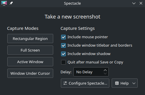
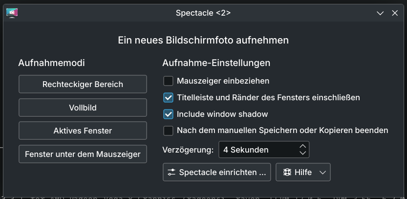
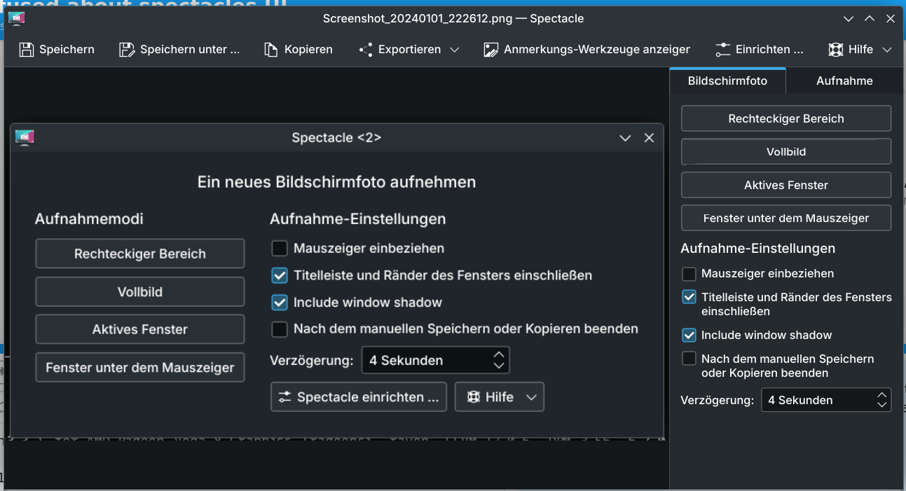
When launching spectacle via searching it, it shows the small screen that only allows to take screenshots. But when launching via Meta+Print it takes a screenshot (can be disabled afaik) and has all the options for editing, as well as the Screen recording feature.
This doesnt make sense? Why can you only record on the edit screen?
I am pretty confused, because afaik the interface switched 3 times in the last months, first the good old reliable one, then this “edit features dynamically below/above the selection” and now this?
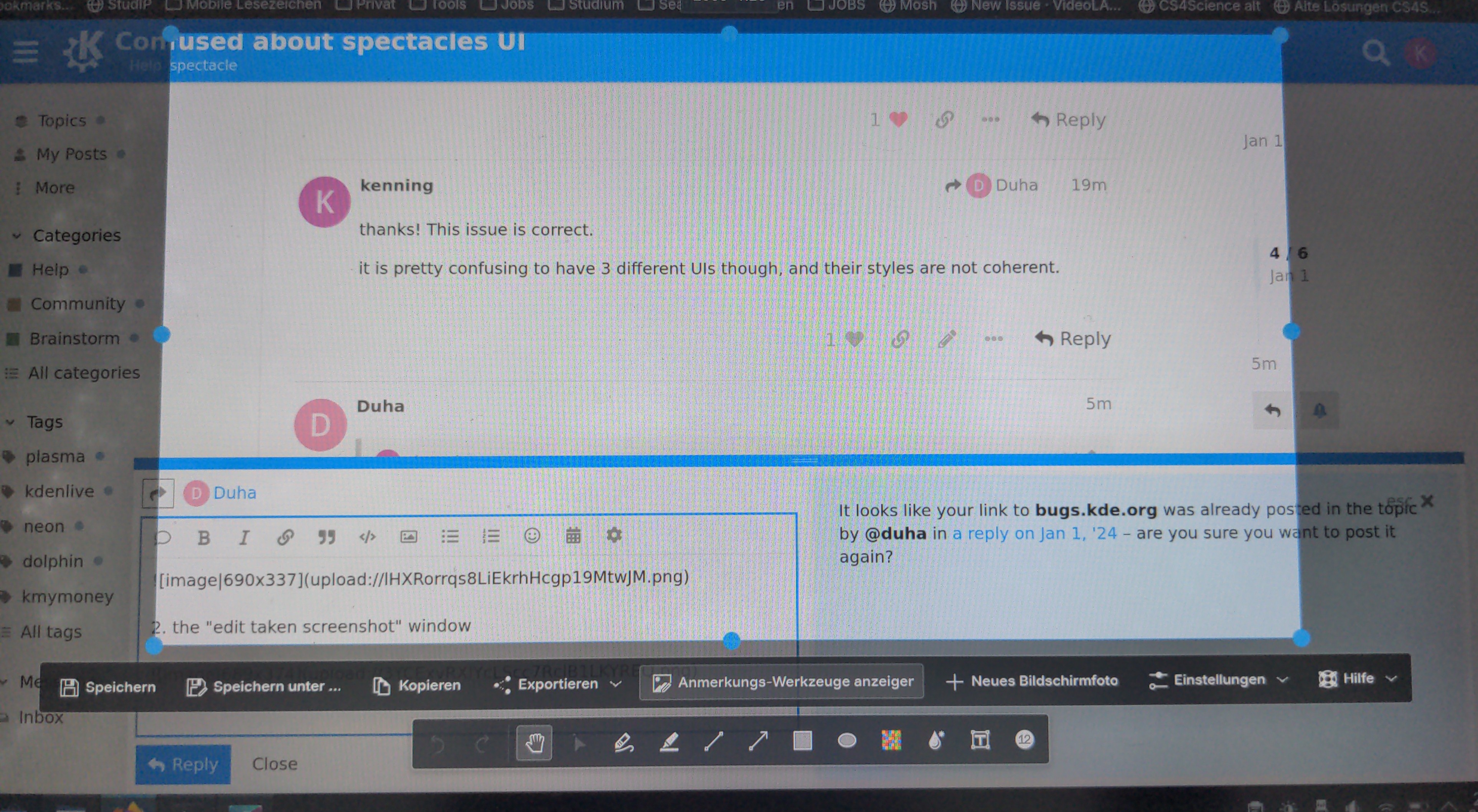
btw taking screenshots of spectacle is not really possible, because its the only screenshot tool for Wayland on Flathub?
You can launch a second instance of spectacle from the terminal spectacle --new-instance to screenshot the first.
You can change it in the options so that when you open spectacle it automatically takes a screenshot (default for me). Then you see the full interface.
I think this is total overkill. I dont know what should go, but there are
3 buttons to take a screenshot
2 ways to have annotations (there is an annotation button in screenshot 2 also, which then is like it was some time ago, but with an extra click)
3 ways to show help
etc. It reminds be a bit of how bloated Firefox is, where there are often 3 ways to make a bookmark etc. (Example: toolbar, right-click-menu, right click on tab) The menus are bloated just to please everyones workflow.
Not to say having an extensible Browser is bad. But compare that with Safari (which I totally hate for its lack of anything) but it has one way, and it works.
there is simply visual design lacking, would you agree?
I think my preferred solution would be improving the minimal first window to include all “create” options.
Not sure if the second one is needed really, seems like missing or duplicated features? But then the rectangle-selection features, which are very nice UX-wise, do they also work for app screenshots and fullscreen? I will test and maybe come with a mockup!