For the past few weeks, we have been working on a few areas around the design system for Plasma. Keep in mind that I am only speaking of the graphic side, not code. Work is ongoing with the Union engine and the team is focused on replicating our current Breeze style using Union.
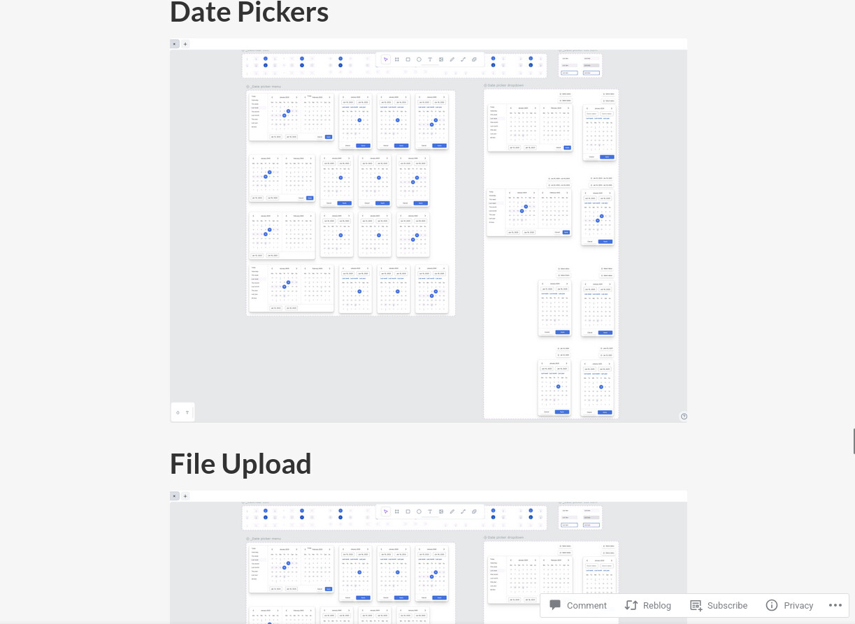
@Anditosan, all of these appear very promising. However, the screenshots are of sufficiently low resolution that I can’t discern anything of note in some:
I believe that this was problematic in a previous post. It’s a slight shame.
I’ll preface this by saying I’m anything but the type of user who refuses any sort of design changes (e.g. the dolphin changes that have been happening for a while) or has a vendetta against padding and big components.
But I feel like the direction the design is taking is completely throwing away KDE’s HIG and distinctive design that we’ve come to associate KDE with.
Had someone blindly showed me the components I’d instantly assume they are Google’s HIG, material design. Though not even their final versions, but an in-between version 2 and 3.
Buttons, dropdowns, avatars are SCREAMING material 2. Then the badge groups look like something that has been on the chrome browser landing. And completely out of place than the rest.
Biggest issue however in my opinion, are the modals. They look like they are from a different HIG. The layout of the first few on the 5th column (right aligned buttons) looks exactly like Elementary’s HIG. The other layouts would benefit from a separator or two, they look like those cookie banners that you have to deny all to continue. Additionally, the Cancel action is no longer on the right side, this is a big muscle memory killer.
In my humble opinion, it would be a lot more beneficial if the new HIG improved upon breeze and highlighted KDE’s unique looks. I see Maui for example, even at its state, as a different take on breeze, that gives it its own identity while also associating with KDE.
For me, the borders, the separators, the subtly rounded elements, the iconic accent colored border with semi-transparent accent colored background elements, the clear sections between views, the grays.
Though to be fair, as mentioned at the start, I am not against a new direction, as long as it’s a unique one and not just a mix of other HIGs that end up looking like a user-made theme trying to replicate them.
Klassy is another popular take on breeze that gets mentioned quite often and I see some of its decisions as doubling down on breeze, like on the window buttons:
I want to strongly emphasize my previous statement that if someone showed me the elements from the new design system, I would instantly think it’s Material Design.
Maybe a wider community request for feedback is needed. Implementing it as a theme quickly in its current state for showcase purposes could help more than just a bunch of floating elements not in context. But it’s better if this happens sooner than later as the closer the new design gets to completion the less radical changes will be doable.
I don’t care how unique and distinctive Breeze is. Since any decent team of UX and UI researchers shall undoubtedly converge on some elements, UIs becoming more similar to each other, when designed well, is expected.
I agree, @Mealynn: all that I care about is that separators always remain between elements. I’ve some devices that cannot render shadows without becoming unusably slow, and I struggle to discern between shapes, when colour is the sole differentiator, just as much as looking at a high contrast theme for hours hurts my eyes.
I don’t know how much of this is relevant, because of the images’ resolutions…
Tangentially, I despise no design system more than Maui, for those reasons.

