If this open for feedback, I have some.
I’ll preface this by saying I’m anything but the type of user who refuses any sort of design changes (e.g. the dolphin changes that have been happening for a while) or has a vendetta against padding and big components.
But I feel like the direction the design is taking is completely throwing away KDE’s HIG and distinctive design that we’ve come to associate KDE with.
Had someone blindly showed me the components I’d instantly assume they are Google’s HIG, material design. Though not even their final versions, but an in-between version 2 and 3.
Buttons, dropdowns, avatars are SCREAMING material 2. Then the badge groups look like something that has been on the chrome browser landing. And completely out of place than the rest.
Biggest issue however in my opinion, are the modals. They look like they are from a different HIG. The layout of the first few on the 5th column (right aligned buttons) looks exactly like Elementary’s HIG. The other layouts would benefit from a separator or two, they look like those cookie banners that you have to deny all to continue. Additionally, the Cancel action is no longer on the right side, this is a big muscle memory killer.
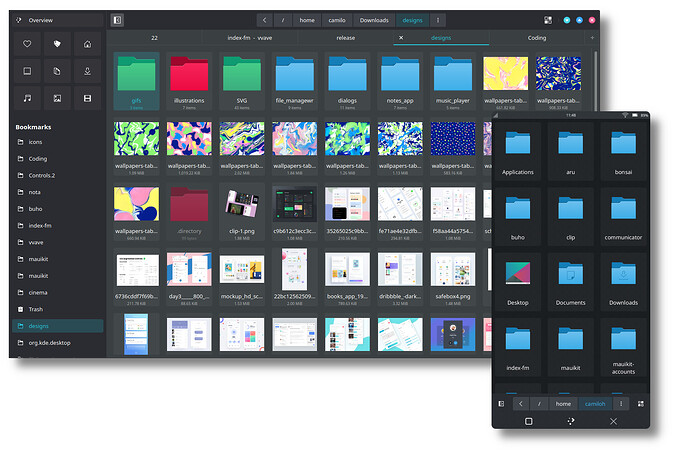
In my humble opinion, it would be a lot more beneficial if the new HIG improved upon breeze and highlighted KDE’s unique looks. I see Maui for example, even at its state, as a different take on breeze, that gives it its own identity while also associating with KDE.
