i tried opensuse tumbleweed but cannot disable this boarder around the folder. i did try some things online but it did not work
1 Like
You can’t remove the selection border because it’s a critical piece of visual feedback that ensures usability and accessibility for all users, especially when a window is inactive or when colour contrast is poor.
It’s a core design requirement, not an optional decoration, and it is also a big improvement following many complaints about the previous iterations.
The best you can do is find or create a theme or colour scheme that makes it as subtle as possible while still being visible enough to serve its purpose.
ok thanks I noticed debian had certian settings the same draw focus indicator in lists or something
No, focus is not selection. A focused item is one you can navigate to with tab or arrow keys.
Try this, open Dolphin at home… Use your mouse to single click ‘Desktop’.
Notice the subtle highlight as the mouse approaches, then the selection and focus when you click once.
Click twice and you’re in a new folder… you’ll see an OUTLINE, but no highlight on one of those files (only when the window is active) to show you ‘here you are’, the focus.
Now click the back (or do Alt↑) and you’ll see ‘Desktop’ is the focus (outline) but not selected.
But this isn’t in ‘lists’ as you just stated.
it looks like i can download a different file manager in discover app in opensuse tumbleweed.
I’m afraid any other file manager you could install as an alternative would be a loss. Just to get rid of this one thing?
1 Like
yes I guess so i just tried it to see
One question: what’s the purpose of this lined border?
Here, it looks like an item is still selected, but it’s not, so it just seems like a visual bug.
And it disappears if Dolphin isn’t in the foreground.
I still don’t understand what its actual purpose is.
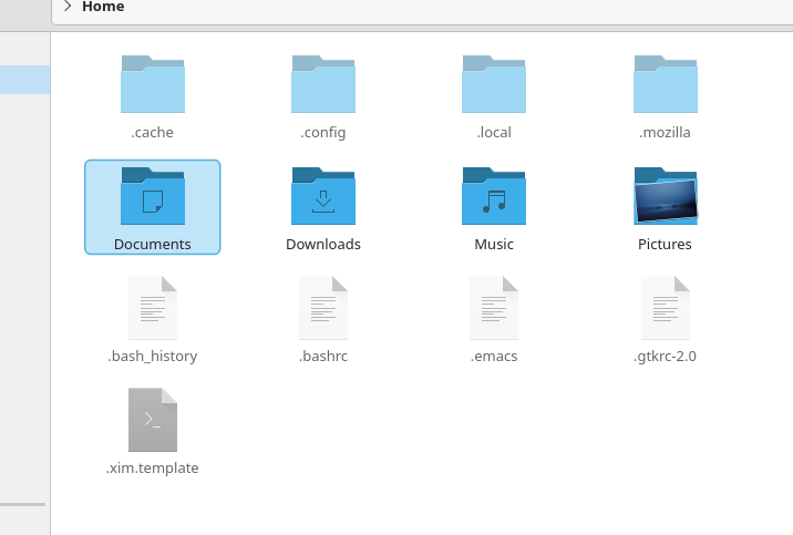
I noticed that when opening folders, the first folder has this line around it, even though it’s not selected.
I’m even more confused about what this is supposed to mean.
@akselmo explains it in the previous thread we had about it. Originally I complained about it being annoying because I just didn’t like it suddenly being there without the option to remove it. I still find it annoying, but not because it’s simply there. Now I’m used to it being there, it’s because of how tightly it’s wrapped around the icon it’s highlighting. Especially the lower padding. Any text with a tail ends up so close to the border it blends together on my screen. So lower case q, y, p, g, j.
It’s an accessibility feature for keyboard users that basically says to the user “you are here”, because it is effectively selected for keyboard use.
1 Like
As mentioned so many times - it’s a focus indicator to say ‘You Are Here’.
It was necessary to specifically explain that this is about using Dolphin with the keyboard instead of the mouse.
I don’t recall seeing this in other file managers, and it’s not usually something that’s considered, since the mouse is the primary tool for selecting things.
So we come to a point of disagreement which gave rise to this thread, mirroring an argument I had earlier with someone who says they ONLY use their mouse to operate their computer and feel very annoyed when they have to ‘raise their hands to the keyboard’.
The keyboard isn’t just an alternative to the mouse, it is the vastly superior tool in most cases - which is why a clear focus indicator makes this file manager more powerful and accessible for everyone.
Mouse-only navigation is intuitive for beginners. Both need support.
Regarding the focus indicator, it’s a “big improvement” only for keyboard navigation. Both need support, so having the option to disable it would make everyone happy and be in line with KDE’s philosophy.