Since the recent Plasma 6 update, when we create a new folder, we get a menu where we can choose its color. I want to thank whoever came up with this feature, I’m finding it very useful.
It would be even more useful if we could right click existing folders, hover over or click “Choose custom color” and get that same submenu. A couple of clicks and we’d get the folder marked or customized. Much more convenient than having to enter Properties and look for colored folders.
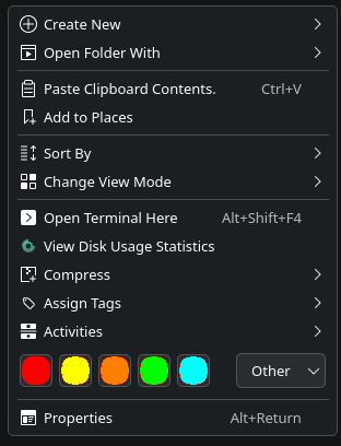
I just update my test machine to gear 25.08 beta and i noticed this feature that i find very useful but it feels like it takes to much place in the menu.
I suggest to replace the folder icon by the color or a least use a square box to make the menu less wide.
It is too wide for your taste, I understand that’s fair, we can show one less icon and that would improve things already.
Showing colors is a new can of worms and currently we allow to select a bunch of icons that aren’t just colors.
And we might want to change the displayed icons down the line depending on the user frequency of use.
No disrespect to @the-entropyst idea, I get it and it would be great if we didn’t have the original one. I just think that, in my opinion, previewing the whole non colored folders will be very useful too.
And even for colored ones, seeing the whole folder feels better than guessing its looks by looking at a swatch. Not that the guess takes a huge mental toll, but small details like that make the user experience nicer. Of course other users might feel otherwise, I just wanted to add my subjective feedback.
So, my vote for leaving it as it is now. This is one of the rare cases when a new feature is perfect for me on the first try, I wouldn’t modify a thing.