Dolphin icons outline update

// Rant:

I used this new style for two or so months, since it appeared on fedora, and I tried to get used to it, I tried to like it, telling myself things like “well now image icons are easier to see when selected“ but ultimately that was the only good thing I could come up with and it’s not even important since when you do select an image icon, it’s because you already saw the image icon before selecting it.

// End of rant

Anyway, this is what I am refering to

You can see the new outline compared to the old highlight.

The things I don’t like:

  • There is too much happening on screen when I move the cursor and interract with icons, it’s distracting and annoying
  • There is very little space between icons to drag and drop, since now there is a big balloon hitbox around the icons that you have to avoid. It feels like aim training, it’s not a good user experience, I don’t want aim train when managing a load of files, it’s tiering

The things I do like:

So anyway, oppinions and all that, but it is objective fact that there is a lot more flashy, distracting, eye tiering things on screen, and that it’s harder to use the ui.

I love KDE and KDE stuff, and I usually always like the improvements KDE does, but this isn’t it.

And worst of all, this wasn’t optional.

Maybe some people like this more, so I say to have an option to use either highlights like before, or outlines like it is now.

So what do you guys think?

1 Like

In the initial image, I think the new highlights are better than the old, there are a few layers of information to unpack, and it’s much clearer overall.

It also looks nicer.

The space between icons in MY Dolphin is perfectly adequate, but I’m not a huge fan of drag 'n drop anyway, with two panes you can simply Shift< F5/F6 to copy/move them to the other pane.

Space between icons does seem to get a bit tighter when previews are enabled and icons are made really big, but I can’t imagine needing them that big anyway.

I hadn’t noticed that it was harder to use, I’m not sure whether anyone can argue that it’s an objective fact… I’m 63 with bad eyesight, but I’ve had no issues with it, sorry to disappoint you.

I do believe that you cannot make a complete rehaul of the Plasma desktop an optional extra.

I doubt it needs a complete rehaul, it was a small update afterall.

There very different ways in which people use these tools, I could just cp /filepath/etc /new/filepath/etc all the time after all, but it’s quicker to open a buch of folder windows, and drag files from wherever to wherever. I use images a lot, so I have the icons very big.

I’m not the only one doing what I do, and you not the only one doing what you do, you have to understand that there’s plenty of people in the world who use certain tools in certain ways, and then suddenly when one tool is updated and becomes annoying to use - but also no other tools can do things like the one in question - you can see why one would complain.

Like I said, the update didn’t seem to be big, so I assume it’s only a minor pain to put back the old code and make a toggle, but I’m not a dolphin developer dealing with ui, so I can’t be certain. In this case someone who knows about this would need to clarify that

1 Like

Oh, if you set ALL folders to have the same default view at the same size, then I can’t agree that your issues are Plasma based.

Without very careful crafting, I fail to see how dragging either way could possibly be an issue - and there’s a ton of space between icons.

Well I’m glad it works for you and many people, but it doesn’t work for me, and many other people.

But you can’t convince me, and said many other people, that the workflow I refined over years of use that became inconvenient because of a big change in ui, actually didn’t become inconvenient.

Differing use cases and workflows is why there are different tools, and it is why I use KDE and dolphin and not something unusable for me like gnome’s nautilus.

I asked what other people think, not for other people to say my way of doing things is bad.

Also, I do think it looks ugly too, you think it looks good, again, I can’t convice you it looks bad and vice versa (althoug I admit it looks pretty good with your theme)

Time for bed now, but that’s likely a side effect of me using Klassy theming.

G’night

:last_quarter_moon_face:

I prefer the old design.

As you mention, at higher zoom levels, and dependent on your screen resolution and the size of Dolphins window, the size of the “hit boxes” can increase such that there is no room to work.

Perhaps these are things that can be tweaked out and refined with time.

I like the way Cosmic Files handles icon view.

I see two issues on that picture. First one is the highlight color, which has no contrast to folders at that “clicked” part (I even dislike “Selected and hovered” for low contrast). Next there is indeed not much space in between. The highlight-area should just ignore the mouse completely in my opinion. If it would be a visual effect only, I think the “aiming issues” are fixed. I fully understand that issue, but haven’t used this version of Dolphin myself yet.

I am willing to improve them (though I am rather swamped at the moment).

I wanted to make the selection more square and not grow much in size. However this caused some oddities with the text sizing, so the filename now affects the size of the box, causing uneven boxes. (This was already happening with old style, but less visible.)

Maybe the spacing between items could be larger now, since the hitbox is the whole icon-grid, instead of the icon+text. But that will take some time to figure out which values I can modify and how much changes to code it will add.

Anyway, the feedback is appreciated, users helping us devs to iterate on things is how we get this better over time. We cant please everyone though..

3 Likes

your openness and honesty pleases me.

thank you.

1 Like

Glad to hear. I want to just temper any expectations and keep things realistic. :slight_smile: But also let you know that yes we do read these hehe

2 Likes

But it’s good also to remember that most criticism comes from a vocal minority (happy people just carry on regardless) and you seem to please most of the people most of the time :vulcan_salute:

2 Likes

Does it care at all if there is a (potential) regression? Just an example from somewhere else: On a multiplayer game there was a new feature implemented, which caused issues for many people. The issue itself was fixed in once week (no bug, just not as easy to handle as it should be). That fix introduced an actual bug where most people are not (much) affected, except me, because my player character relies very heavily on a feature and setup which triggers the bug very often. I didn’t play that game for over a month now, because it is unplayable for me, but it seems I’m a minority here, so no fix is incoming, so I’m unable to use it.

It feels super awful to know that a loved feature is changed and the whole experience is gone while nobody cares about, because only a minority has this issue. While I am on Plasma 6.3 and not affected yet, I am already affected by GNOMEs file manager regression and it seems KDE is following this direction (but also willing to look for a solution).

You’re not even affected since you usually do not use drag & drop functionalities and since you’re more a keyboard user. It is fine to tell that there are people who like the change, but you probably shouldn’t tell to ignore the critics, just because you’re not affected.

I’m also not affected, yet (Debian user), but I want to help to find a good solution for everyone, especially on a such central desktop element as file managers where nearly everyone relies on (except some terminal only users). It is something different if people have similar issues on system settings or Discovery which people only use a few times and usually in a not productive way compared to central elements as Dolphin where people work with.

@akselmo: Did you think about what happen if people using small symbols? The space even short names are using become larger and so the boxes in general become larger, too. This critics is not about me, but about design logic. While it is for sure an improvement with dynamical sized boxes, it heavily relies on the name-to-icon-size-ratio. Also folders where all names are long does not improve anything here. In addition it also looks not so nice to have different sized boxes (something I don’t care much about, but still..).

If there is not “one solution fits all”, isn’t it possible to make at least an option to ignore/pass through mouse input on the boxes with pass-through disabled by default? It is not just to drop files at the right spot, it is also to select multiple files. On GNOME I had/have the issue to drag files and folders around instead of marking them, because of the little space available. Especially on a touch screen device (where I use Phosh/GNOME). A later “improvement” was to make boxes bigger, so that 20-25% less folders can be displayed on the little device, which decreases quick navigation (they want support phones, so that is important).

I think there should be a way to please both groups of people in this specific case. I agree that not in every case it is required to please everyone, but some desktop elements should just work for everyone and file managers are a critical part of it. By the way, Dolphin was one of the strongest arguments to switch to Linux, even 10 years ago and that not because Windows has a bad one (in fact, their file manager is also good), but Dolphin just allows better productivity.

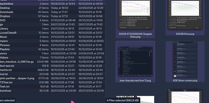
Yes, I tested this while developing, and other people reviewed it. It went through a lot of feedback and work, and was not just quickly added.

There are bugs, I am not denying that. And they will get fixed, in a way or another. The current logic underneath for small icons is odd and I do not like it, but it requires much more rewrites to get things actually work correctly here.

As it works currently, behavior wise, it is rather identical to the old style. Only the visuals + hitbox changed. Otherwise, the grid is the same grids it has always been using. It’s just much more visible now.

it heavily relies on the name-to-icon-size-ratio

Yes, it does, and always have done so and it needs fixing for this new styling, but fixing it will be difficult due to how this has been made in the first place. The issue is known, and anyone who has more time than me to work on it is free to help us fix it. You’ll have to be familiar with QGraphicsScene and related things and figure out where the calculation logic is done, and tweak it in such way that it’ll not break everything.

I spend a lot of time across KDE applications and plasma, so I can’t jump in to fix everything in timely manner.. I wish I could, but that’s just how it is.

2 Likes

Obviously; I do care quite a lot. But at the same time, I guess having started using computers with a 16 bit PET, I always had the feeling that all operating systems, all software, kinda sucks.

Quite often, things can be changed in Plasma - only to realise later there are hidden or unexpected consequences to be ironed out later… Overall, the effect is mostly positive; nobody truly thinks Plasma gradually gets worse.

So whilst (in many ways) it sucks big time, and I can complain that it’s not working the way I want it to work (and there are developers keen to bring back mouse gestures or ‘mouse actions’) if it’s possible - but in the meantime; I can make it work by learning adjacent skills.

I can also make it work by making choices in my workflow that make it easier for me, and not being too stuck in my ways to be so bothered by it.

WTF I’m only 63, maybe in another ten years I’ll just sit back and complain I’m too old to change - who knows?

I know and I never expected anything like this.

I joined Linux entirely few weeks ago. In the meantime I had to change half of my workflow and it begins with turning on PC and enter LUKS or typing passwords when installing stuff or how to make backups, how to organize the desktop and much more. It is not about the willingness to change things. It is about efficiency (at least about this topic). Even the first post never said “it is impossible to use Dolphin” or “I will switch to something else if it is not fixed”. But I’m sure you also wouldn’t like to get Ctrl+C changed into Ctrl+Shift+Alt+C. That is the kind of thing that is discussed here.

Anyway, that is just an explanation why I do not totally agree with you (it is also not totally wrong), but akselmo “solved” the topic for me, for now. So for now I will just follow further changes that come with time and hope everything goes in the direction all are happy with.

2 Likes

It mostly does - though the main benefit of using Plasma, for me, isn’t so much that everything is perfect - but that most things can easily be found to have alternatives (unlike many other desktops).

So as I try to mould it to my hands, my hands can also adapt to fit new moulds.

1 Like

I had a feeling you didn’t, I just like to mention it in general for anyone reading this :slight_smile:

2 Likes