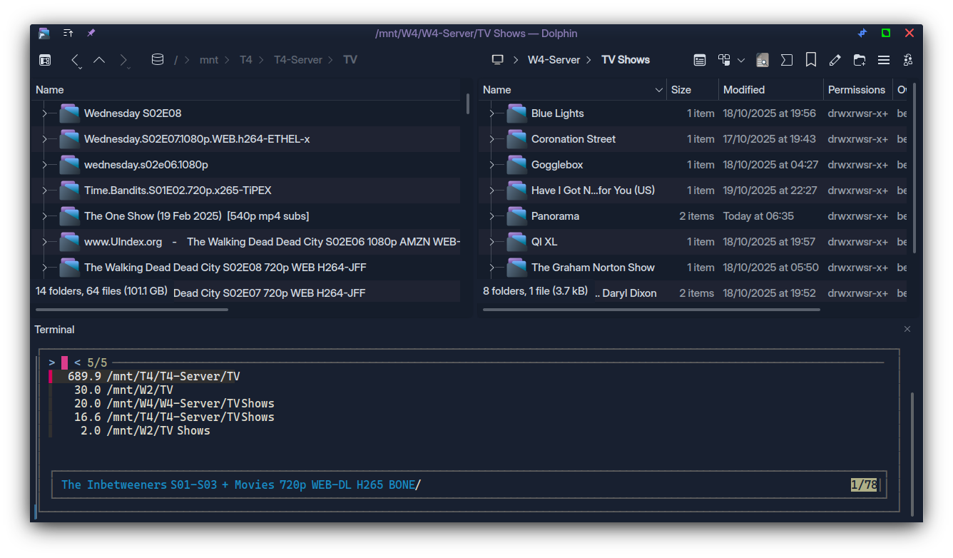
Ok, but I think the LOGICAL answer would be to restore both the panes and the focus as they were previously.
This can be mitigated with a more obvious indicator - something I like with the Kvantum theme ‘KvCurves3d’ which you can see here has a very nice orange outline to the ACTIVE pane.
With people more challenged by aesthetics, the desire for a flatter scheme maybe causing some issues here; not the case with this Kvantum theme which has a nice outline for Active:
However, I’m not a big fan of Kvantum, though I am seriously a huge fan of the 3D look of that theme; I should learn to use inkscape to make it work better for me.
Going back to Windows… I remember a very nice ‘Office’ theme, which has been imported as ‘Marble’ colour scheme. Here’s my version:
Marble- 1.colors
[ColorEffects:Disabled]
ChangeSelectionColor=
Color=255,0,0
ColorAmount=
ColorEffect=0
ContrastAmount=0
ContrastEffect=
Enable=
IntensityAmount=
IntensityEffect=

[ColorEffects:Inactive]
ChangeSelectionColor=false
Color=112,111,110
ColorAmount=0.025
ColorEffect=2
ContrastAmount=0.1
ContrastEffect=2
Enable=false
IntensityAmount=0
IntensityEffect=0

[Colors:Button]
BackgroundAlternate=224,223,222
BackgroundNormal=232,231,230
DecorationFocus=43,116,199
DecorationHover=119,183,255
ForegroundActive=255,128,224
ForegroundInactive=136,135,134
ForegroundLink=0,87,174
ForegroundNegative=191,3,3
ForegroundNeutral=176,128,0
ForegroundNormal=20,19,18
ForegroundPositive=0,110,40
ForegroundVisited=69,40,134

[Colors:Selection]
BackgroundAlternate=62,138,204
BackgroundNormal=130,157,190
DecorationFocus=43,116,199
DecorationHover=119,183,255
ForegroundActive=255,128,224
ForegroundInactive=165,193,228
ForegroundLink=0,49,110
ForegroundNegative=156,14,14
ForegroundNeutral=255,221,0
ForegroundNormal=255,255,255
ForegroundPositive=128,255,128
ForegroundVisited=69,40,134

[Colors:Tooltip]
BackgroundAlternate=196,224,255
BackgroundNormal=192,218,255
DecorationFocus=43,116,199
DecorationHover=115,159,255
ForegroundActive=255,128,224
ForegroundInactive=96,112,128
ForegroundLink=0,87,174
ForegroundNegative=191,3,3
ForegroundNeutral=176,128,0
ForegroundNormal=20,19,18
ForegroundPositive=0,110,40
ForegroundVisited=69,40,134

[Colors:View]
BackgroundAlternate=248,247,246
BackgroundNormal=255,255,255
DecorationFocus=43,116,199
DecorationHover=119,183,255
ForegroundActive=255,128,224
ForegroundInactive=136,135,134
ForegroundLink=0,87,174
ForegroundNegative=191,3,3
ForegroundNeutral=176,128,0
ForegroundNormal=20,19,18
ForegroundPositive=0,110,40
ForegroundVisited=69,40,134

[Colors:Window]
BackgroundAlternate=174,194,218
BackgroundNormal=177,196,220
DecorationFocus=43,116,199
DecorationHover=119,183,255
ForegroundActive=255,128,224
ForegroundInactive=136,135,134
ForegroundLink=0,87,174
ForegroundNegative=191,3,3
ForegroundNeutral=176,128,0
ForegroundNormal=20,19,18
ForegroundPositive=0,110,40
ForegroundVisited=69,40,134

[General]
ColorScheme=Marble
Name=01 MarbleS
TitlebarIsAccentColored=false
shadeSortColumn=true

[KDE]
contrast=4

[WM]
activeForeground=100,92,71
inactiveForeground=87,87,83
Many other themes do this well, Nordic-darker is one (subtle but clear) and another theme which I tweaked to take off the brightness, but the vastly under-rated Windows XP theme is a very good starter for tweaking your own:
XP-Dimmed
[ColorEffects:Disabled]
Color=56,56,56
ColorAmount=0
ColorEffect=0
ContrastAmount=0.65
ContrastEffect=1
IntensityAmount=0.1
IntensityEffect=2

[ColorEffects:Inactive]
ChangeSelectionColor=true
Color=112,111,110
ColorAmount=0.025
ColorEffect=2
ContrastAmount=0.1
ContrastEffect=2
Enable=false
IntensityAmount=0
IntensityEffect=0

[Colors:Button]
BackgroundAlternate=189,195,199
BackgroundNormal=212,209,197
DecorationFocus=61,174,233
DecorationHover=142,200,225
ForegroundActive=61,174,233
ForegroundInactive=127,140,141
ForegroundLink=41,128,185
ForegroundNegative=218,68,83
ForegroundNeutral=198,92,0
ForegroundNormal=35,38,39
ForegroundPositive=39,174,96
ForegroundVisited=127,140,141

[Colors:Complementary]
BackgroundAlternate=59,64,69
BackgroundNormal=49,54,59
DecorationFocus=30,146,255
DecorationHover=61,174,230
ForegroundActive=147,206,233
ForegroundInactive=175,176,179
ForegroundLink=61,174,230
ForegroundNegative=231,76,60
ForegroundNeutral=253,188,75
ForegroundNormal=239,240,241
ForegroundPositive=46,204,113
ForegroundVisited=61,174,230

[Colors:Selection]
BackgroundAlternate=29,153,243
BackgroundNormal=131,153,177
DecorationFocus=61,174,233
DecorationHover=142,200,225
ForegroundActive=252,252,252
ForegroundInactive=239,240,241
ForegroundLink=253,188,75
ForegroundNegative=176,55,69
ForegroundNeutral=246,116,0
ForegroundNormal=252,252,252
ForegroundPositive=23,104,57
ForegroundVisited=189,195,199

[Colors:Tooltip]
BackgroundAlternate=77,77,77
BackgroundNormal=35,38,39
DecorationFocus=61,174,233
DecorationHover=142,200,225
ForegroundActive=61,174,233
ForegroundInactive=189,195,199
ForegroundLink=41,128,185
ForegroundNegative=218,68,83
ForegroundNeutral=246,116,0
ForegroundNormal=252,252,252
ForegroundPositive=39,174,96
ForegroundVisited=127,140,141

[Colors:View]
BackgroundAlternate=239,240,241
BackgroundNormal=230,230,230
DecorationFocus=61,174,233
DecorationHover=142,200,225
ForegroundActive=61,174,233
ForegroundInactive=127,140,141
ForegroundLink=41,128,185
ForegroundNegative=218,68,83
ForegroundNeutral=246,116,0
ForegroundNormal=63,68,70
ForegroundPositive=39,174,96
ForegroundVisited=127,140,141

[Colors:Window]
BackgroundAlternate=189,195,199
BackgroundNormal=200,196,180
DecorationFocus=61,174,233
DecorationHover=142,200,225
ForegroundActive=61,174,233
ForegroundInactive=127,140,141
ForegroundLink=41,128,185
ForegroundNegative=218,68,83
ForegroundNeutral=246,116,0
ForegroundNormal=35,38,39
ForegroundPositive=39,174,96
ForegroundVisited=127,140,141

[General]
ColorScheme=BreezeClassic
Name=01 XP-Dimmed
shadeSortColumn=true

[KDE]
contrast=4

[WM]
activeBackground=200,196,180
activeBlend=252,252,252
activeForeground=90,118,85
inactiveBackground=200,196,180
inactiveBlend=75,71,67
inactiveForeground=95,98,100
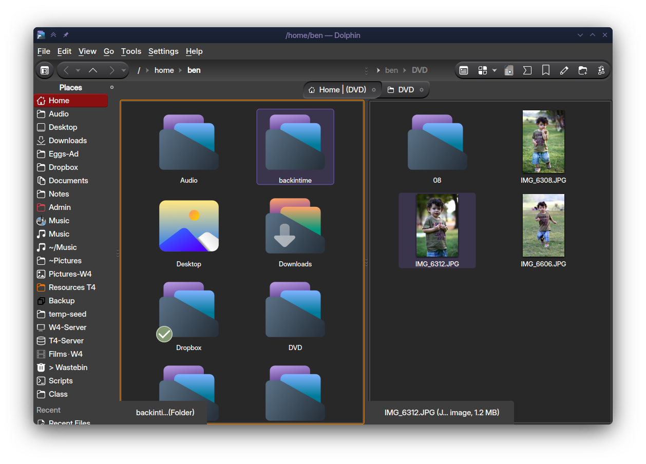
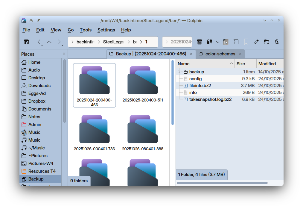
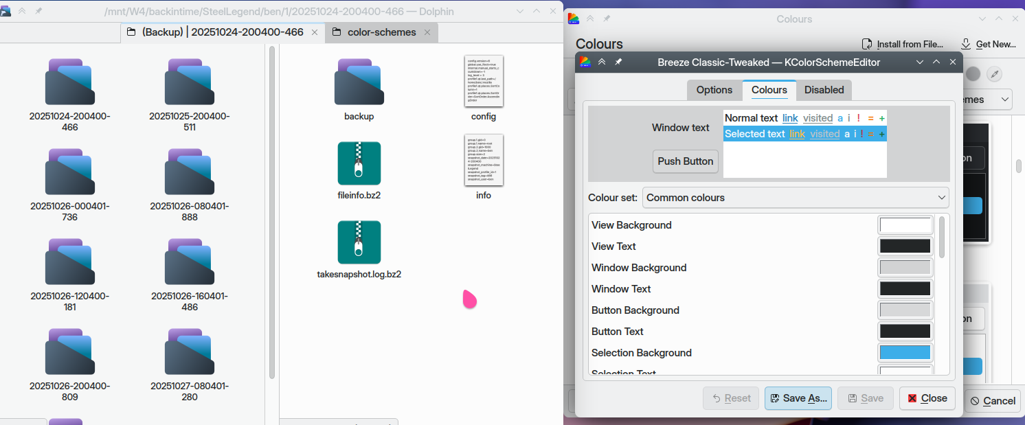
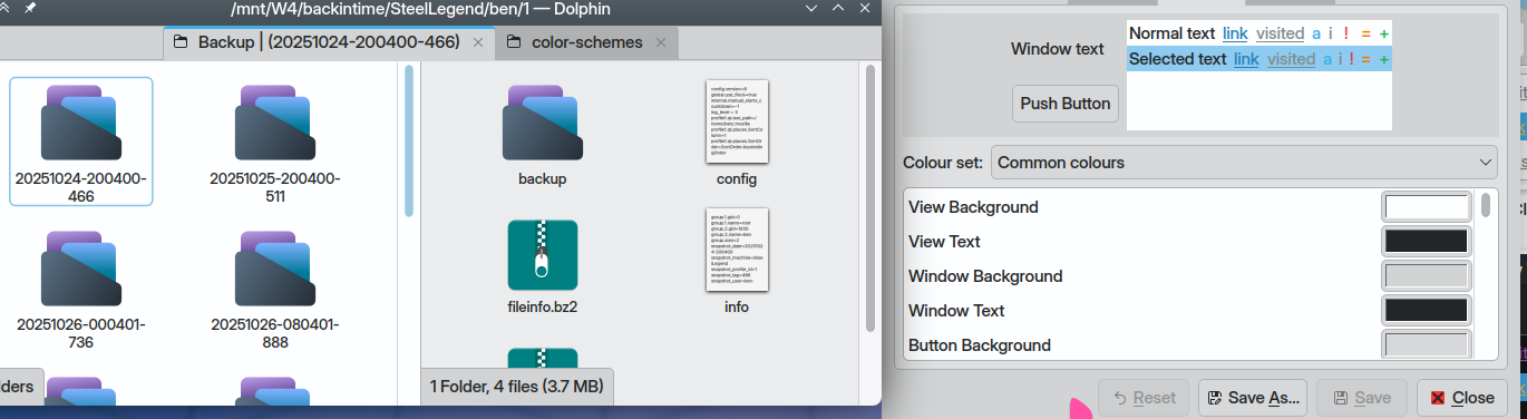
You can do this yourself in the GUI… just for an example, load up Breeze Classic and dual-pane dolphin:
Absolutely no lessons learned here from Windows XP… but now we can click View and Window and Button backgrounds. Let’s make some items darker:
So to help with left/right pane ‘issues’ I’d suggest making sure your colour scheme helps you actively distinguish which one’s active.
I had to do this with my current theme based from Magna-Dark and PurPurNight.
It can be very complicated (as some colours are derived and controlled by variables - variables for contrast, saturation, tint etc).