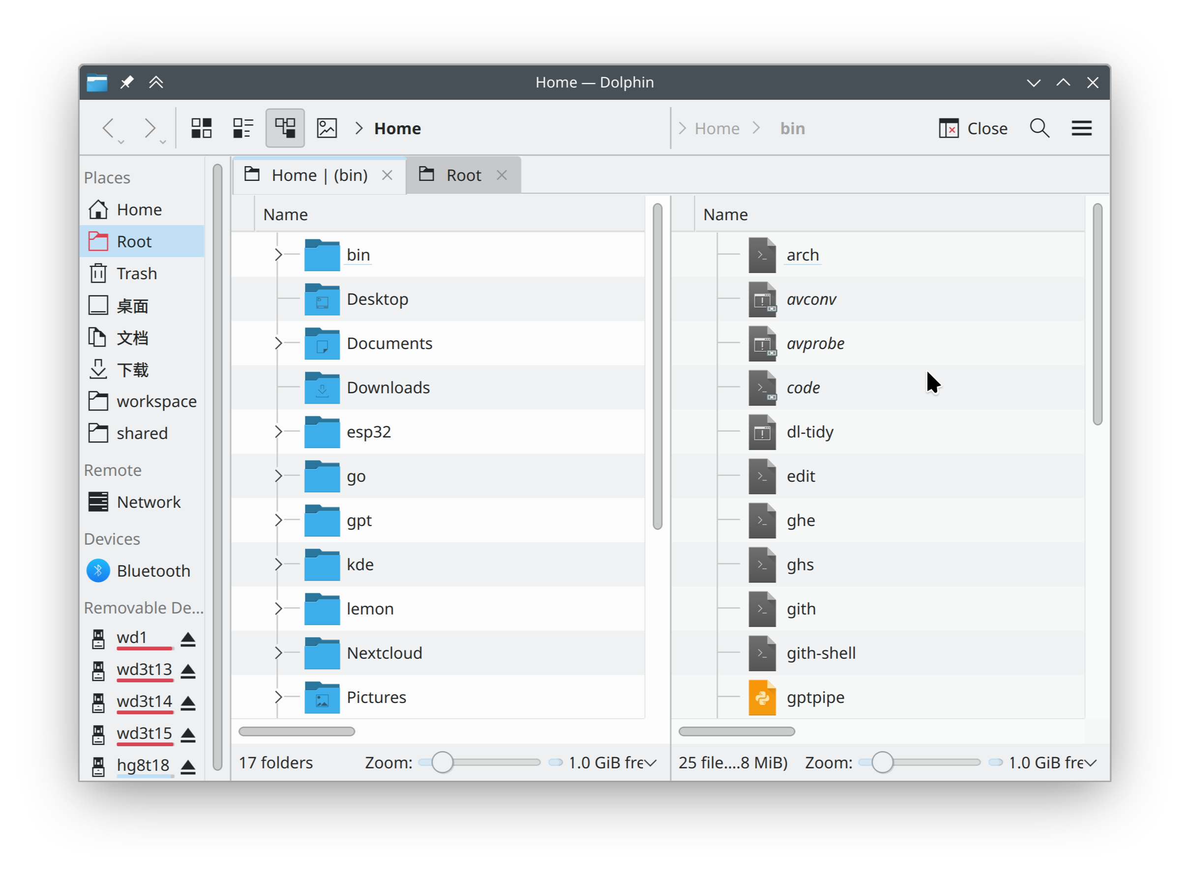
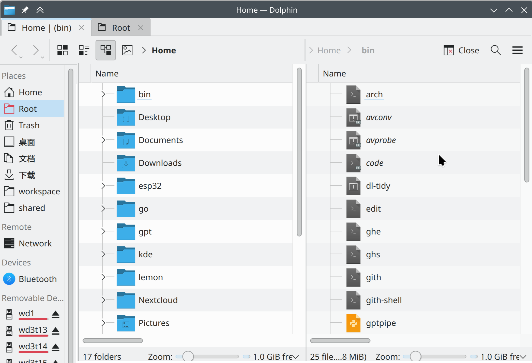
The problem with the current layout is that the “location” part of the main toolbar really belongs to the current tab. So, the UI hierarchy doesn’t match the logical one.
The problem is especially visible in split views. Without tabs:
maybe it’s a theming thing, but when dolphin has focus my title bar and tool bar are visually set apart from the viewing areas with the tabs so it does not feel disjointed to me with the tabs how they are.
I agree that tabs above the toolbar/locationbar looks better to me. For what it’s worth, I opened a bugs.kde.org issue about this, with screenshots comparing to old/new Firefox versions, although maybe that wasn’t the best place to open the issue: 464386 – Place tabs above toolbar
Even though browsers do this, I’ve never understood the appeal of moving tabs higher up in the window. Having the tabs above the toolbar implies visually that toolbars are per-tab, but that’s not the case.
I guess the main motivation is that users click on tabs more frequently than on the toolbar (which also applies to Dolphin, in my experience, when I’m using tabs), so Fitts’ Law (which doesn’t apply to Dolphin since the title bar).
But also the main part of the toolbar - the URL box - does belong to the tab. So do most buttons: Back, Forward, Reload, etc. This also applies to Dolphin.
In the same sense, Information panel and Terminal panel belong to the tab too. So the current layout is hierarchically incorrect in multiple aspects.
The back, forward and parent directory buttons, the view mode buttons, the current location breadcrumbs/text field, the split button all depend and take effect on the current tab. They do not take effect on hidden tabs and do not show the status of hidden tabs. Also, if you tear a tab into its own window it gains its own toolbar.
However, the menu bar/hamburger menu indeed is not tab specific.
We are simply getting closer to the BeOS (1) approach of stacking different windows together using tabs and moving away from the MDI approach.Opera, one of the first browsers to offer tabs, actually started by offering MDI windows within windows, moved to tabs and MDI, just tabs below and finally tabs on top. Other browsers never had the MDI phase. Tabs below are somewhere in between the two approaches and less flexible than either. Especially on Windows, MDI was everywhere in the '90s. Today, I can’t really think of any MDI app.
Kwin even used to offer window stacking back in the KDE4 SC days (2) and it is one feature I wish would make a return. Today, other than Haiku, I think the only platform that supports this feature is Windows thanks to 3rd party apps like TidyTabs and Stardock Groupy. There are two tickets (3) about this feature but they are marked wontfix. Personally, I still even hope for DWD.
The tab-bar location messes with the perception of the split panes in a very bad way. Split panes are clearly per-tab but but the information about the panes is located above the tabbar. There might be logical inconsistency with tabbar above the toolbar but it’s not actively confusing in the way that tabbar below addressbar is in the case of split panes.
Hello everyone.
Is there something new on this topic? I agree that the tabs should be above the “Location” bar, because this bar reflects the state of the tab.
This is the behaviour of browsers (firefox, chrome, edge, etc) and it is also present on the Windows 11 file explorer, and also these two alternatives:
This is just the opposite of my workflow. I click the toolbar buttons a lot. I have 15 buttons besides the 5 you list, a total of 20. The tool bar buttons are situated above the section they are used with.
The folder navigation is on the left, view type, search, filter bar and hidden files etc are above the main file section, and bookmarks and terminal on the right. I do not like playing the Menu Maze game. Click a button and move on. This is also why I don’t like the hamburger menus.
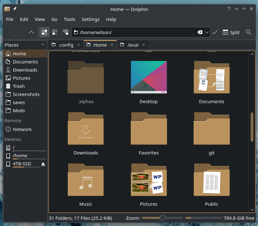
My location bar is separate from the toolbar. I have the toolbar, the tab bar, and then the location bar.
Ill stick with the devs in this one, it doesn’t make any sense to put the toolbar “inside” the tabs.
Y’all must understand that the toolbar holds a bunch of things beyond the tab controls. You can have window controls, panel controls, etc… The toolbar is a shortcut for the hole app, not just tabs stuff.
I came here today looking for this feature. I think this is what makes sense, the address/location bar below the tabs, individual to each one.
But this is achievable in the settings without any hacky trickies.
3-
Now, a plausible discussion could be if this behavior should become default, or if it should have an explicit guide in help/hints for how to achieve it; or even if
it makes sense from a usability POV to add a hole new toolbar exclusive to tabs, so, for the ones who would like it that way, you hide the main toolbar and keep only the tabs’ toolbar. Whatever…
But I think it’s pretty much fine as is for this matter.
This always funnel into the same discussion to the “copy, move, link” menu for drag and drop.
Do NOT REMOVE features. There are ppl who likes them the way they are. Just make them customizable, that’s the way.