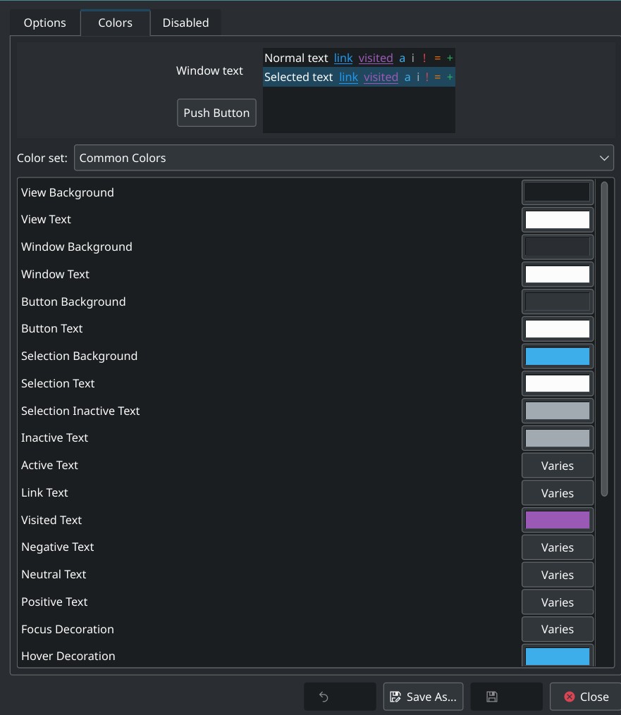
Personally I don’t think ‘documentation’ can improve on the interface, which shows previews with tooltips. The biggest headache is just knowing how to name all of the elements, and understand the language involved. It is a complicated task and I really think cannot be simplified by creating documentation (there comes a point where the documentation would un-necessarily complicate the issue).
Important tips:
- To edit a scheme (example ‘Marble’) first ‘save as…’ . Let’s say it’s just too blue, or too bright - so we might desaturate a little. Save as ‘01 Marble-desat’. and/or ‘01 Marble-dimmer’. Then edit a little - and test.
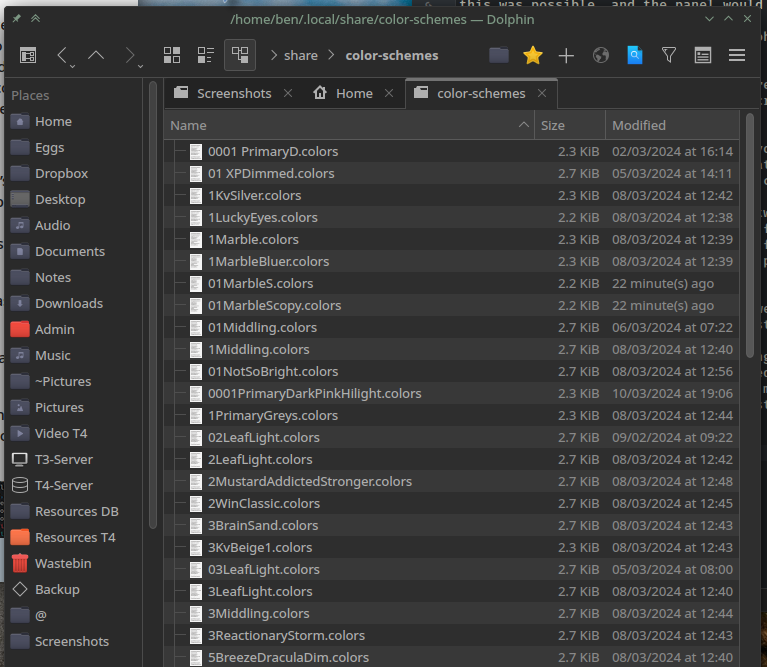
- Store colours separately - Kate works well with colour previews for this, as does KColourchooser.
It’s a labour of love, but you should end up with a couple of good basic themes which suit your personal situation/tastes/monitor/eyesight etc.
Anyway - just to help along, I’ve an archived bundle you could grab and mess about with.
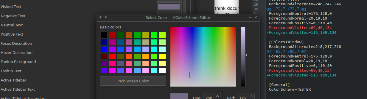
Remember, these are text files. You can open them in your editor, find out where the name goes (here - I’ll copy one, and name it ‘TESTER’) then edit a colour in the GUI, save it, and then view the difference in your text editor (I use Kate).
So here you’ll learn the language - in the text file, the numbers are RGB (116, 108, 134) for the paler purple - the old value was 69 , 40, 134. Also the name in GUI was ‘visited text’, listed in the file under several views… ‘ForegroundVisited’ under [Colors: and then subsections Window, View, Tooltip etc.
It’s a faff. When you get your contrast/brightness sorted, then you can go in and simply adjust the ‘Hue’ to get variations on a theme.
Marble is a good one, as is ‘Card’ (cream/green) and for dark, I tend to start with a completely desaturated theme - all grey, zero saturation. Once that’s right, you can clone it and choose a hue, and play with saturation.