I’m happy to announce we have selected the finalists for the Plasma 6 wallpaper competition!
As a bit of an insight, we received more than 250 submissions, most of which were of extraordinary quality. Choosing just six finalists has been extremely tough, requiring multiple rounds of discussion and voting.
I want to thank everyone who submitted an entry. The fact that so many of you spent time and energy to help out this community means a lot. We’ve received super-cute wallpapers featuring Konqi, lots of unique 3D renderings and vector art, but also pixel art, paintings, collages, and more. I’ve never seen such a wide range of creative entries. Selecting just six was a tough task from start to finish; even the 30 (or more!) best wallpapers were all extremely high quality.
I also want to thank Framework for offering the prize for the competition. It means a lot to us, and it shows that they are willing to really support projects they share a vision with. I can’t wait to award the Framework Laptop 13 DIY Edition to the winner of the competition!
Finally, we loved some wallpapers so much that we’d like to create a KDE Community Wallpaper Pack after this contest is done. Many wallpapers had great references to KDE Plasma and its lore, and we’d love to include them out of the box, even if not as a default wallpaper!
The finalists, in no particular order, are:
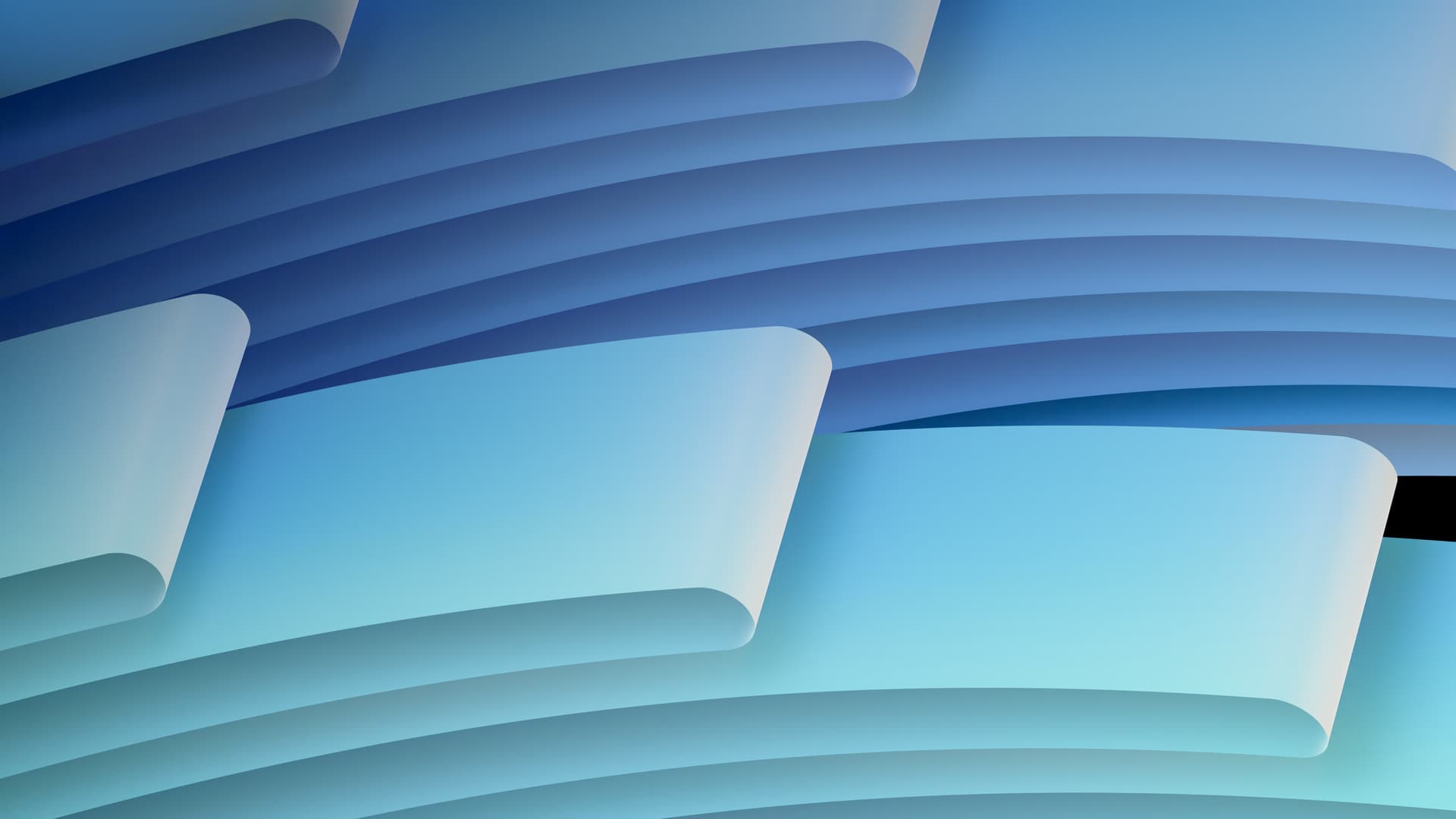
FLOW:
HARMONY:
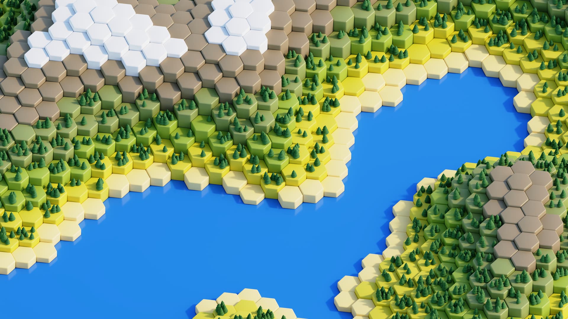
HEXWORLD:
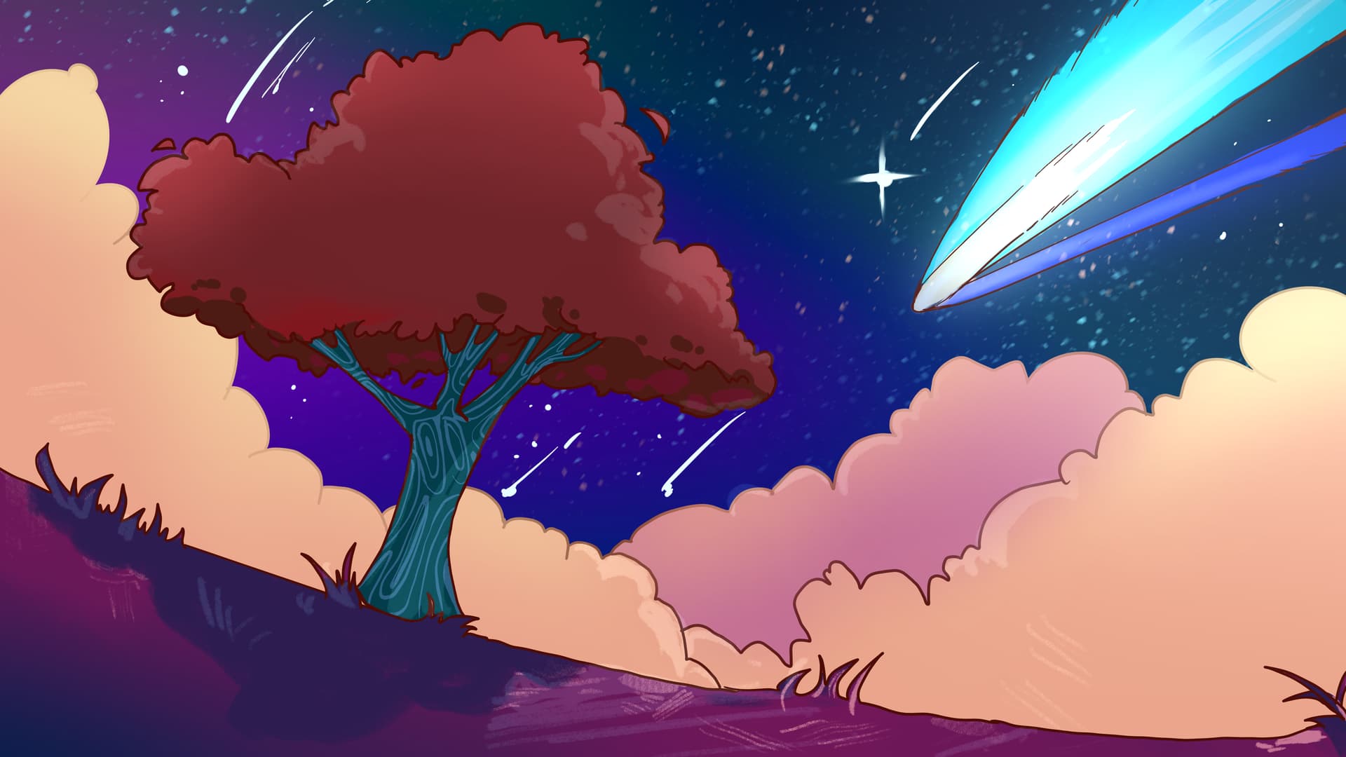
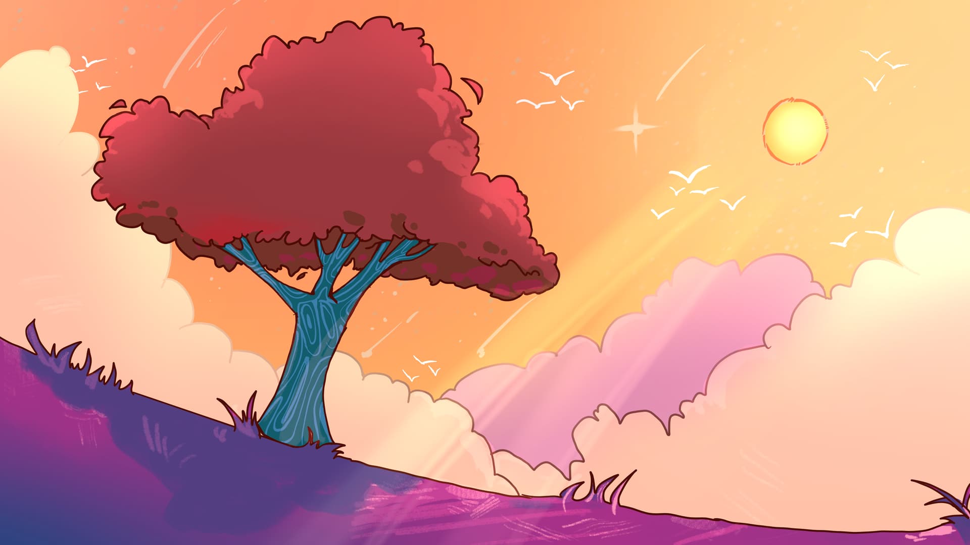
SUN / COMET:
STAIRWAY:
WAVES:
If you have submitted one of the above wallpapers, you now have two weeks to tweak your wallpapers, if you’d like to. You will receive official feedback from the judges (some of which are in this post already, some of which might come later). The wider community is also welcome to take part in this refinement stage with their feedback – just make sure to be constructive!
Feedback:
Again, feedback is presented in no particular order. Judges have different tastes, so they might contradict each other!
Flow
- The light version is too light. I’d recommend using the dark one for the light version, and creating an even darker variant for the dark version. Also, that patch of pure black on the right side is a bit awkward and too attention-getting. Consider replacing it with a lighter color or with something more subtle.
- The “grooves”/inset shadows from the folds in the light variant seem to be lit from the front while the dark variant is lit from the bottom. This makes it so that the light variant looks somewhat flat and low contrast (which is fine, just want it to be consistent) compared to the dark variant.
For example, it makes the top left part blend in. Also, the second layer of folds (the ones on the back) are lit way more than the folds on the front. Makes it harder to parse where is what on the Z axis. Is the light in between the folds there? - The dark variant’s shadows in general look gray-ish and desaturated, like it’s #000000. Consider using a dark, slightly saturated blue.
- Do not use true black as the background colour of the dark variant; perhaps use a dark shade of blue (Midnight Blue, Traditional Royale Blue, Navy Blue, etc.) instead. For the light variant, maybe make the lighting of the background folds be more consistent with that of the foreground folds.
Harmony
- Maybe try having the butterfly in the light version be on top of the blocks in the light version too. It would help with creating better cohesiveness with the dark variant. Some of the lines are rather harsh, try softening them a bit. Perhaps colour in the lineart and see how it looks, as it might look better.
- A bit too much noise on the last iteration of the wallpaper, IMO!
Hexworld
- There’s so much detail that desktop icons get lost when placed over the area with the hexagons and trees. Consider changes that reduce the visual complexity and allow desktop icons to stand out more against the background.
- Looks fantastic. Would be nice if the text of the desktop icons could be more readable, but it’s probably quite hard to do that without changing the wallpaper a lot. Perhaps you could make it more of an island and make it take up the screen’s rightmost 2/3. Then add some faint bokeh on the right?
- Too complex to be a wallpaper. Desktop text can become difficult to read with this in the background. Reduce visual complexity in general. Suggestions include significantly increasing the size of the hexagons, reducing or completely removing foliage, or completely reworking the wallpaper in its entirety. Adding a very slight tilt blur could also help.
- I also would love you to experiment a bit with some blur; either tilt blur, or bokeh, or similar.
Sun / Comet
- I love the light variant and would keep it as is. The dark variant’s hue looks a tiny bit too orange for a nighttime setting. Don’t know how to describe it, but it feels more like a darkened light version if that makes sense. The tree still looks as if it’s shaded by the sun (like the sunlight bounce on the tree canopy), maybe making the comet’s light bounce onto the tree surface could help?
- The stars in the night sky of the dark variant could be lessened a lot or even outright cleared out, to improve the readability of desktop icons and text. The random white streaks and birds should also be removed for the same reason. Keep in mind that some displays are rather crisp, so less is more here.
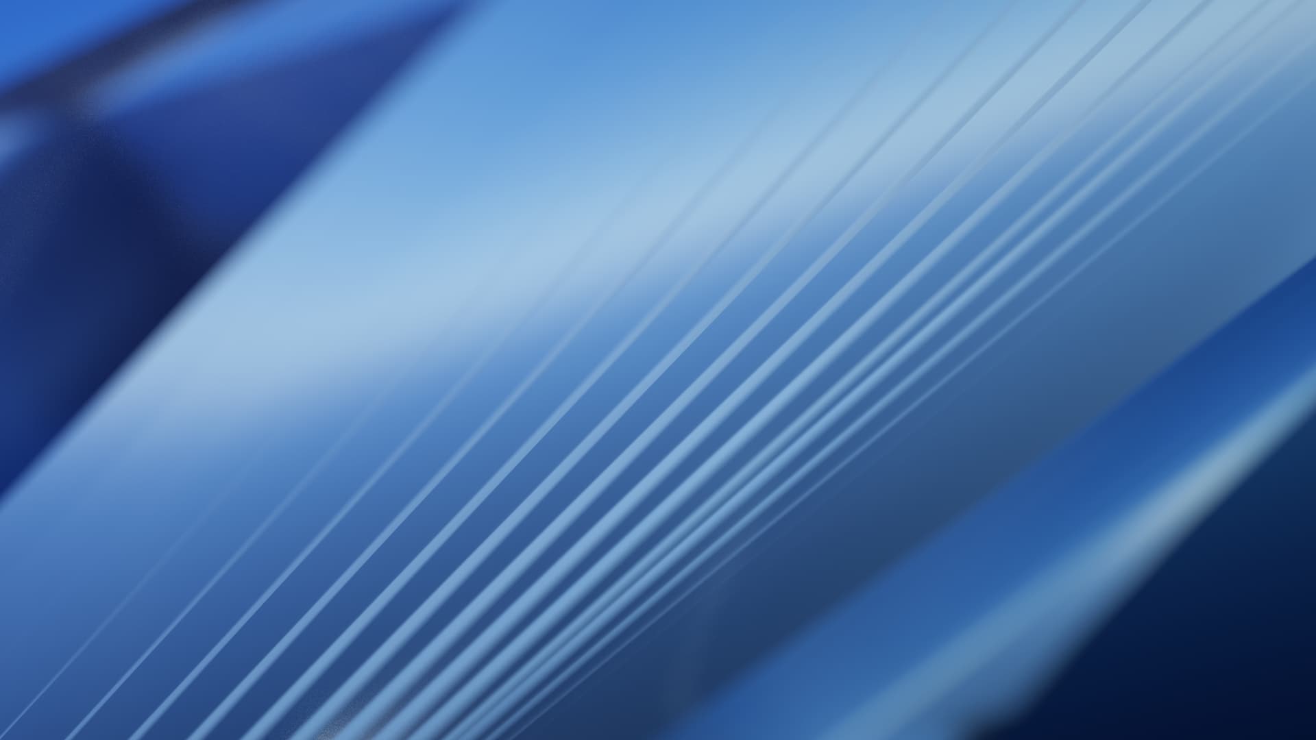
Stairway
- Would appreciate a bit more visual complexity, but just a bit.
- Try to match what lines are visible in both the light and dark variants as much as possible, for better consistency between both of them.
- I dig it, especially the dark variant, which I’d keep as is. The light variant’s lines (or, well, stairs) look less like a lit groove (like a part of an object) and slightly more like a sticker. I think it might be because in the dark variant the stairs’ edges start closer to the light source and taper off as it gets closer to the shadow, whereas the light variant’s edges start much later and bunch up in the shadow.
- I’m a bit confused by the vertical blue lines. To me, they almost seem like graphical glitches. Is there a way the composition of the wallpaper could be a bit more clear?
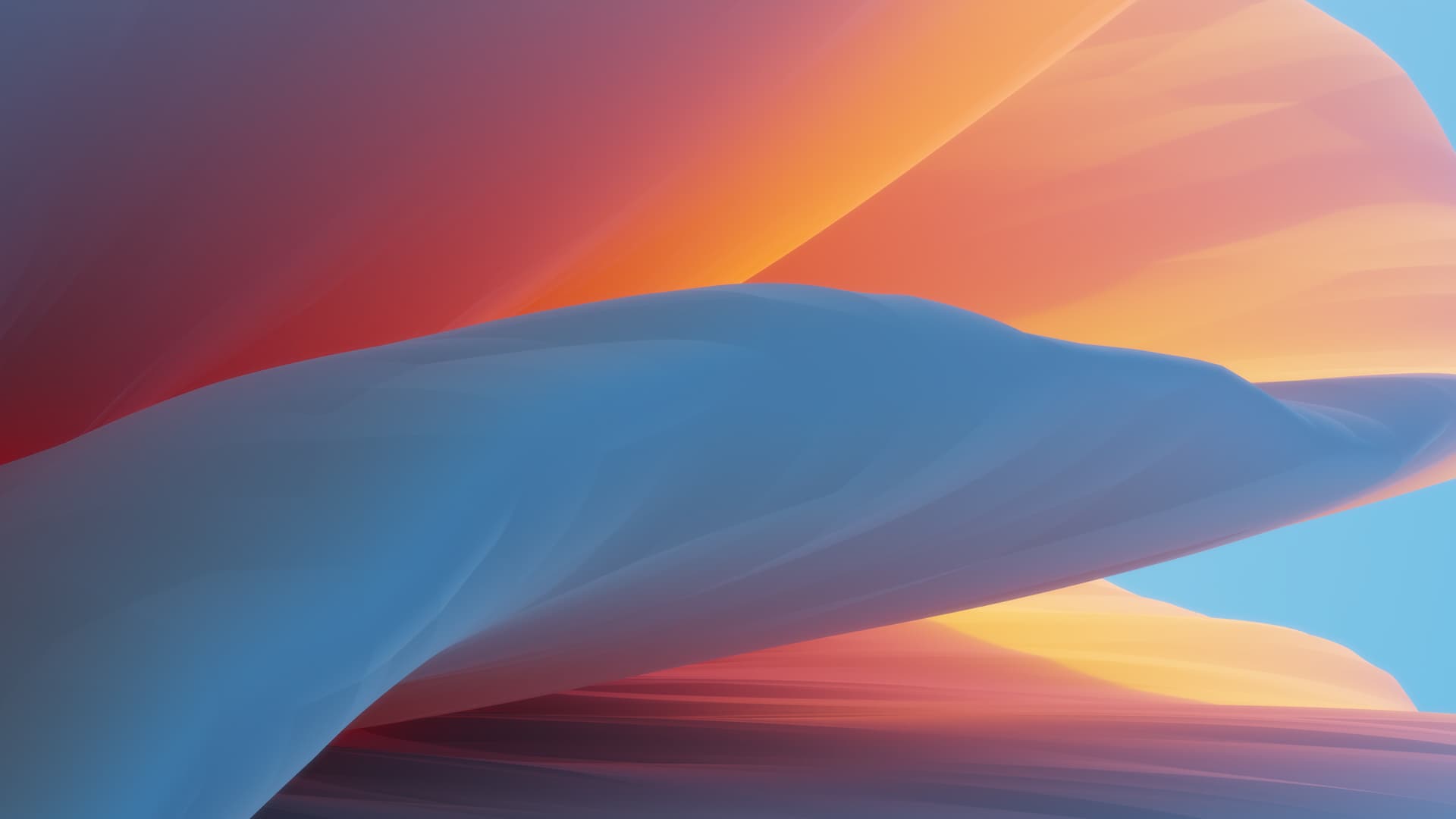
Waves
- This wallpaper feels a bit reminiscent of some of macOS’s recent wallpapers to me. Consider minor changes to visually differentiate it a bit, and give it more of a KDE style. Also, the bright areas of flat blue and black color on the right side of the light and dark versions (respectively) feel too attention-getting. Consider replacing them with something more subtle.
- I have a significant issue with the hard lines, especially on the bottom; colors are suddenly changing, and it seems like a graphical glitch to me. I’d like the wallpaper to be a bit more clean, maybe using some gradients.
- Dark variant looks too organic, like a zoomed in photo of a mushroom or the insides of an intestine. Would recommend changing the colours and/or textures. Do that with the light variant as well, despite it not looking as organic in the same way.