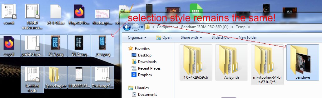
In Windows 7 selection style remains the same regardless whether icon is on desktop or in window (file explorer)
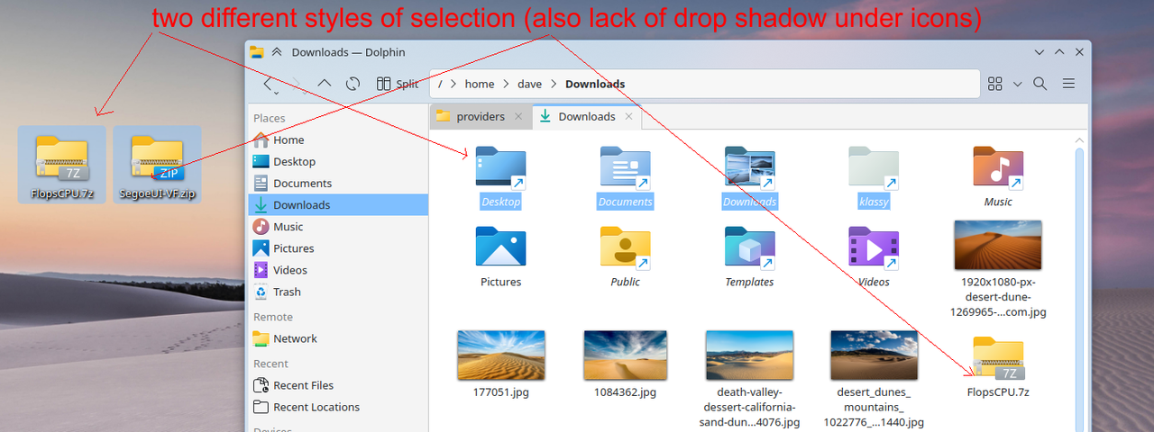
But in KDE Plasma we get this mess
I barely see what icons are actually selected! Please copy the same selection style when icon is on desktop. Also It would be AWESOME if you could add and option to force drop shadows under icons like when icon is on desktop.
A new Dolphin selection style is currently being worked on. It might be released in the next August Dolphin release if we manage to get it done until then.
be AWESOME if you could add and option to force drop shadows under icons like when icon is on desktop.
We use drop shadows on the desktop because it can improve readability of the text on busy desktop wallpapers. In Dolphin we always have a clean white or black background, so a drop shadow is not necessary as far as readability is concerned. For this reason, I don’t think having a setting for this is a good idea.
Oh, I misread indeed. For icons it does indeed make more sense because if an icon is white and the background is also white, the icon is effectively invisible. A drop shadow would side-step that issue.
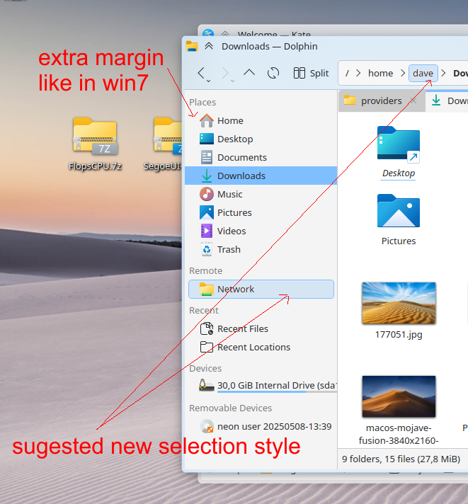
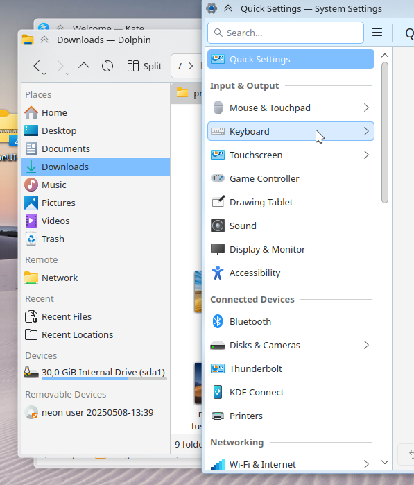
I think we try to be consistent with list styles all over Plasma with this. System settings sidebar does not have any margin like that either. I don’t really have a strong opinion on this currently.
I like it better as is. the “places” “remote” “recent” is clearly different from the rest, and with extra space in between we must scroll, I have a lot of shortcuts and now I do not have to scroll, see picture.
oh I’m sorry. I thought it was vertically. But I guess we save some usable screen area by keeping as is, and not implementing bigger margins. Sometimes compact can be good, when it’s on the least significant place, leaving more room for the important work-space.
It would annoy me if this changed as I resized the panel.
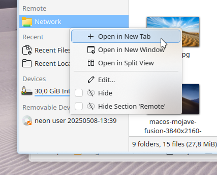
The easier fix, in my own opinionated mind, would be to fix the one area that is different - the context menu in the Places panel – remove the “Hide” checkboxes , which removes the indent, and make them toggles, instead. Simple!
This provides more complete consistency, so everyone is happy, right?
You will have to live with that. Current layout without that margin looks odd for somebody coming from windows. It looks simply clutered. That’s bad UI design. Windows has been using that margin for more than 20 years so hundred millions of users got used to it. I didn’t see any riots on the streets…
Dolphin has had this margin since at the very least 17 years, if not longer (2006). I started using it in KDE 3, and even there it didn’t use an indent in its side panel.
Either style is opinion, and mine of course is just that --mine.
But…
Why can’t you live with it
Because it looks weird (unfinished) when everything is glued to the left margin. I’m a windows guy and I like margins. It helps when it comes to separation of different section in the panel.
I came from Windows too and honestly, it doesn’t feel cluttered at all to me.
Thanks to different font characteristics, the section titles come out to be different from the entries and it doesn’t make me slower when glancing.
I am more frustrated at the new gnomish address-bar with curved borders, which doesn’t match my cornerful aesthetic, but as long as it is not making my workflow worse, I’ll let the designers do their iterations.
Let’s not make design decisions to placate people with angry emotions, they will always find something to be angry about.
And let’s not assume that “everyone” is angry about this specific design choice. I am glad that there are shadows on desktop icons by default; they help the icon to visually separate from the wallpaper image.
I also like shadows on desktop. I would like to see them also in Dolphin window. I think we are on the same page. I can safely assume that we all like CONSISTENCY in UI , right?
Regarding your scroll issue, so to speak. YMMV, everyone has their own set of shortcuts, so there are people who would scroll anyway, but your pov basically boils down to “make everything as tiny as possible so I don’t have to scroll”. That’s not the reasoning I would want to dominate among devs minds. It’s better to have well structured and ordered list with margins and scroll, than compactify everything in order to get rid of scrolling. In the end of the day, scrolling is not a hard thing to do even on laptops. While pinpointing a specific entry could be though, if everything is packed too dense so false selections and wrong directory navigation happen more often. Yeah, they already do.