After using plasma for multiple years, I’ve come to realize that there is no real organization or fluidity when it comes to desktop widgets; they’re all custom sizes predetermined by the widget creator. When these widgets are placed on the desktop, they often do not match up with each other and overall don’t look very organized. My solution for this would be to create a widget grid system for the desktop. Example: let’s say we have a 1x1 widget that would just be an icon, then a 2x2 widget that might be something like the clock or notes, a 2x4 widget for calendar, weather, etc. 4x4 widget for system monitor and other larger widgets.
This is a very simple fix, and won’t appeal to everyone because people like a bigger weather widget, while some like a smaller weather widget, which is why it would also be a reasonable idea to create different sizes of that widget so that when we move the widget to the desktop, it will start as its smallest form, then you can choose larger version of the widget to meet your needs, the different sizes will be programmed to display the content according to it’s size.
IIRC, KDE Plasma 4 (or 5) had a grid option. But the user coild define, how many rows and columns ot had (within some predetermined constraints), and then the widgets were squished amd stretched to fit those.
i would not want this, even if i did use widgets on my desktop.
each widget is resizable at almost the pixel level and they all have different needs for screen real estate in order to provide their function and look correct.
forcing them or squishing them into cell phone like 1x1 or 1x2 sizes would take away the users ability to create anything tailored to their needs.
only if this were enabled as an opt-in feature would i consider it and even then it would have to be on widget by widget basis rather that take over the whole desktop.
I agree with that, which is why, for now, I think a better solution to my problem would be to just make it so that each widget has the same space away from the edge of the screen and also has the same spacing between widgets, because that is also another thing I have had issues with when using widgets. Just that fix would actually make up for the lack of matching widgets in my opinion, or even if it was possible to make widgets match through resizing, which I can’t seem to achieve at the moment.
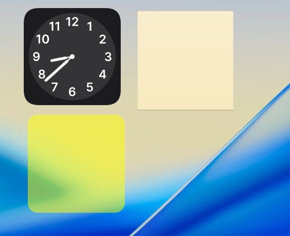
This is what I’m referring to with the widgets having unequal space from the edge of the screen. I can’t move that clock widget any closer to the edge, and the widget doesn’t like to match up with the clock widget.
I think that is the case, it would be nice if the desktop had a set amount of space from the edge that you could set the widget at, but then again, that would be a rough process for the already existing widgets, because widget creators would have to remove padding from their widgets that applies to the desktop.
I agree about the ability to snap to grid. I understand some users want absolute freedom for pixel-adjustments, but many users also just want to align things. I am in the latter category, where I prefer ease of alignment to pixel-perfect adjustment.
Supporting both is good, but also introduces an issue of discoverability - if holding shift makes it snap to a grid, how does one make it intuitive and discoverable for the user that this functionality exists?
when in edit mode when you have the drag handles visible you should notice that they are already on a snap to grid array.
you can manually align the handles so they fall onto the same grid points
however, depending on the widget and how the developer crafted the widget, the elements visible within the widget may or may not align with similar elements of another widget.
that is simply down to the individual developers of those widgets and the choices the have made for padding, thickness, etc, and how it responds to being resized.
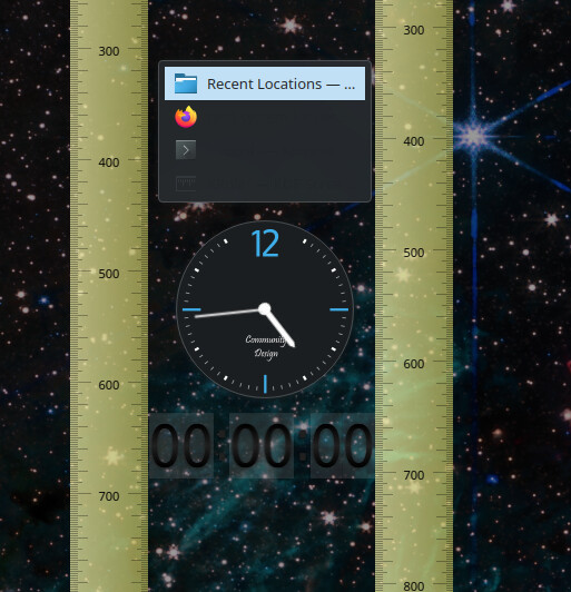
for instance these three random widgets all have their handles aligned manually and to my eye they appear aligned, but it was trial error to get the handles to match up
and when a ruler is placed along each edge of the timer widget we see differences in the padding compared to the other widgets.
short of limiting what developers can do within an individual widget, i don’t see how it can get better than being able to align the handles.
in libre office impress they have “help lines” while moving which are temporary lines that indicate when an element is aligned with another element to aid your drag and drop placements.
perhaps a feature like that could be added to the edit function, but it would not change how the individual widgets are constructed.