I would like to increase the gaps / spaces between icons on the KDE Plasma Desktop.
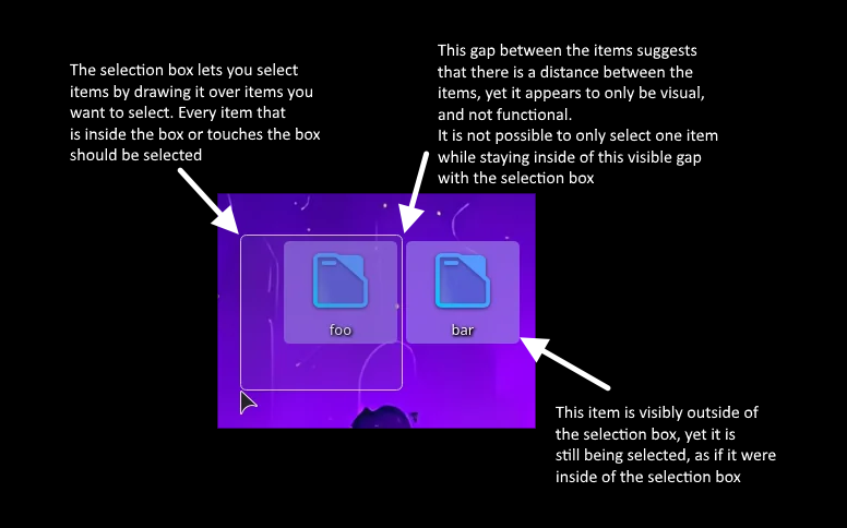
The picture should tell you everything that I’d like to fix. The icons have virtually no spacing between them, making selecting a single row or column very difficult if not impossible in a packed grid of items.
Why is bar also selected, despite the selection box not overlapping it?
Making the icons one step smaller does not fix the issue as the gap is still nonexistant.
Making the icons bigger does introduce a workable gap, but that makes the icons way too big for me.
I have not been able to find a setting for the icon spacing.
Ok, so you have to go from Desktop to Folder view - missed that part… to be honest, I use Desktop view and have one icon (called ‘Tidy’) which I use in lieu of the desktop folder… which I keep empty mostly.
So yes, if you put a ton of icons on there, then selecting them with the selection box is absolutely terrible, not just columns and rows - it almost seems to select at random; and there’s nowhere between icons to start a new selection rectangle.
So back to the way I find better - have one ‘Desktop’ or ‘Tidy’ icon, click that one time and get the folder open in Dolphin.
I guess it’s something that should be fixed - meanwhile, I’d just suggest never using the Folder view - it’s so WindowsXP Sorry, not much help here.
After playing with this again, I have to say that with wallpapers, it’s really not good to be doing this stuff on the desktop - sadly it’s not Dolphin, where things are much tidier and more manageable.
I concur that selection bounding boxes are broken or at least inconsistent with what the visuals entail. @ben2talk, @deelan’s screenshot clearly displays the bar folder being selected when its highlight box is outside the selection box, when it shouldn’t be (and you seem to have forgotten there is text describing just that in the top post, not only the image).
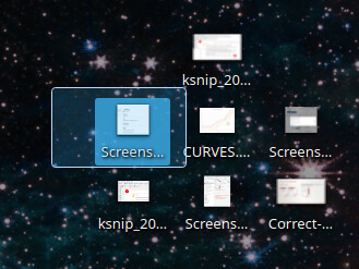
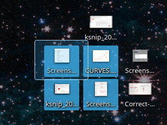
On top of that, it’s impossible to start a selection box drag inbetween horizontally ajdacent icons, resulting in a drag&drop action instead, while doing so in the vertical gap seems to work fine:
This is un-intuitive and inconsistent with pretty much all other (grid-aligned) desktop icon implementations out there. Even old environments like System 7.0 (1991!) handles this better than status quo Plasma (no, really, open an emulator on e.g. infinitemac, enable Apple → Control Panels → Views → Always snap to grid, and test out on the Finder desktop).
The spacing is purely visual - the actual areas touch, and the highlight is made a bit shorter to provide a visual gap between them.
Even just increasing the visual gap would require a lot of familiarity with the code and require quite a bit of effort to make sure it doesn’t break anything, making it have an actual gap would require intense reworking of rather complicated and old code.