How to get list-style program picker back?

The new one,

uses massive icons and a grid. It’s truly awful. The previous one,

this,

didn’t.

How do I reactivate the other one? This difference appears to be because it’s using the Wayland/Flatpak portal version, which appears to have been the inferior version for some time.

Can you explain why the new dialog is awful?

4 Likes

@fusionfuture, the large icons and grid format are really difficult to parse. This is significantly worse on small and low-DPI monitors that I’ve evaluated it on.

Considering that this is meant to be a list of names of applications rather than a photograph picker, I’m really surprised that there isn’t even a list option. Why not just integrate the Dolphin KPart and point it to applications:/? That should even provide different list modes.

I neglected to state this because I truly thought that this must have been a mistake, since the disadvantages appeared self-evident to me. Apologies.

I think that what I really want is

to be provided when I try to invoke a file-type that doesn’t have a default application associated with it. I swear that it used to use this dialogue for that purpose. I can only use it when manually changing it via Properties, now.

1 Like

I agree the filter in the new dialog is not very handy, so I changed the code.

1 Like

Thanks loads, seriously, although it still doesn’t fix the fact that it’s just… so much worse than the previous one. I even more so don’t understand why both types of dialog are used now.

The new portal doesn’t even adhere to my preference of one click to select and two to invoke. It just invokes with a single click. It’s like the old Windows 8 interface.

The new portal doesn’t even adhere to my preference of one click to select and two to invoke. It just invokes with a single click. It’s like the old Windows 8 interface.

Sounds like it lacks some integration with system-wide preferences for single vs. double click. But then again, you never double-click icons in Kickoff application launcher, which this app chooser looks very similar to. I mean, what would you do with single click selection? You can’t e.g. drag an app icon anywhere from the dialog.

Considering that this is meant to be a list of names of applications rather than a photograph picker, I’m really surprised that there isn’t even a list option. Why not just integrate the Dolphin KPart and point it to applications:/? That should even provide different list modes.

That’s more about the choice of technology. Dolphin is based on QtWidgets, while new software tends to be written in declarative QtQuick/QML which is much more convenient for developers to work with, and for graphics to render efficiently.

@ratijas, regarding selection, indeed it is a new inconsistency. The other dialog allows the user to select the program in order to use the other options that it provides, which again, the new portal doesn’t:

  1. Remember / do not remember association
  2. Invoke in terminal
    1. Do not close when invoked in terminal

Are KParts unable to be used with QML? I really hope not, but that would explain some otherwise unexplainable reinvention of the wheel in some recent Kirigami software.

It is technically possible to embed a QQuickView inside a widgets application, and vice-versa render Widgets through custom QQuickPaintedItem graphics & event handing magic in QtQuick/QML. But not always desirable due to performance impact, code complexity and some other limitations. Unfortunately, the wheel has had to be reinvented to be able to move forward.

Thanks for explaining use cases and the need for single click. I’m sure we will be able to sort it out and bring old options back.

1 Like

I’m sure we will be able to sort it out and bring old options back.

Really glad to hear. I worried when I asked the original question, and more so when I mentioned my rationale for the question, that I would be silenced by those not interested by the problems that this slightly strange partial replacement for a previously perfect window have caused for me.


Thanks for the additional information, too. Knowing that I am still able to utilize those brilliant KDolphin, Konsole and KWrite/Kate/KDevelop KParts incentivises me to try convergent Qt toolkits like Kirigami, whereas I otherwise wouldn’t have any interest whatsoever despite the obvious benefits of a convergent graphical toolkit.

CC @ngraham What do you think about adding icon size slider, Open in Terminal options group, and respecting global single vs. double click preferences?

1 Like

Not sure of the use case for icon size slider or a list view. A list view or tiny icons are not touch-friendly and an explicit goal was to make this touch-friendly.

Open in Terminal can be added back.

Respecting single vs double click does not make sense since that setting is only about files and folders (it explicitly tells you this) and this dialog is about apps.

@ngraham, shouldn’t the display-scale be how touch sizes are supported? That’s how Android, i(Pad)OS, Windows do it, and currently how I do it for KDE, to great effect. After all, the previous association window persists (by necessity) when invoked from Properties, so merely creating another dialog doesn’t remediate any problems, really.

The list view is definitely necessary if more than about 5 application are available. Sometimes I have 20 applications registering associations for a (file/mime)-type. At the evry least, the current implementation doesn’t adhere to literally any of dolphin’s grid icon size nor plasma-systemsettings’s icon size configurable preferences. It’s really, really inconsistent for no obvious benefit. It’s a lot more like what I’d expect from GNOME (especially since they don’t even provide options for such things, so whether ya get a list or grid and what size each icon is pretty arbitrary).

Having this new portal interface just forces me to close it to use the Properties’ one whenever it appears.

shouldn’t the display-scale be how touch sizes are supported?

No, that’s not generally how it works, because we need to support convertibles where increasing the whole screen scale doesn’t make sense. The goal is to use display scaling primarily to achieve the correct effective DPI for the device’s physical properties and form factor. Once that’s done, we adjust individual UI elements as needed if they’re not touch-friendly. If keeping an item smaller than would be ideal for touch friendliness is desired, we change size to be touch friendly only when in the special “touch mode.”

At the evry least, the current implementation doesn’t adhere to literally any of dolphin’s grid icon size nor plasma-systemsettings’s icon size configurable preferences.

The new portal dialog doesn’t respect Dolphin’s icon size setting because it’s not Dolphin, and it doesn’t respect the systemwide icon size settings (which one? There are several) because we’re moving towards removing those settings in Plasma 6 because they’re “broken promise” features; see Plasma 6 proposal: remove the ability to configure icon sizes systemwide in the icons KCM (#58) · Issues · Plasma / Plasma Desktop · GitLab and Get Involved/Design/Lessons Learned - KDE Community Wiki.

On another note, can you please try to moderate your tone to not sound so insulting and accusatory? I’m not feeling a lot of warm fuzzies after reading stuff like this:

It’s truly awful

it’s just… so much worse than the previous one

It’s like the old Windows 8 interface.

It’s really, really inconsistent for no obvious benefit.

It’s a lot more like what I’d expect from GNOME.

2 Likes

I mentioned the single versus double-click incompatibility because frequently I want to ascertain whether something provides right-click options. Frequently, for these to be exposed, the user must single-left-click to select the item before right-click is able to invoke a context menu. This is a habit for me and at least some of my family consequently. That is why I believe that subverting that expectation is problematic.


I’m surprised that the stated display scaling approach is desirable, since that seems like a lot more work, would necessitate manual addition of duplicate arbitrary scaling values based upon conditions, and isn’t how any other OS has done it, to my knowledge. I really like Android and Windows’ approach because I can be quite confident that whatever I’m looking at shall actually scale to what I set (provided in Windows’s case that I’m looking at a GUI rendered by WinUI or vaguely older XAML). In Android’s case especially, I’ve not seen any cases in which this system didn’t work due to the ratio of actual size to resolution of the display.

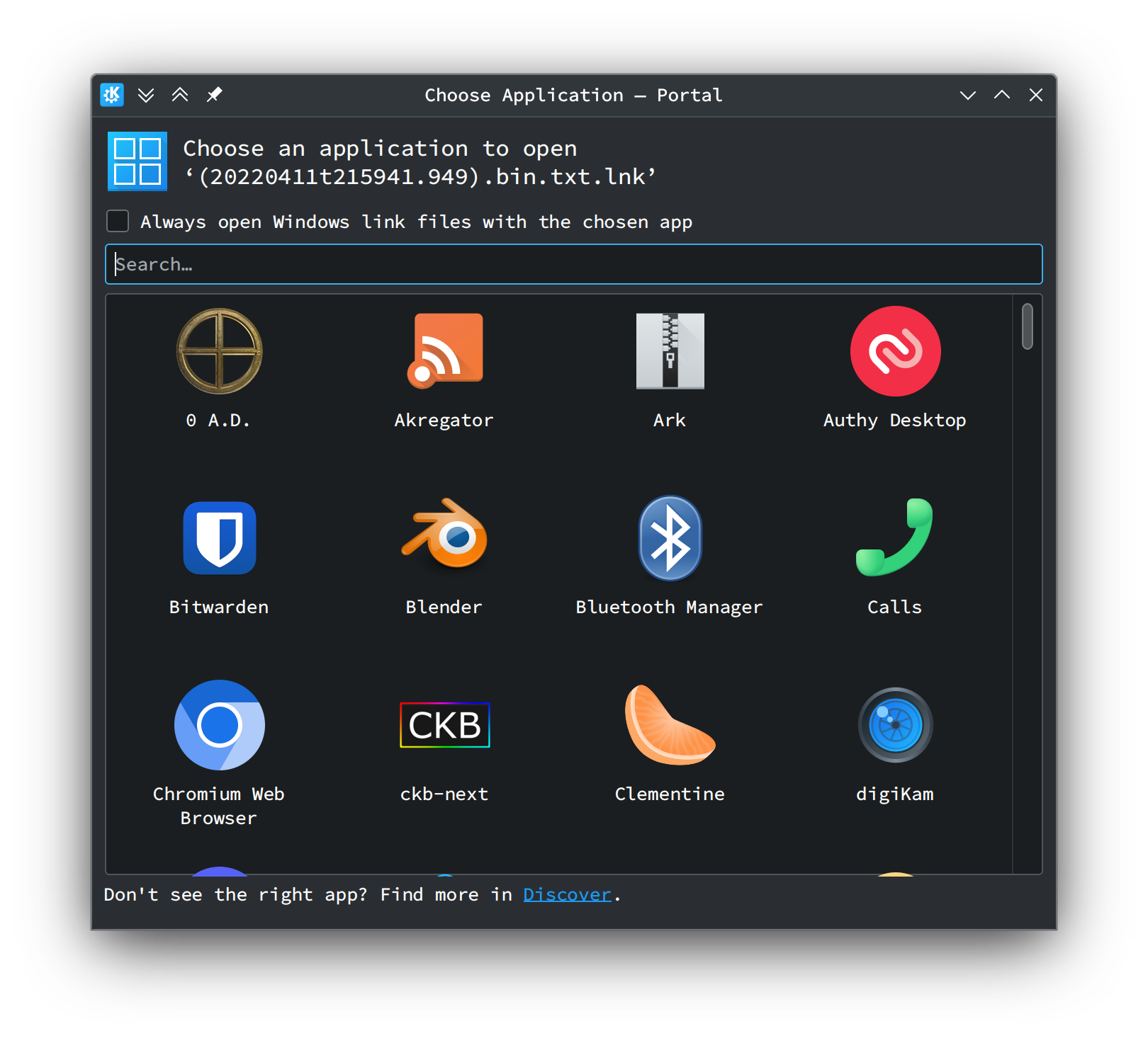
I can see manual scaling becoming problematic when dealing with software that isn’t developed by KDE. At the very least, such an interface as the portal’s surely isn’t the way to go about it?

In that rergard, I can thank you very much for extend kio with portal-based open-with implementation (!47) · Merge requests · Plasma / Plasma Integration · GitLab so that it can be thought a little longer. The benefits of OpenSUSE’s brilliant speed of updates should hopefully allow my OCD to rest easier for now.


I apologize for any accidental emotional insensitivity. Did you read the supposedly accusatory statements in context? They should solely have summarised previously stated criticisms. I dislike negative conjecture as much as I expect that you do, so each should have been accompanied by previous evidence for my dislike. I know not how to communicate my criticisms more politely.

Any suggestions in that regard are welcome, although please consider whether I have actually been unreasonable. I certainly don’t believe so, else I would certainly have stated such when realized to prevent any problems.

Also, I must mention that including

It’s a lot more like what I’d expect from GNOME.

in the list is somewhat humourous.

Anyway, thanks again.


Minor corrections for posterity:

Line Correct Incorrect
3 very evry

Forgot to add the #plasma tag.