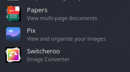
tested on both x11 and wayland. I’m running linux mint 22.1. The icons look perfectly fine on Cinnamon, but in plasma they look like this. Not all flatpak icons look like this but some do.
hi, welcome
so mint does not come with the plasma desktop, and furthermore, cinnamon is based on the GTK toolkit, while plasma is based on the Qt toolkit.
if i had to hazard a guess as to why they look different in the two DE’s it would likely have something to do with that mismatch.
plasma can use GTK items for things but they will not likely look as good or work as well as a native Qt item.
for the best plasma experience, i would recommend a distro that is focused on providing the KDE desktop and deploying it with the best defaults and settings (including a mostly Qt set of supporting software).
kubuntu would be the closest match to your distro + DE selection.
Hi! If I’m seeing that screenshot correctly, then this comes down to issues with the Qt toolkit’s renderer for the SVG images that are used as icons by some applications - especially common among those that adhere to GNOME visual styling.
For reference, there’s more context on this issue in the following KDE Bugtracking System ticket: 448234 – Usage of Qt SVG renderer causes some 3rd-party app icons to be mis-rendered