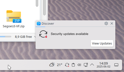
I think notification window needs some attention when it comes to overall design. It has that dated and unpolished look. Button is too close to the edges of the window. The same with text in window. Icon is on wrong side. Bold font style also do not fit to overall taskbar design. Gear and Close icon size is also too big. It should have the same size as icon on regular window.
7 Likes
Can’t agree on gear and close buttons being too big, to me those buttons on your suggested mockup are too small. KDE default titlebar buttons are too small and too round already (and have been like that for too many years, this is why the first thing I do on any fresh install is replace Breeze decorations with Klassy), and spoiling notification buttons as well is a horrible idea. Closing windows, notifications, etc using cursor point and click with mouse and esp touchpad easily is a crucial thing for UX. And yes, shortcut are no excuse for bad design.