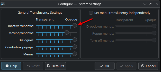
Hi, I’ve been tweaking Plasma’s transparency using window rules (opacity ~70%), manual edits to dialogs/background.svg (opacity ~45–50%), and enabling Force Blur (a fork of KWin’s blur effect). It looks great on dark wallpapers pretty much readable, smooth, and clean. But with brighter or pastel wallpapers (like light purple), the transparency becomes too “washed out” and text becomes barely readable. You have to increase the opacity a lot just to maintain usability, which defeats the purpose of transparency.
here’s how it looks when using a dark wallpaper:

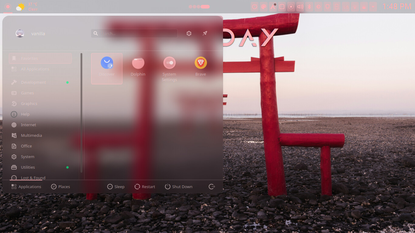
when using a light vackground:
I’m also using KDE’s Material You color system (not sure if that has an impact, and no big diffrence when using the dark breeze color ), and my device is a Chromebook with a weak screen so contrast issues are more noticeable.
The core problem seems to be that Plasma’s transparency doesn’t adapt to the background content or brightness. On macOS, transparency is more refined and
i think It uses vibrancy effects with multiple blur layers.
The blur is also dynamically adjusts based on brightness and contrast of what’s behind the window.
Apple also adds color tinting and desaturation, ensuring UI elements stay readable regardless of background.
In contrast, Plasma’s blur is mostly static, and transparency is done through theme hacks or window rules. It would be amazing if Plasma adopted a more native, adaptive system ; one that can detect low-contrast situations and auto-adjust the opacity, blur strength, or even add subtle shadows or outlines for text.
This has actually improved a lot over the past few months , text readability used to be a major issue. But for Plasma 6 and beyond, a native glassmorphism-like solution would make the desktop much more polished and usable across all setups.
Thanks a lot for your hard work on Plasma!