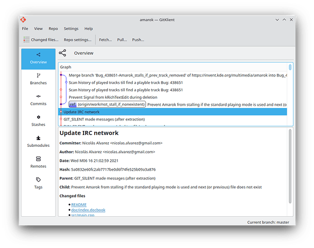
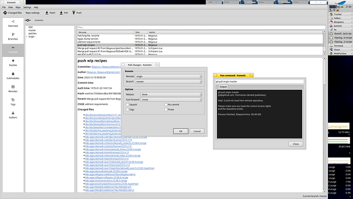
Comparing this app to my favorite daily tool — Sublime Merge, most of those tabs in the sidebar could fit their content inline in a 2 or 3 split views in a single window without the loss of usability — quite the opposite, screen estate would be less cluttered with app navigation and filled more with actual content.
Commit graph is too dense and not informative. It only lists commit titles, whereas the other important commit metadata includes date and author. Also, where are the remote branches?
Commit details view is too sparse. Same amount of information could fit in, like, 2x less space. And, in fact, not all info is needed: “Child” title is uselessly repetitive, and should be replaced with a clickable commit hash. Date, on the other hand, it’s not clear whether it refers to commit date or authored date, especially since the showcased commit on the screenshot here have both. But when committer and author ARE the same, it doesn’t make sense to list them twice.
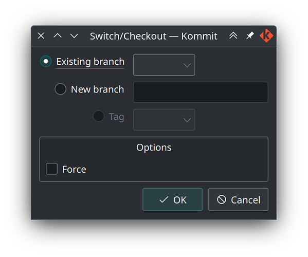
Some random layout issue: in the “Switch/Checkout” dialog, radio buttons on the left are not base-line aligned with their fields on the right.
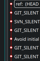
Random UI rendering issue: at 150% scale graph lines are not continuous:

also, white dots in the middle of bright red line on a dark background is not exactly the best combination of colors. Generally all colors for branches are quite… intense for any color scheme.
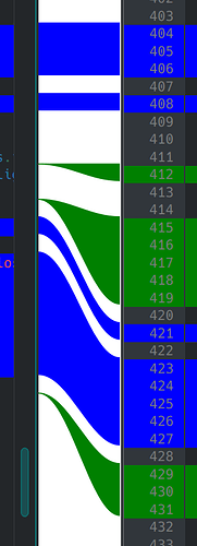
The diff view is both eye-tearing and space inefficient: change indicators (currently on the left) could be drawn on top of scrollbars; views are not scrolling in sync; “Show file names” button take up the space that could be used to… always show file names!
Diff curves are pointing at slightly wrong vertical offset:
Random UX issue: when browsing commit files tree, keyboard navigation does not update the right pane, requiring mouse click. Not sure why is this even possible, but I accidentally opened two “Brose files…” windows by double-tapping on that context menu item.
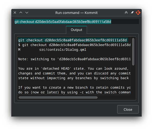
Checkout process could be greatly simplified. This whole window is just a status update, it doesn’t have to open in the first place:
But since it does, please, don’t duplicate the command in a separate field. Tab isn’t needed, because it’s the only one here. And three levels of frame-nesting goes against the tendency of “frameless design” of late. Close button isn’t needed, as the dialog can be just closed as a normal window, and it reacts to Escape as well.
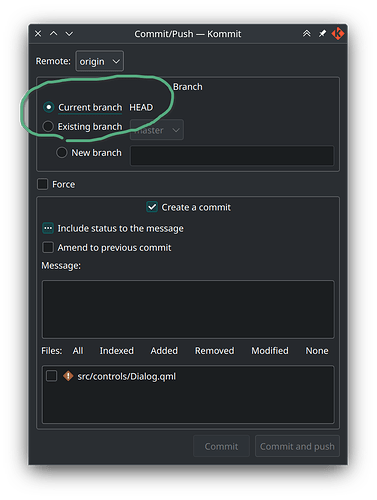
Commit/Push window is a bit traditional for Git GUI clients, I guess, but that’s exactly what kills the mood. How am I suppose to interactively stage chunks or view files in such tiny modal popup? Then, “Message:” label better be just a placeholder of the text area. What is the “Include status to the message” checkbox, and why is it tri-state? Why is branching merged into this window — don’t we have a whole tab dedicated to branch management? Also, HEAD is a ref, not a branch:
OK, so that was just my brief review. There are sure more issues/bug/nitpicks to be found, but the ones outlines above should give developers some ideas what to iron out first. In 2023 tooling market is flooded with Git clients for any taste, so it’s gotta be hard to start competing with existing high-quality solution, but, eh, it would never hurt to have a native one from KDE. So, good luck!
