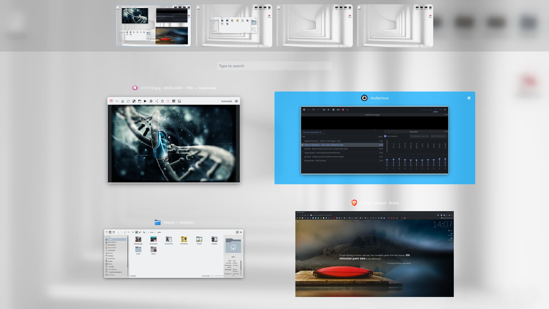
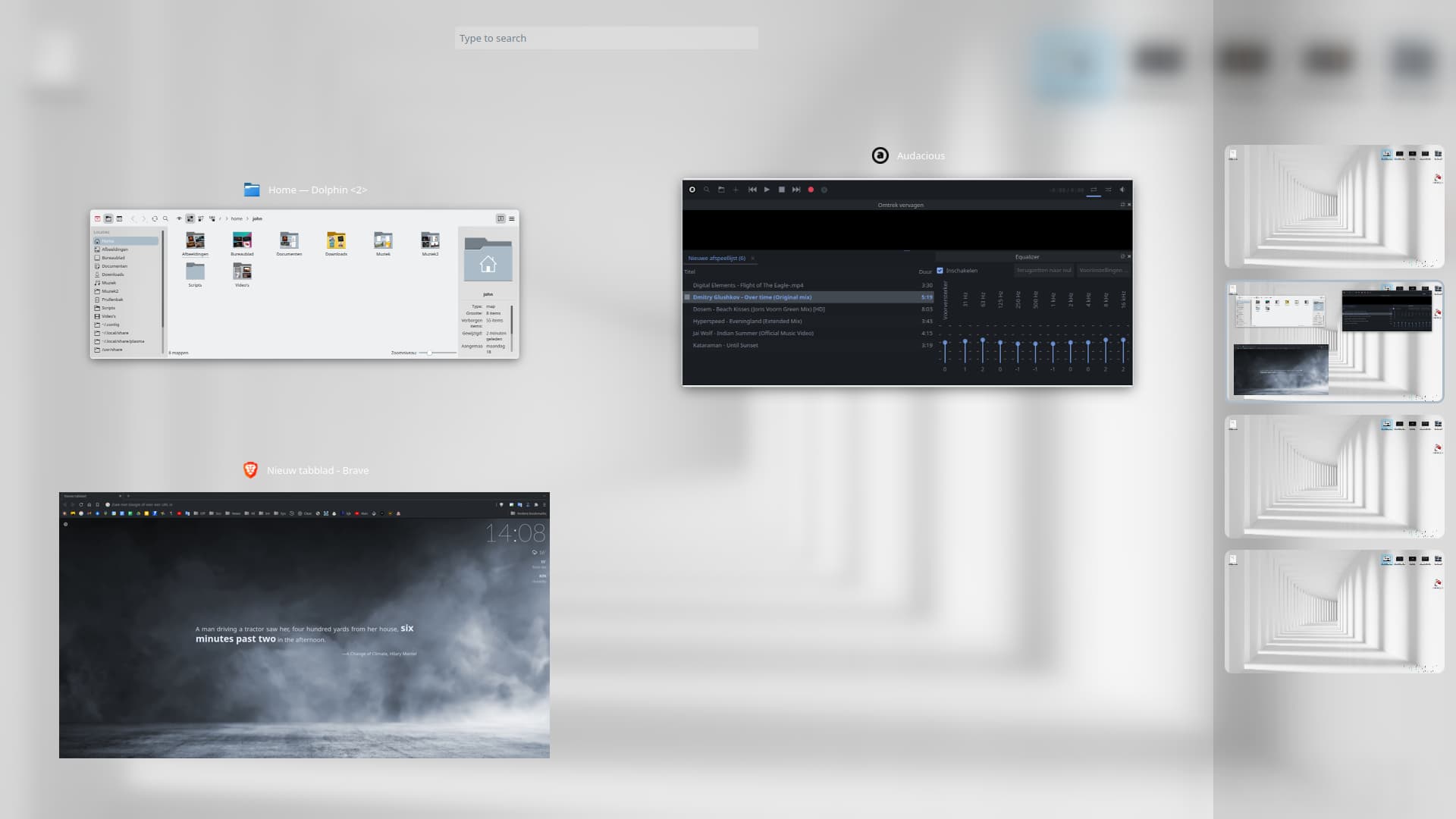
The new overview effect is great, but I think the search bar to filter windows should be moved to the bottom, instead of being between the view of the current desktop windows and the miniature of the other desktops.
This is important because a big use case for the overview effect is to be able to drag and drop windows to other desktops, having the search bar in the middle increases the distance and makes this move more inconvenient .