Could you please advise me how to add that to my color scheme?
I customize my color via the System Settings GUI, starting from Breeze.
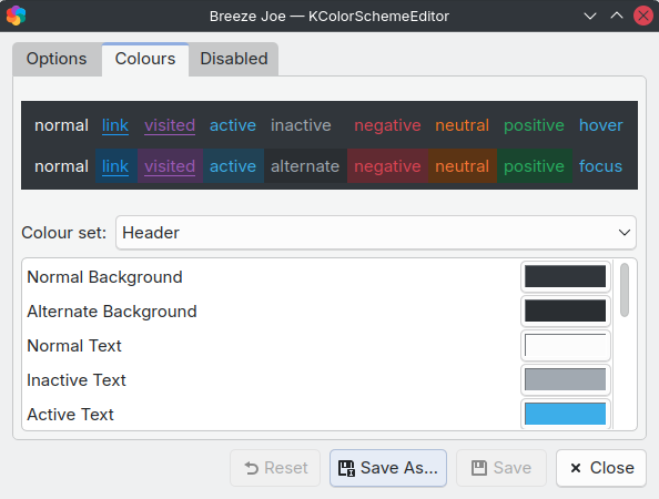
I looked at my .colors file and only found BackgroundAlternate.
Could you please advise me how to add that to my color scheme?
I customize my color via the System Settings GUI, starting from Breeze.
I looked at my .colors file and only found BackgroundAlternate.
Wow. You guys (KDE devs) are awesome!
There is already a code for a revised design in just a few days. ![]()
The new design look great.
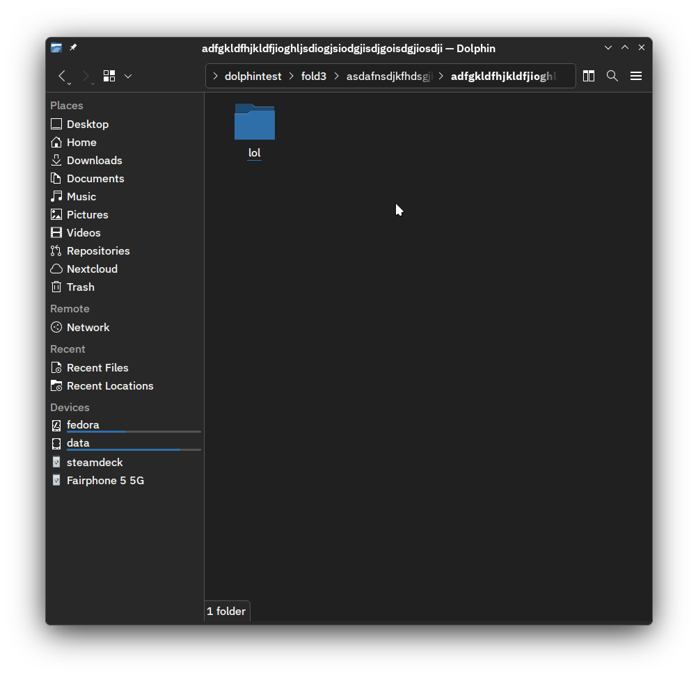
BTW, will it be possible to omit the folder icon for normal folders without special icon set for them?
The icon has a utility, and having it sometimes when having it so other times will be disruptive for users.
Another solution is being worked on.
I was wrong earlier. The issue is that your color mix is mixing clear and dark scheme.
The color used in the new component is the same as the window main view background.
I’m going back to removing all icons:
So I sort of agree with the feedback, though I do like the current iteration as well.
The MR looks like this at the moment:
I might add the icons to tooltips, when user hovers the item with mouse.
I am mostly bummed how some people have been very toxic about this: I don’t mind feedback but some people really need to calm down.
But we can maybe revisit the icons when we completely change our system styling. With luck someone has added a chevron shaped buttons to Qt at that point ![]()
Anyway, I’ll polish and wrap up the merge request, and powers that be can decide if they want to merge it or not.
Looks great, very clean and flowing and easy to parse.
Instead of waiting, @akselmo, I presume that someone could file an issue at Qt’s Jira. Have you reason to believe it wouldn’t be accepted?
Anything is possible. ![]()
@akselmo, if it’d be useful and I can find a reference issue requesting another icon, I’ll do so then, since I’d rather like this same icon for my own location bar implementation (and github.com/Winand/breadcrumbsaddressbar). [1] Otherwise, I fear I shan’t know what to say.
Could you please consider adding support for this light-dark mixed color scheme use case?
I like how Arc Darker look color-wise. When I discover that I can do the same by using Breeze and adjusting color scheme, I was quite surprised at how configurable things are. Now, I happily have the dark header/toolbar like Arc Darker, with Breeze style and accent color from my wallpaper. I know I’m the minority here, so I understand if you decide not to support this use case.
I think it looked good both ways. the fact that you could still set it to “Make location bar editable” meant you could have either style. The pure white while jarring it was still in the testing stages so I personally thought it was fine. Also the View Mode button is a great add,
Dolphin is having its looks tweaked and has a new icon with an actual picture of a dolphin inside it!
“It’s made with bits of real dolphin, so you know it’s good. They’ve done studies, you know.”
To fix this, you’d probably need to work on upstream Qt framework to allow this use-case and that’s a tremendous amount of work.
Or maybe I am over-complicating things.
It is not we decide not to support this, it is a matter of deciding where to put our time and efforts into, we are volunteers…
We’re on the right track, and that is to say, the breadcrumb bar more resembles the old layout than it has since this change.
My take on how to enhance it from here, not completely abandoning icons. There’s certainly a middle ground, I enjoy seeing custom icons resolve for folders of mine but not at every directory level. This would resolve both of the regression bugs I opened, with only minor changes to the design.
From my perspective, the biggest factor in this backlash were multiple big design changes being made at once, and as Nate mentioned somewhere in the last day or two: to a library used by highly visible applications like Dolphin and Gwenview.
Not to recommend taking any pages from big tech’s methodologies, but has anyone noticed the last time Youtube had a redesign? That’s due to small incremental changes spread out with portions of designs inching back and forth. Obviously the scale in resources are astronomic between those organizations and KDE, with the idea of those types of deployments being just as astronomic, but still, the small changes are the idea. (I learned recently this is the Principle of least astonishment - Wikipedia)
Simply enhancing the background tint first would have certainly gone over more positively than not, and could have raised awareness and discussion on the utility of the bar’s overall contents, without the fuel of unpopular design changes already having been pushed through into production.
as a bit of a newer ( ~10months) user i just wanna say this change was kinda jarring. theres nothing Wrong with it persay but i ended up here wondering if i can tweak things to make it look like it had a week or so ago before i did an update. theres something about the seperator lines vs > that just feels really weird. learning i could click the little folder icon to change directories was neat tho but that said the icons also feel a tad redundant being at each location.
as for coloring i don’t personally have issues with the way mine is set up with some purple bits vs a light or dark its pretty legible its just the separator lines that feel super awkward imo.
i’ll definitely be checking out that other link mentioned here
I hate all UI changes in general. It’s always upsetting me to an unreasonable degree. (But it’s still really upsetting me.)
If anyone likes the change, that’s good for them. But at least I want to have an option to change it back.
@Yora, this is a consistency improvement for the sake of usability. There’d be no reason to offer an option to change it, when it can just be improved in code. Someone would have to maintain both implementations. Even then, it would set a precedent for the next improvement. Then, we’d have three location bar styles.
There’s an option for that which makes sense to have multiple implementations, like view modes and date formats. Not this.