After a update, The background color of the location bar is white.
I prefer the old style which the background color is grey. Is there any ways to change to the old style?
Did you change themes? I believe that is theme related.
It is explain here
Dolphin is having its looks tweaked and has a new icon with an actual picture of a dolphin inside it! (Darshan Phaldesai, 25.04.0. Link).

In the same vein, Akseli Lahtinen added a background to the navigation bar of Dolphin and Gwenview (Akseli Lahtinen, KF 6.12.0. Link).
This is just the new style provide by KF 6.12.
I agree this white is a bit violent.
It uses the “View” color from the colorscheme, just like any other input fields. You can change that color in System Settings → Colors & Themes → Colors, and either using different colorscheme or editing the default one.
Both states of the URL bar share this color value though, even when the location is not being edited. This makes it appear as if the bar is always in text edit mode by means of the background indicator, with the only other indicators being the formatting of the text, and the presence of the ![]() button.
button.
Could it have been possible to use a new colorscheme entry for the non-edit-mode location bar’s background, rather than sharing the same value, or a dynamic mix of the “View” color and the themed header?
We will be gathering feedback over this, but there are possibilities for different color and styling changes here. I just ask for some patience in return.
The main point with this change was to make sure users know that they can click on it, as it follows other interactable UI colors. It was more about consistency. Many people did not know that it can actually be clicked on, from what feedback we have gathered.
I’ve opened these bugs to track what I’ve experienced are the two main regressions:
Background styling: BUG:501606
Breadcrumb system: BUG:501607
The latter is honestly more of a breaker than the former, and probably should have been proposed in a separate MR ![]()
Thanks for the reports, someone (likely me) will look over them when there’s time.
For what it’s worth - purely personally, I think the Location Bar changes are major upgrades, as it’s:
**OK, maybe don’t take my word on aesthetics ![]()
I understand where folks are coming from with feedback in the other direction, just wanted to explain why it was a pleasant change for me.
Just wanted to add, this kind of work is iterative. It will take time to get it right, and polite feedback will eventually nudge things to right direction.
What this means is that KDE stuff is genuinely community work: Both feedback and the work that goes to a thing is provided by the community. We do not have huge testing houses or big designer teams.
So if things are “wrong” the first time, share your polite feedback (like people in this thread have already done): What you like and what you don’t like. Then we can iterate over that feedback, so that next version will be better. And for things to get better, we ask for patience. And again do mention what you do like just so that we don’t remove that thing because we thought nobody liked it ![]()
The former style was perfect…
@makosol, I disagree. I considered it unintuitive (due to touch target identification being inconsistent amongst alternative clickable elements) and aesthetically unpleasant.
This is actually the general case for text boxes in KDE: they have the same background color whether focused (“text edit mode”) or not. The only focus indicators are the blinking cursor and the light blue outline (which the location bar seems to be missing).
Quite true, but most KDE text boxes (like the System Settings search field) don’t have an additional state that presents interactive buttons as the Location Bar’s breadcrumb navigation does.
It could have used a small bit of improvement. Tinting the URL bar’s background a slightly different shade than the header, with no other changes: I can see it being praised universally.
But i’m not sure anyone asked for a full rewrite of the navbar’s schema and interactive elements. At least I can’t tell in the MR where the discussion pivoted from a simple background enhancement to the full refactor.
@breakingspell, there was a discussion about Dolphin’s future where mockups were made, which were adhered to in the MR: phabricator.kde.org/T12308#212598. It had been well received since ⪅ 2018.
@jinliu, that’s not applicable to the majority of QLineEdit and QTextEdit elements that are always active. However, for those which can be disabled until a button has been pressed, and then become disabled again when that button has been pressed, having them be obviously so would be a significant improvement.
Is anyone willing to suggest this? It would affect more than Dolphin, and very positively.
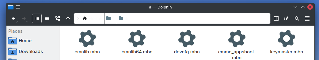
For my setup, this update make my location bar unusable in bread crumb mode. Please see the screenshot:
(Fedora 41, Breeze theme with custom colour scheme)
I think it’s because the new location bar use the edit box background colour, but use button text colour. So, please at least make it consistent by using the edit box text colour.
Anyway, even if it work, it won’t look good on my setup. So, if there is a way to customize the colour, it would be great.
Maybe we could get some inspiration from other desktops.
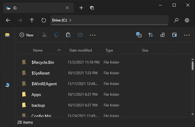
On Windows 11 File Explorer, location bar seems to still use » as separator:
(image from Wikimedia)
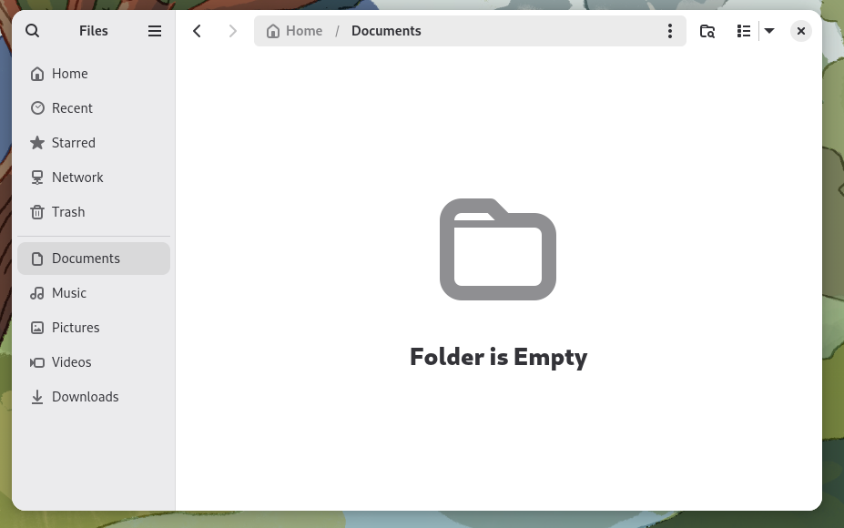
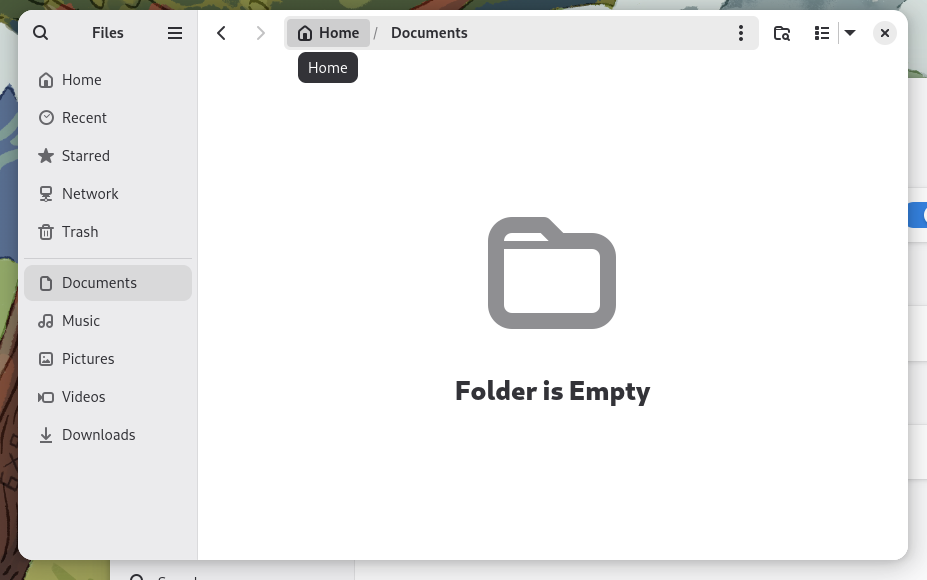
On Gnome’s Files, it look like an edit box with some nice tweak:
For me, I like how it look in Gnome. It look like a path on an edit box, but there is some effect to hint users that it’s clickable:
@ninjoe, probably best to not take inspiration from explorer.exe, but Microsoft’s new WinUI3 framework also uses chevrons in github.com/files-community/Files:
GNOME’s doesn’t demonstrate that it’s clickable unless hovered, which is one of the problems that this MR attempted to address. The current implementation in Dolphin looks like a combination button to remediate that.
I’m refactoring the code currently. Draft: KUrlNavigatorButton: Use arrow as separators (!1842) · Merge requests · Frameworks / KIO · GitLab
That’s your color scheme that’s broken, it does not define an alternate background color. QPalette::AlternateBase