Menu, standard ribbon menu design for kde plasma

I came from Windows 10/ms office.

This made me work with ribbon witch i feelt was easy to use not over velming but at the same time every comand existed in the menu so i dont ned to look around or right to use a function.

I think it would be a good for kde to have a standard ribbon that applications can use so more apps use and it makes the work easyer and alitetl bit more like my Windows 10 experience.

// Simon

As an option perhaps but as the default hell bleep bleep bleep no. The ribbon was and still is one of hundreds of reasons why people leave WinBLOWS.

4 Likes

It’s a no from me, sorry. The ā€œribbonā€ wastes vertical space that could be used for the rest of the UI.

4 Likes

make it more like my Windows 10 experience

You may read this: Linux is NOT Windows

1 Like

libre office already has this in View > User interface.. > tabbed toolbar

i don’t see why anyone would need this UX across all of the desktop.

that’s a serious no from me as well.

2 Likes

What you are suggesting is to prioritise accessiblity over functionality - a laudible aim.

LibreOffice has introduced some alternatives, like Notebookbar and tabbed amongst other options - so this could be useful in Calligra Suite.

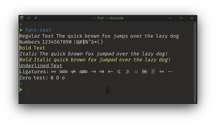
However, we have many keyboard shortcuts - for quick actions - and mostly we prefer more compact menus where they are not too complicated… and we also have Customizable Toolbars (which can thankfully be hidden; here, for example, is Konsole:

Linux also has an emphasis on choice - with optional and (where practical) editable UI modes as well as keyboard shortcuts.

So I’ll agree that a contextual tabbed/ribbon layout could be useful for some things - perhaps Calligra (Words, Sheets, Stage) and KMyMoney, probably Krita and KDenlive, not sure about KDE Partition Manager, Okular’s annotation would benefit.

Overall, I’d go hybrid - I like LibreOffice and find it easier to work with than MS Office. I think Dolphin could benefit, but I wouldn’t use it, because my Dolphin looks quite a lot like my Konsole - I don’t need icons to switch Ctrl 1 →3 for display modes, for instance, or for creating new folders or tabs… or splits.

Dolphin works amazingly well with minimal clicking - and not many icons would be needed for most people who don’t need everything on display.

Konsole would have the same problem - with a dozen options for splitting, you’d have many icons laid out - so practically this is why many applications tend to diverge.

For this reason, I prefer to keep a tight grip on the Traditional - This means primarily a normal Window menu, accessible via Alt (Usually toggled with Ctrl_M)… and I’m warming up to the F10 menu (also works with Firefox now).

For example, in Dolphin (the one with no menus or icons - is it useable?) I can hit F10 to get the ā€˜hamburger menu’; with no hamburger. To get the ā€˜regular’ menu I can press arrow UP (this goes to ā€˜More’ at the bottom of the menu, extending to File, Edit, View, Go, Tools.

I think accessiblity is important, but I think people should try to discover things too - and so whilst nobody will argue that the Ribbon is a useful idea, it is not a suitable one for broad-stroke application.

1 Like

sry, i’m like a kid with a new toy.

3 Likes

I’m one of the few (?) who actually likes the ribbon, but only for MS Office, it may be useful for similar programs, but I feel it’s really not needed anywhere else like a file browser or text editor.

I find a standard ā€œold fashionedā€ Menu bar is a good compromise between the showing of more than necessary in a Ribbon and not showing anything and hiding it all in an hamburger menu.

2 Likes

What is the best genre of wallpaper image, and why is it bird photos?

1 Like

cats have the internet, birds have the desktop, dogs have the smart phones.

1 Like

Couldn’t it be something that explodes?

No, the ribbon’s pretty good if you’re ok with the space… it’s just that not that many things you do on your desktop are going to benefit from that; I use the Compact Tabbed mode in Writer - it’s great.

For sure, Linux’ers have a habit of knee-jerking anything that looks remotely Mac’ish or Windowish before looking at them (like those stupid 'colour circle’ window decorations…).

I think the Tabbed Compact is the best compromise - especially if it’s editable - because those standard ā€˜old fashioned’ menus can be a bit much (go play with Calc, you’ll get the picture).

1 Like

Takes me back to taking my mum to a restaurant - she ordered ā€˜Soup of the Day’ because she had that last week, and it’s her very favourite soup.

I do recall that the menu was not of the ā€˜ribbon’ design, being more of the ā€˜laminated printout’ variety.

The best Genre of wallpaper - dark, light, bird, landscape, tilt-shift - all beaten by the ā€˜Favourites’ folder.

That’s my favourite Genre.

1 Like

You know, I’m going to try it out for a while in Calc and Writer. I might get used to this!

On average that may be true, but I can tell you for a fact that in this case that’s not what’s happening. When Windows introduced the ribbon in Office most of didn’t have an issue with it cause it actually worked for office, but When they decided that that had gone so well that they chose to add it to Windows Explore over 80% of their user base cried foul. It was one thing to have the ribbon on an app that most of us used full screen, but to add it to a app most of us use windowed to save desktop space to run other task was something else entirely different. The saving grace is tweak tools new and old found a way to restore the previous way.

2 Likes

I also like the ribbon. Back at my old job at a translation agency that was kind of a requirement when we started using LibreOffice, it’s more effective for straightforward workflows than the menu bar with an overwhelming toolbar.

Functionally it’s just a tab bar for toolbar controls, it’s not a particularly unique control. There could be a Kirigami / Kirigami Addons control for this, in case application developers would like to use it in their own apps.

(That’s how it works, it’s not really a matter of ā€œhey, let’s use this design choice everywhere!ā€ as people are thinking of in this thread)

1 Like

The suggestion was for it to be use in Dolphin by default. VERY BAD idea. A toggle for it yes, but on by default simply no. There have already been more than a few design changes foisted on peeps that should of been toggles.

1 Like

I would say it would be a bad idea as a default look. But as a alternate look for menubar, it could look quite well.

Maybe an option ā€œshow the menu bar as a ribbon menuā€œ in dolphin or another app with a menubar…

Idk how it will look like but that could be fine as a proof of concept.

1 Like

Well, that might be your experience with MS/Office but it sure hasn’t been mine. From day 1 I hated it so much. I could never find a menu item it that horrible system, then you need to open that tab and search to find out it isn’t there, then the next tab and when you were lucky you found it there.
On June 6 (yes D-Day) of this year I closed down the last Windows computer in my life since that was the last day I worked, I am retired now. No Windows stuff in my Linux, not now, not ever.

You are also dating yourself as a fossil (I’m over 60, but not yet turned to concrete…) who possibly experienced early softwares like Word Perfect before we had all the bloat of the desktop, the toolbars with icons… so that you would see accelerators and activate (Alt_F for file, etc).

Then you get a long dropdown menu - often with trees… so a dozen different ā€˜split’ commands go off from a ā€˜Split >’ that requires careful navigation - and you quickly remember, or set new shortcuts, for any frequently used items there… or you move that specific item to a toolbar for quick access.

But given that there are SOOOO MANY different menus and trees, wouldn’t it be better to have a separate menu for those? That’s where the Ribbon idea comes in - it brings in TABS to the toolbar, so you can click or use a shortcut to activate View tab, and see the different options there.

When thinking about these issues, you have to take care to be logical and impartial. Ignore any affiliation with any historical operating system.

You must also cater for different kinds of users - some learn to use keyboards, others never do - they ALWAYS need an icon to click, however ridiculous or inefficient that is. When I used mouse gestures on X11, I could do more things than you can think of - forget having to remember a hundred keyboard shortcuts, I can draw a particular shaped arrow to toggle maximising a window only horizontally, or vertically… to open a window, close it, open new tabs, re-open closed tabs, re-open closed windows. Everything you can do with shortcuts, and a lot of things you’d never remember shortcuts for… toggle window decorations, go to desktop 3, take this window to Desktop 3, SEND this window to desktop 3… show all desktops/windows…

It’s difficult NOT to look down on other people who don’t understand MY way of doing things, or understanding WHY it’s so obviously better… This becomes truer the longer you use a particular system. This is why Windows users cry foul when they want to get rid of middle-click paste because it messes up their scrolling…

So what we need to do is look at the ideas for tabbed toolbars/grouped toolbars and WITHOUT LOSING the traditional menu system (it’s always thrown in at the end of F10 menus for applications) find other ways of working.

What you need to do is to come up with a very specific incident, a precise example, where you had a problem with using the Ribbon vs another variation.

Will you cater for NEW USERS? Will you cater for people who used Windows?

Applying Text Formatting in Writer:

Classic Menu Approach:

So let’s get some text up here, hmmm so I can see Format (Alt_o) Character (h) which opens a multi-tab dialog… so you can manually pick your font/size/colour.

Same for Paragraph spacing - Format - paragraph…

There is a pain point here, with overwhelmingly long menu dropdowns, and then nested menus… and quite often the tools are disconnected.

With the RIBBON

You go to ā€˜Home’ tab - you can visually pick font/size/colour AND paragraph spacing from there… and the menu doesn’t get cluttered up with too many other options (So make this editable - you can fully design and customise your icons layout across tabs).

There’s NO DOUBT that the Ribbon makes things more discoverable by grouping things visibly and labels reduce the guesswork. As an experienced user, just as a noob must accept, Contextual tabs are more efficient for such an incredibly complicated task.

  • For Keyboard Ninjas, there’s no comparison… Alt_F for file, or Alt_o_p for paragraph - so much easier (IF you already know where you’re looking).

  • What I love about OLD style menus:

  1. I remember Alt_o_p will do paragraph. Screw your toolbars and your icons.
  2. I forgot how to do ā€˜word wrap’ - so hmmm let’s go Alt_V view, no shorcut - so arrow or mouse to get ā€˜Word Wrap’ - we see Alt_W toggles wrapping. How easy was that? From now on, I don’t need to waste more time in the menu - and I can toggle the menu off again.

We also see other options - if one’s interesting, you can then go to keyboard shortcuts and fix your lack of accelerator for that item…

Really efficient BUT more work to set up.

This is especially true with Kate editor - have you ANY idea how many different variations on the ā€˜split’ icon you can specify in the keyboard shortcuts?

With a ribbon, that’d be simpler.

And the final comment - Software should be designed with a ā€˜useable with zero configuration’ option… without losing too many useful legacy features.
1 Like