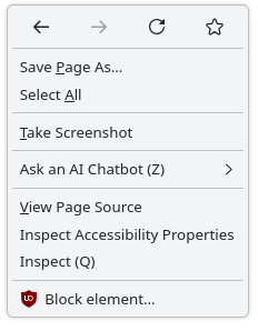
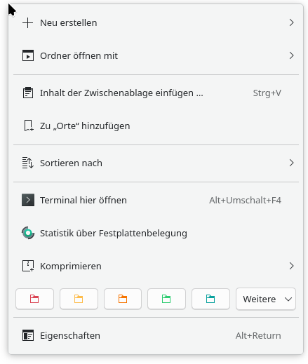
Quite some time ago a Plasma update caused all the menus of KDE apps to become in my mind a bit excessively padded out. Compare e.g. the context menu of Firefox:
No worries, but I do second the idea of having a more “dense” UI mode/style in general for smaller screens, to not waste so much space. For example I’ve also changed the Breeze window decoration button size to “tiny” to be more reasonable for my 1080p display. So it would be really nice to have sort of a meta-setting to make everything more tight…
Anyway, sorry for the ramble, and thanks for working on this.
There are still a lot of current laptops with screens that are only 768px in height. Such menus were difficult enough with the before-size. Unusable with the after-size.
Ideally we would allow users to change the density, but in our current theming system, it’s very time consuming to make it work nicely, and requires a lot of changes and testing.
I haven’t updated yet, Manjaro hasn’t released the update yet. But I absolutely detest this trend of increasing padding in UI elements. Way to reverse any advantage gained by increasing resolution!
I hope the developers reconsider or at least provide users a way to adjust
I’ve tested it to work on Dolphin, Konsole, System settings, and the Plasma shell. Unfortunately, not yet with Neochat but I suspect that’s because I need another patch to qqc2-desktop-style. I’m not entirely sure how I can make it respect the application style settings, as I don’t see any code within the repo that can read/respect those settings. But maybe I could be the one to add the plumbing for that Otherwise, I’d love some pointers.
That’s probably a good idea. I’ll give it a try later