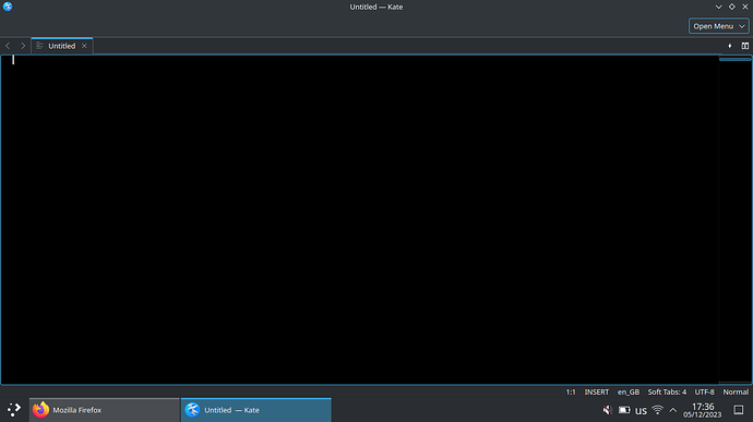
Hi,
I find it very neat and convenient that the menu bar at the top can be hidden and it then reappears as a small link at the right side of the Toolbar. However, I am not using the Toolbar either and thus, an enormous amount of space is reserved just for this little shortcut to the menu. I would like to see that shortcut go on the Tab bar, right next to the Quick Open and Split View buttons. Can we possibly do that?
I chose the text only version instead of the hamburger menu, because the Tab bar becomes slightly more narrow this way, and it comes out as a nice link which says “Open menu” plus a downward-pointing tick/arrow. It would look better if the “Open menu” text is removed and only the arrow remains! Then if it’s placed to the right side of the split button, and the space taken by the unused Toolbar is removed, we have the perfect minimalist design!
That being said, I have no use for the Quick Open button, so I wouldn’t mind removing it as well.
