Here, the comment marked with a red box is mine, but does not seem to be until I hover over it and see the “edit” button.
The same is not a problem in case of bubbles view.
Proposed changes:
Moved Avatar and Comment title to the right. Fixes problem 1
The text of own comment now starts on the far left, making it so that own comments without a title can still be noticed as different.
Please ignore the nonexistence of other user’s profile picture in this image. It’s probably because I didn’t install the compiled program properly. Also, the highlight is just due to the mouse hover and not part of the change.
If the above seems desirable, please inform me, so I will port my code changes to master branch (Currently on the KF5 branch) and send a merge request.
Preferably I would have a title and avatar on all own-user comments in compact view for problem 2.
You are right, I should have given a report first.
But at the same time, I haven’t added any code specially for that and the change is just a side effect.
The change in left indent was initially to make sure that the width of the text area remains the same as before.
Yeah it should be pretty easy to sort as well probably just a single line fix for making sure that local user avatars are shown in compact mode
Edit: In fact I think I already fixed it in the latest version as on master it works fine. Last time I touched that code was September so the current stable release may not have it.
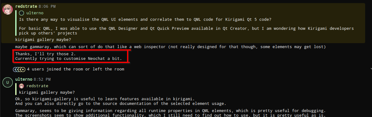
@nvrWhere
I was going to submit a bug report for this, but …
When editing a previous message (cursor is currently in the editing box), if another incoming message comes under it, the cursor position changes to the Chat box (for new message).
Regarding the original discussion:
Now the decision to be made is whether this change is to be made configurable or it is fine to keep it as I have currently done.
I would call this bad behaviour, if a user is editing it’s an intentional choice by them and my general rule of thumb is to respect user actions. So we should just fix
Regarding your original suggestion I wouldn’t accept the change I don’t think there is a need to align the messages to the left, it won’t look very good. Especially when as mentioned it’s already been fixed so the avatars appear as they should for the next release.
I’m also working on some further improvements for compact mode that I noticed when I took at look at the current state for this discussion.
My original requirements for making my change was to make the “own message” or local user message be more conspicuous in compact mode (as it is in bubble mode) in any possible way. To resolve above problem 1
As long as that is fulfilled, I don’t have a reason to try any additional customisation on my own.
It is not necessary to have the text aligned to the left and was only a side effect of the main thing of moving the own avatar to the right.
Alternatives might be:
Colouring the own message box background
Adding a single line or a border line to the own message
Really anything that would make it stand out enough from the others to feel like an own message, while not being too distracting, or becoming too light.
Feel free to make a suggestion for highlighting your own messages in bubble mode the background color of the bubble is changed so it’s not without precedent.