You’re definitely right that relying on colour to convey meaning is a big problem for accessibility and I like that you’re moving away from that. The argument that devs can add colour on top as desired is also good.
However, for the MIME types especially, the lack of colour really reduces how easy they are to parse, as the text of these symbolic icons is tiny in real usage. If a colour is necessary to understand an icon or distinguish it from another it’s bad, absolutely, but having a characteristic colour additional to a unique design often significantly improves recognition and distinguishability and it would be a shame not to leverage that.
People are used to document/presentation/spreadsheet files being blue/orange/green, and PDFs being red, and the colours for different programming languages are generally both unchanging and distinctive. I think it would be a significant hit to usability if such icons were monochrome.
Tbh, the argument of colour aiding recognition (as long as the monochrome icons are distinguishable already) applies to an extent to all icons. I wonder whether it would be possible to have two sets, identical in shape, but with one set in colour and the other monochrome, where all icons in the colour set have a (usually arbitrary) colour, not just some, and all in the monochrome set are monochrome.
Just looking at the different status symbols as examples – there is a limit to how different the long row of WiFi icons can look when monochrome, and making the failed/broken/disconnected symbol red would help. Always with the condition that icons must work in monochrome first and foremost, with the colour just a little recognition aid applied on top.
There are several colour-blind-friendly palettes out there, so it would be an option just to use one of those: Paul Tol’s bright or vibrant palettes would work well for example, or my preference which would be the very nice Okabe and Ito palette:
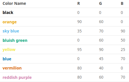
which would work well in an OS because it has colours that can be used to indicate bad (vermilion), ok/iffy/imperfect/average (orange) and good (bluish green).
In fact I’d be happy to take it on myself to create a colour version of the icon set once the monochromatic version is finished, as I’m suggesting to use the same forms for both versions. I can’t help design the shapes, but I could certainly apply a defined set of colours in an intuitive/logical way.
