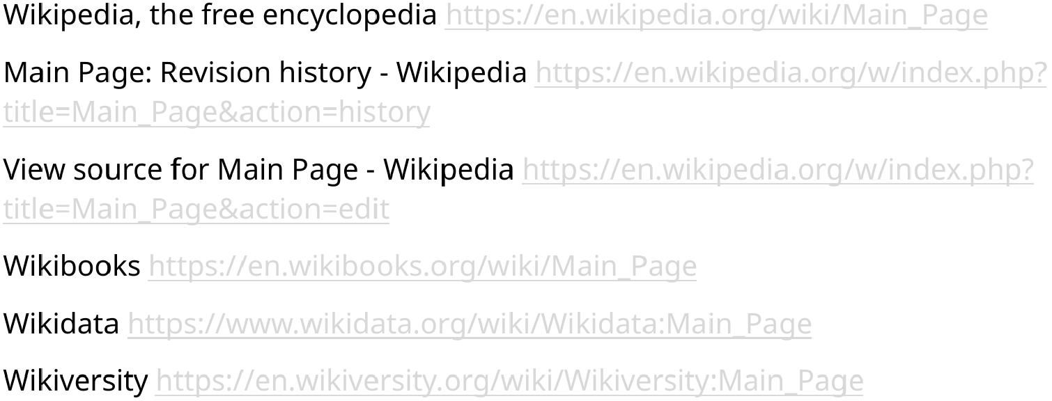
Hi all.
In Okular:
Hyperlinks are EXTREMELY dim, a very light colour, and difficult / almost impossible to see.
No matter what options I choose, the colour is very similar to the page colour.
Example:
On a white page, hyperlinks are a very light grey colour, almost white.
When I “Change Dark and Light Colours” under accessibility settings, hyperlinks are almost the colour of the page, no matter what colours I pick for dark and light.
Things I have tried to change the colour of hyperlinks:
Changing “Settings > Colour Scheme” to any/all of the various options. No effect.
Switching options under: “Settings > Configure Okular > Accessibility”. My preferred default setting here is “Change Dark and Light Colours”, but it doesn’t matter what option I pick. The hyperlinks are almos the colour of the background.
I have examined the 2 okularrc configuration files under .config, and cannot see anything relevant in these.
When I have Okular colour settings set to default, the hyperlinks are an extremely light grey, almost the colour of the white page.
When I am in dark modes, the hyperlinks are almos the colour of the black page.
This is a fresh install of a debian fork. I am using the settings I always use (I think), and it is the first time I have encountered this problem.
Apologies if this has been answered before. I had a look around the internet, and searched these forums. Couldn’t find an answer.
I suppose the setting could be under ~/.config/okularpartrc
but if so: I am not sure what to modify. I have tried plugging any of the hex values at the bottom of that file into a colour picker, but the colour picker doesn’t show any of the colours I am seeing for hyperlinks in Okular.
Any help would be greatly appreciated, as this is hindering my ability to study and write documents at the moment.
I guess there must be a lot of other issues to solve, but is there really no simple fix for this? It makes Okular very difficult/annoying to use for any document containing hyperlinks.
Please see the attachment. This is how links appear in Okular. VERY faint! It doesn’t seem to matter what I choose under
Settings > Colour Scheme
or
Accessibility > Change Colours
Nothing makes a difference. Links are always a relatively faint colour and difficult to see. Is there not a single member of the KDE Community that can advise on how I can modify this, or what setting / config file needs to be modified?
It’s really difficult to answer that.
I’ve tested it on two files (one created in LibreOffice and one downloaded from the internet)
I don’t have that problem. The links appear in blue and are legible.
Could it be a problem with the KDE theme?
Does the problem occur with all files?
I am not using KDE as my desktop WM. I am using XFCE. Not sure if there is some way to toggle theme for all KDE applications that run on my machine. I wouldn’t think so, and it wouldn’t sound like a good idea if so.
When I set Okular to default colors, hyperlink text is very light gray and difficult to read.
It would be really great to be able to manually change the color of hyperlinked text.
Also, an option to increase the length of the list of recently opened files.
This is the kind of thing I would have thought would be included in
~/.config/okularrc
Or some other similar config file.
Is there a setting available in some config file?
That would be ideal.
This is important information.
XFCE does not use Okular as its default PDF viewer. I believe qpdfview is the default viewer.
Using software designed for a different desktop environment (such as Okular in XFCE) can cause display issues.
Which distribution are you using? Did you install Okular via Flatpak or through your distribution’s app store?
Well… that’s what I’ve noticed over the last… 20 years now. And on all kinds of distributions.
But you’re a KDE developer. Perhaps you could explain to @spaz how to sort out his problem.
And I have ABSOLUTELY no wish to stir up controversy. I have far too much respect for all developers, whether they’re from KDE, GNOME…