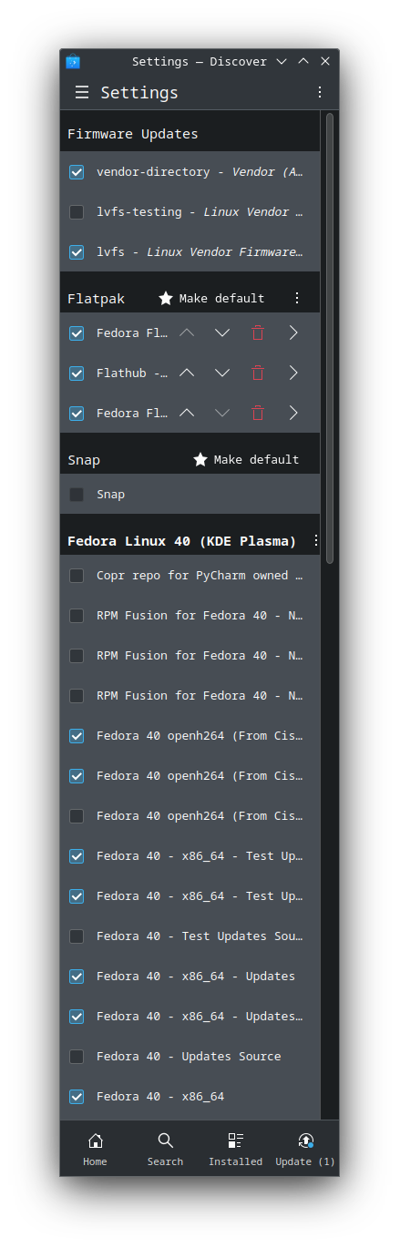
Obviously that’s longer than a regular smartphone display would be. However, width is, and together they demonstrate the significant difference that not having the repository management buttons in the lower entries has on readability. Putting those arrows and bin symbols into a context menu would improve this.