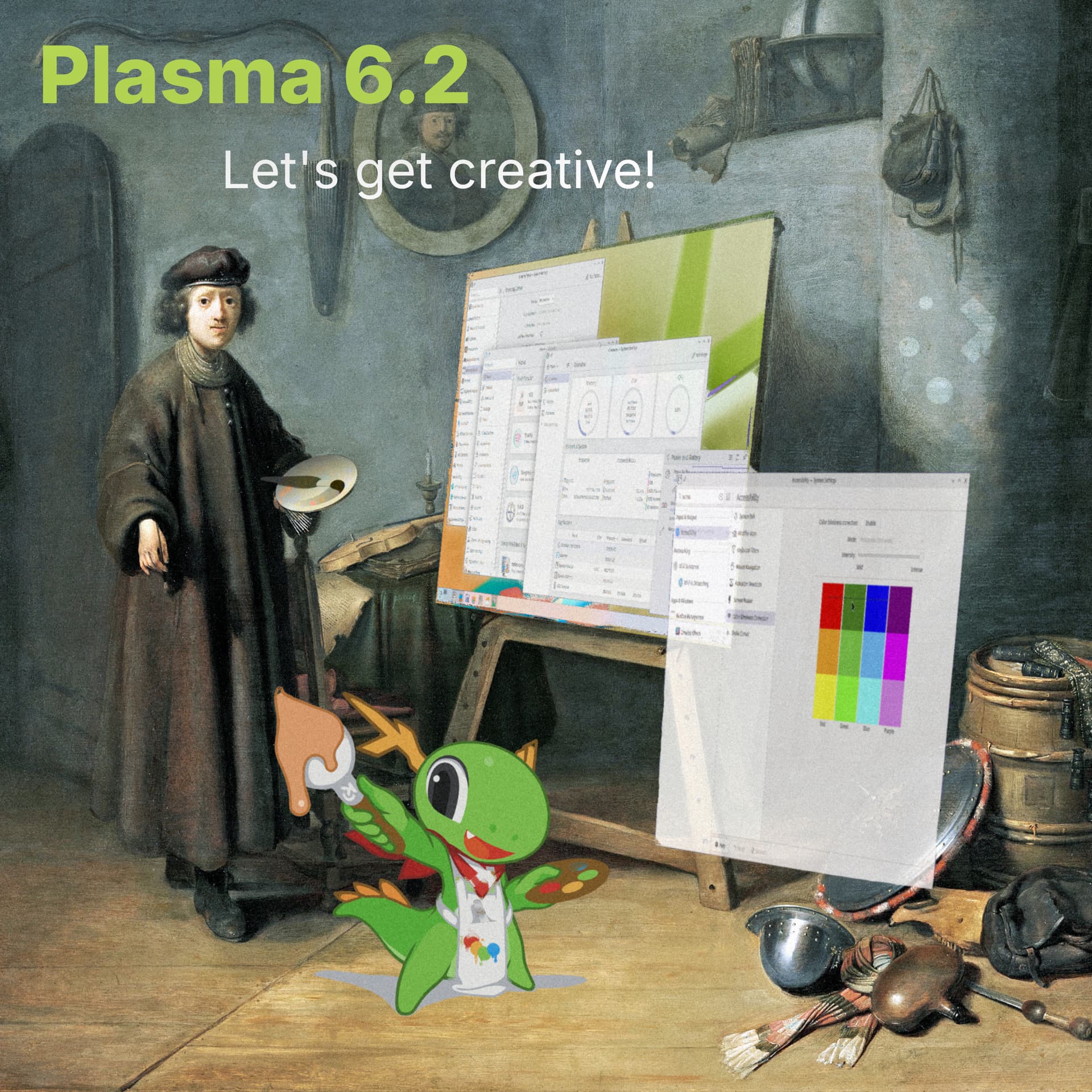
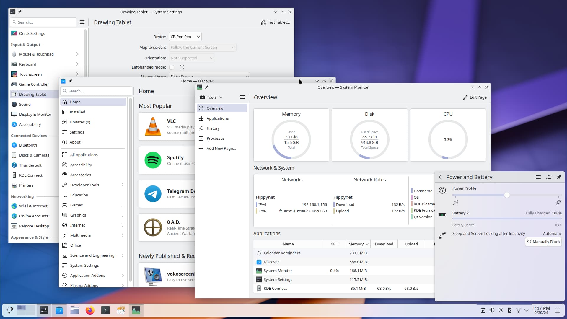
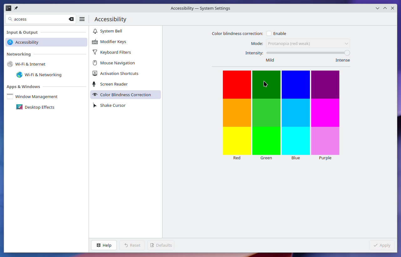
Check out the inbuilt tablet configuration, improved HDR and color management, enhanced accessibility, cool visual design upgrades, granular power controls, and much more.
16 Likes
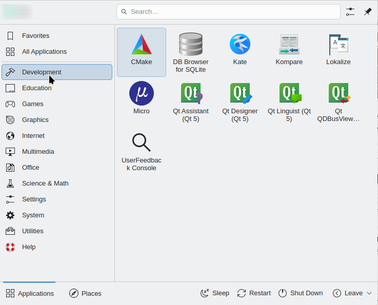
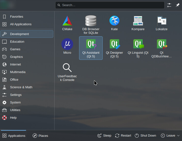
Guys+gals, I don’t think that the new monochrome icons in kick-off look better than the previous ones, it looks literally like the poor thing was skinned alive, it just lost its personality, looks naked, traumatized and dull (and a bit amateurish, Education? a rectangle with 2 dashes? seriously? Games? Its icon looks like a monster, at least it could be the iconic Invaders alien…). If you want them to be that thin, then the cogwheel for “System” should reduce its “fat” as well and have just an outline, and “Graphics” should get a new one because I don’t know what it is supposed to show (and without the grey fill). “Help” doesn’t have a new one?
Imo there should be an option for choosing between the colored ones and the new ones.
I really hope this is not a sign of losing all the nice icons everywhere, like in Settings. KDE used to be slick, this is clearly a visual regression, if not a “butchering without anesthetic” and a return to monochromatic 1980.
2 Likes
I think the new one looks great
2 Likes
I also do not like these monochrome icons. Colorful enable me to find what I am looking for much quicker, as I can quickly see the right item based on color.
1 Like
Cool, after upgrade to 6.2 session restore feature finally start works ![]()
I like the monochrome icons. I think they are elegant. That being said, you can already change these icons based on your selected icon pack so if you hate them it is very easy to select a different icon set. You could even fork the breeze icons and keep them colorful.
2 Likes
Some icons dont revert to their colorful counterpart, which is a bummer
I think it’s fine for the new icons to give it a more modern/professional look, but I would love to have the old ones available (fully) again, just for the folks that did like them!
But yes, currently (or at least on my installation on Neon with Plasma 6.2) the Dark icon set kept the old design of most icons
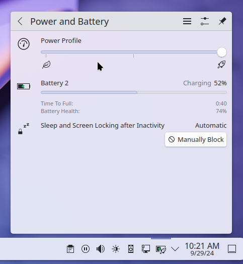
Edit: Still a Linux newbie, but so far, update is cool! Love the addition of an easy “block this app from preventing screen locking”, it’s so handy for me!
I know it’s relatively minor, but this is a “gamechanger” for folks like me who constantly have trouble remembering which device is “Family 17h/19h Audio Controller” and which is “ABC Device Quotient Parallel Gizmo 42”
Thanks!
4 Likes
![]()
After I have already change that game, using wireplumber, to something I currently really like I just hope this changes my specific setup not to something comparatively worse again.
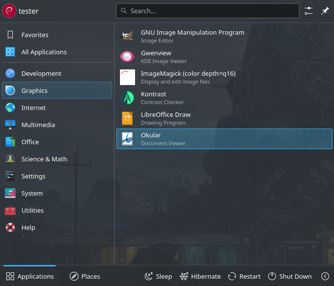
Out of curiosity, is there a particular reason why the monochrome icons aren’t being used with the Breeze Dark theme but are forced with the Breeze (light) theme otherwise? Shouldn’t it also “conform” to the new HIG?
(this is “Breeze Dark” global theme, but with “Breeze” icons)
One can also toggle between symbolic and monochrome icons by modifying /usr/share/plasma/plasmoids/org.kde.plasma.kickoff/contents/ui/KickoffListDelegate.qml.
Simply change
if (root.isCategoryListItem && src.length > 0
                    && src.search(/:|\/|\\|-symbolic$/g) === -1) {
                    return src + "-symbolic"
                }
to
if (root.isCategoryListItem && src.length > 0
                    && src.search(/:|\/|\\|-symbolic$/g) === -1) {
                    return src
                }
Not sure if this is recommended.
1 Like