Looks like the discussion around flat and raised buttons has become hotter among KDE devs recently, but I haven’t managed to find any community discussion of the issue, which I think is needed.
The point of the discussion is that quite some people have issues detecting that flat buttons can be interacted with, which makes the UI less usable and accessible.
Looks like there are two approaches to improving this situation:
Dropping flat buttons in favor of elevated ones while decreasing the overall count of buttons in UIs.
The problem of this approach is that it would make button-intensive UIs look heavy and cluttered.
Redesigning flat buttons to convey that they can be interacted with, without making them too heavy.
The problem of this approach is that it is just difficult to do, especially in a way that fits into the current design.
The solution that I find the most promising is this merge request for redesigning flat buttons:
I think in needs to experiment a bit with padding, coloring, rounding and edge cases. A very thin border could also fit in well. The border might even be a gradient, but that has the chance to make the buttons too heavy. (Instead of a full blown shadow, a 1px gradient as the border, going from light to dark in color as it goes from top to bottom in space).
What do you think? Do you have problems with flat buttons? Should they be redesigned or dropped? Do you like the proposed redesign for them?
this might be too much of a throwback to blister buttons, but they were otherwise flat except for the little bulge in the middle where the blister was located.
so instead of shading at the edges to make the button look raised, how bout shading (and/or highlights) in the middle to make it look like a blister?
As a relatively new Plasma user (less than a year), I don’t like that idea of repurposing one color to use for another task. It’s already difficult enough trying to figure out what does what.
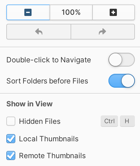
Here is Plasma 6 Beta 2 with stock Breeze except I changed the button color to light green. We can see the drop downs and the buttons at the bottom are colored as expected, but not the menu bar buttons. In fact, the image even shows icon only, menu bar style buttons with the new color on the color scheme itself (the pencil and the trash can) implying they too should get this color even though they don’t. However, over in Dolphin they have decided to make the entire column bar and the little circle zoom slider at the bottom use the button color, but not what to me are buttons on the menu bar. The ‘details’ button does have a thin border and a color to it since it needs to identify which of the 3 options is selected. Other colors seemingly don’t exist. For instance, my mouse is hovering over the dev folder but that is not the ‘hover decoration’ color and lib has, what I’m guessing is, the ‘focus decoration’ color having been selected. In fact, that specific hover color does not exist in the color scheme. I’ve tried many color schemes and they all seem to be using a faded version of either the hover color, accent color, or something else not selectable or changeable.
I do like the hover border on buttons. All the alternatives I’ve seen look dated.
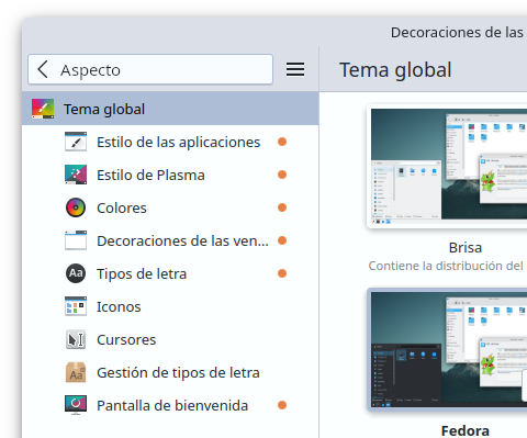
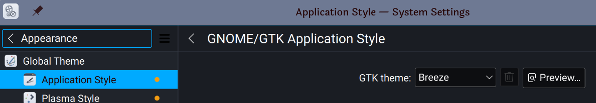
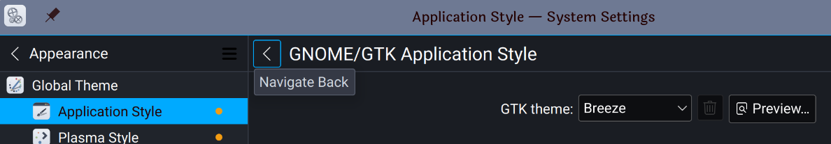
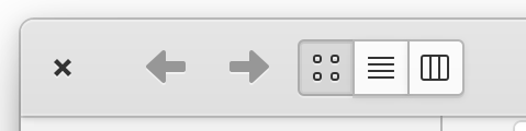
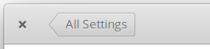
However, here again there does not appear to be a standard being implemented. Two pics from the same page showing what is clickable: ‘< text’ or just ‘<’. Inconsistency like this is part of the reason why people get confused and don’t know what is clickable and what is just text in menu bars.
if the thought is they need to be distinct to regular buttons, offer another color theme option, ‘menu bar button’, instead of repurposing an existing color. This allows those that want it the ability to enable it and control it without impacting the rest of the look. If a color scheme doesn’t come with that setting, it can either use the existing button color or the menu bar color by default but can then be changed going forward.
an option to enable/disable an outline for menu bar buttons within the Application Style. This would be that existing thin outline color that already exists on the selected buttons shown above with ‘details’ in Dolphin, just not filled in with color.
if that option is created, you can offer to extend the ‘alt’ key which currently underlines the Menu and regular button shortcut keys to also outline all buttons (regular and menu bar) while depressed. This would provide temporary clarity when desired as an accessibility add-on, but can remain off the rest of the time for the seamless look.
Didn’t expect to see my MR here. Just to clarify, the MR is nothing final, it’s just a quick way to showcase and discuss a potential solution. (I’m sure most of you know this, but it’s good to mention it anyhow.)
Basically the problem I am trying to solve here is that it can be very easy to miss flat buttons. I know I have missed them a few times.
The other solution for this problem, IMO, would be that all flat buttons have an icon that indicates that it’s something interactable, just like we have learned when using our phones.
Comboboxes and elements that do not have an icon could have an underline, so it looks like a clickable link, since that’s also something we’ve learned when using computers. But I do not know if that’s too confusing.
With all respect to Oxygen creators, Dark Breeze (not Light Breeze) is by far better than any theme provided by any Linux desktop, it even beats that Dark Adwaita theme.
Making every clickable item noticeable to eyes will give us an interface filled and crowded with many square buttons.
Sometimes a meaningful icon (e.g check, trash, pen… icons) is sufficient to tell the user that the item is meant to be clickable, and sometimes simply the label with the position is enough to convey the meaning.
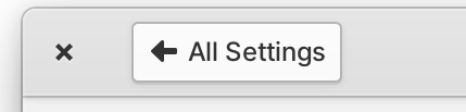
The real problem with those buttons is their position in the same level as the page title, it’s like KDE is following GNOME direction by moving and adding every button to one place.
In that “Window Decoration” page, there is enough empty space at bottom for that combobox, and the previous tabs usage was much intuitive than what I saw in that draft.
I don’t know the real intention of adding those long buttons/comboboxes near title page, but if it’s forced design, it’s better to use different background color, because they really look ambiguous and hard to see as clickable item, I’m used to seeing only page title at that level.
First of all I want to clarify that this is not a comparison but a suggestion, I think that certainly what could help this problem, would be to make some buttons not flat and that those that are flat have icons a little more specific.
elementary has a good mix of flat buttons with specific icons and buttons that were previously flat and became regular buttons.
I’ve also noticed that they vary in the use of color tones of the fonts, so you can get an idea of which ones you can interact with and which ones you can’t.
Looks like colored icons help out a lot in Pantheon. Looks like most of their interactive items are either colored of elevated, while static at the same time have little color and are flat.


