Plasma X - a glimpse of future

I hate to be kind of negative and I still think you are really talented, but I showed the screenshots to some older, less “computer-savvy” people:
Although they said the screenshots “looked cool”, they could not figure out that e.g. the icons at the bottom are in a panel (in fact they could not understand that there is a panel at all “when there is no panel…”).
They were convinced that these were icons on the desktop (as they were used to e.g. in Windows).

This is one example why I consider those totally translucent themes a bad idea as a default.
It makes some elements of the GUI much harder to understand for “ordinary” people.

6 Likes

I would agree with @schwarzerkater , completely translucent themes i feel are generally a bad idea. The UI shouldnt be just pretty but also able to direct users properly to the necessary information even if its their first time using the system. You also lose contrast which for the visually impared or just those with moderately bad eye sight makes things difficult to read. This is a very pretty look i will say though.

Make sure youre not just designing things to be different because you want them to be different. While some UI design elements between desktops can feel a bit sameish these days thats for good reason. We are at a point of several decades of trial and error for UI design and your primary focus should be how easy is it for the user to interact with the system and how does the look/theme augment that goal?

If your end goal is simply to make KDE look different because someone said KDE looks like something else you might consider reevaluating the “WHY?” of things. Different for different sake because of a stranger on the internet shouldnt totally dictate your actions/design choices and it shouldnt matter if windows, macos, gnome, xfce, etc. cannibalizes and idea from KDE or KDE from them.

6 Likes

thanks. nothing wrong with your opinion and its all completely valid. as long we keep a good conversation truthfully im wanting these negative and critism more to improve the concept.

in my humble opinion:

the phylosophical problem

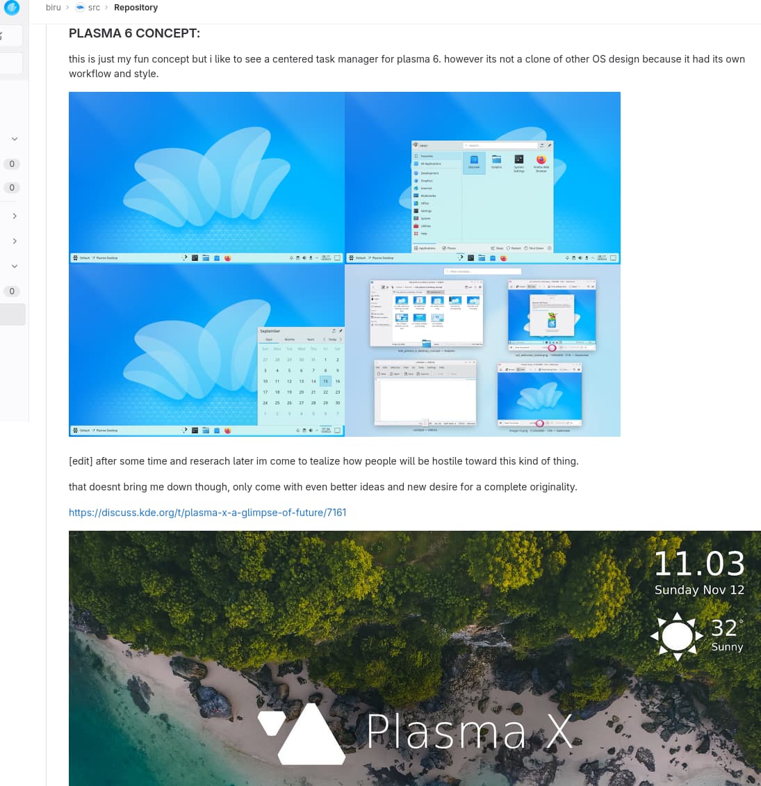
Plasma X actually my last and final reevaluation. before there are mixed suggestion from various people (like my serenity wallpaper with centered task manager that spread more agitation than its worth (in some other place)).

in the end its just like the wise fable “the miller, his son and the donkey” story. for this one concept im decided to follow my heart and confront the problem it would entails.

the translucent theme and cognitive problem

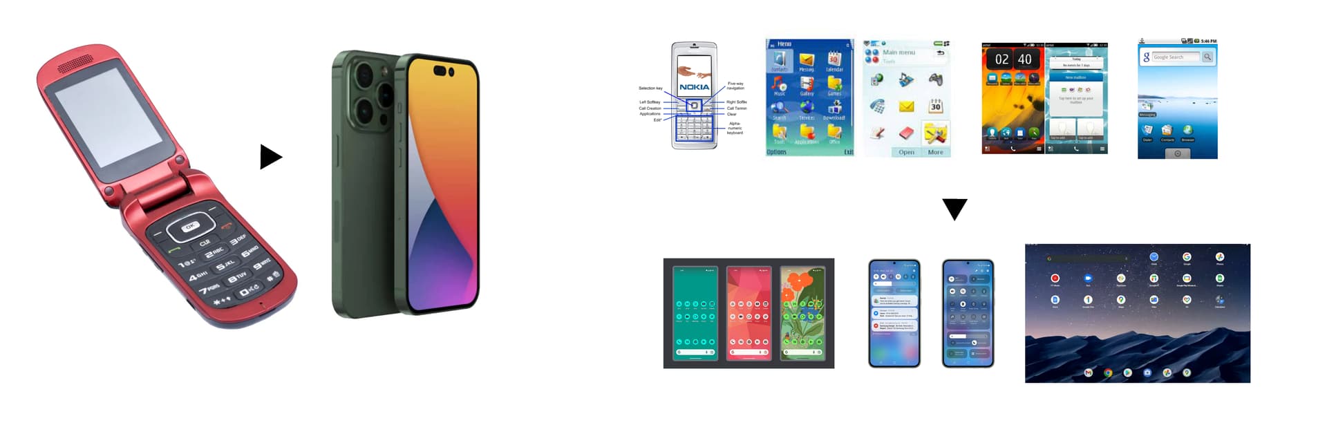
i think this is just a matter of habits. its the same problem with our phone nowadays but the companies back then continue to shift from “opaque & full of clear indicator” trends into now “translucency & seemingly hid standard feature” trends.

if you give nowadays smartphone to classic phone user they woulndt know that there is actually a dropdown QS beneath in the top area, long pressing on invisible homescreen will bring widget menus, screen gesture, speak asistant etc…

the translucent theme and accessibility problem

its for sure, but since the beginning these are not intended to be a pursuer of “one size fits all” design but rather “one settings fix all” design.

rather than prioritize to make a default that can satisfy wide variety usecase as possible, im thinking to make it easier for the system to adapt to any user needs instead.

my possible solution

to keep a space of innovation while keeping user expectation and satistification im thinking something like to make it easier for people to switch into comfortable environment they want from the very beginning.

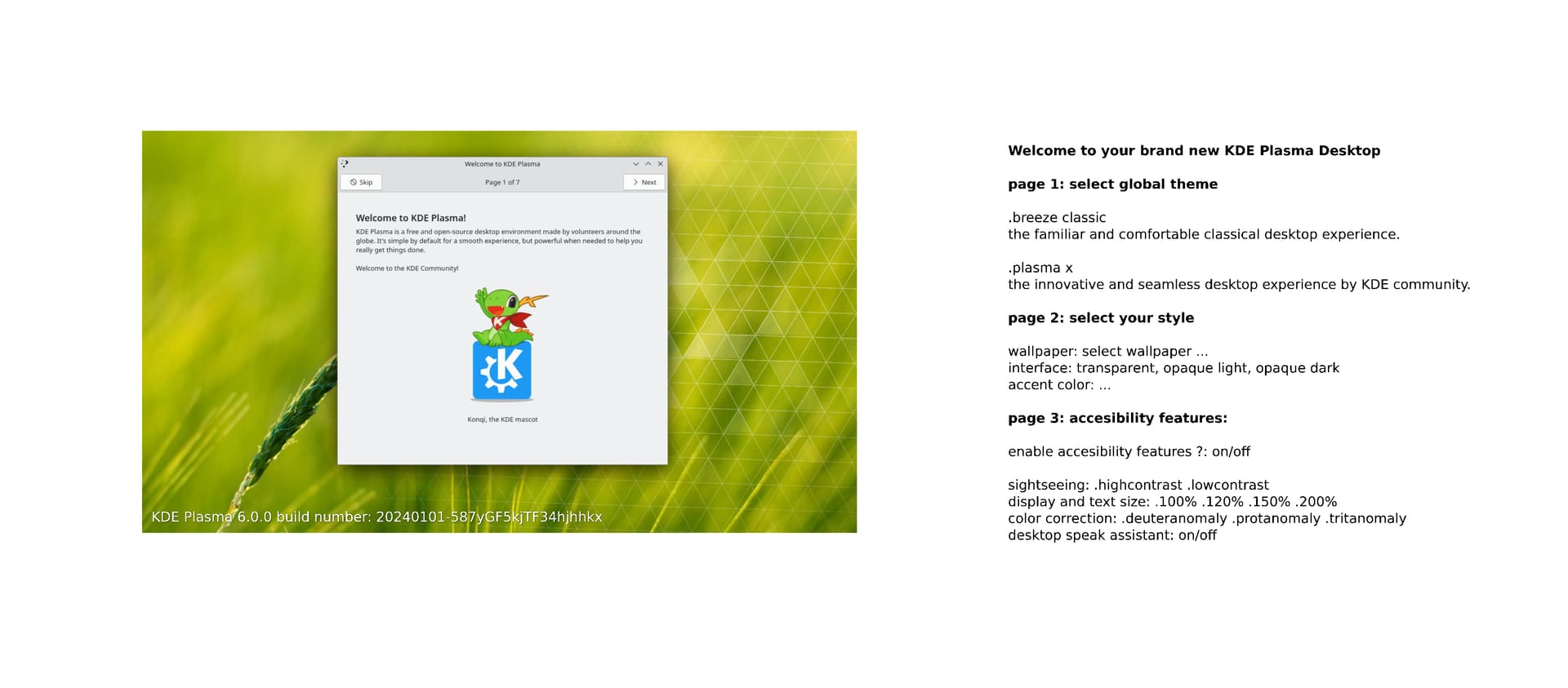
something like this welcome screen fresh install prompt concept:

closing notes

again no offense here and im thankful you took your time to assess and giving feedback for my humble concept. im also open for further feedback.

1 Like

done! the video trailer added to the top page :mirror_ball:

with this, all the core concept and demo of Plasma X is complete :tada:

best regards.