Breeze now

Proposition for improving the tabs : cleaner and conveys more the idea that the content pertains to the tab.
your proposed render is definitely more clear
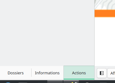
however your proposed render is currently how things look in all my plasma 5 GUI
this is how settings > application style > breeze looks for me
so if you are using plasma 6 and your current view above is how things are rendered, this sounds more like a regression and a bug than a feature request.
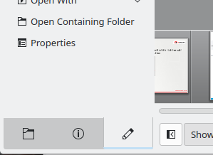
what application are you showing in the screen shot, and why are the tabs at the bottom?
It’s Gwenview (in french).
ah, so this is what mine looks like … sounds like you are experiencing a bug and it should be reported to bugs.kde.org
I don’t think so, I use Plasma 6.4.5 (Fedora 42) and you use Plasma 5 if i understood correctly.
you are correct, this is plasma 5
but what i’m saying is the plasma 6 implementation is a regression and needs to be brought back to the GUI usability that was achieved by plasma 5.
it’s not an “improvement” if it’s already been done correctly in the past… they just need to catch up.
i would log it as a bug.