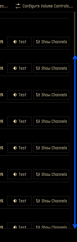
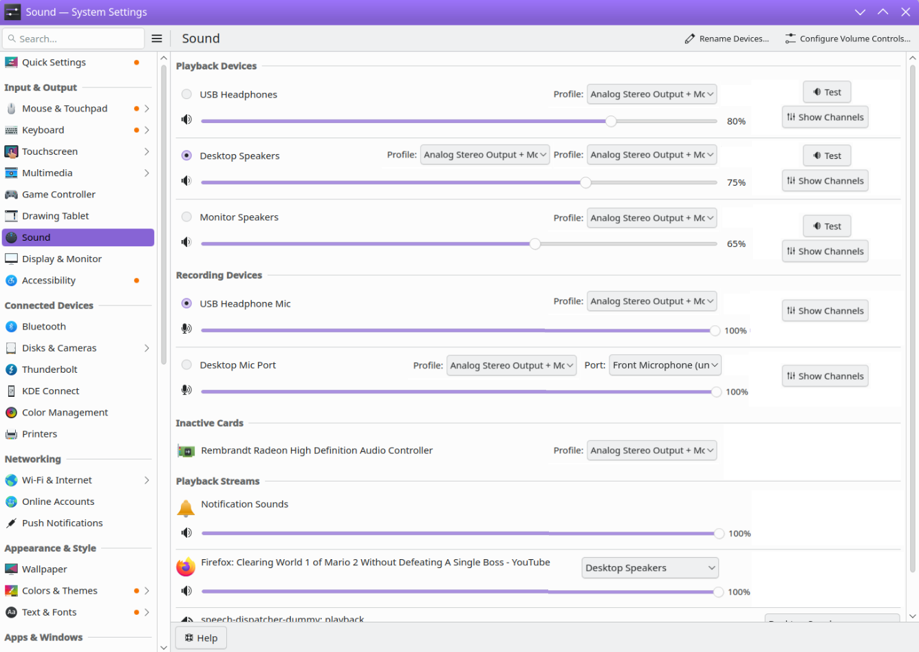
Currently, if you click on Configure Audio devices, - it pops up a window with multiple dropdown windows. This screen allows scroll input on hover, for any of these inputs. It lends to users changing settings without even realising, because they’ve accidentally scrolled.
For me, in the rare occasions that this does happen, I just scroll back. I disabled the annoying sound of changing volume so generally it doesn’t bothers me.
I do, however, miss a mini slider to change the volume, similar to the one windows use. Do you know any widget for it?
I hardly ever scroll here. Don’t know what you’re talking about
I’ll just say that I don’t think that the drawbacks to reddit’s ideas have been given due consideration. I’d rather see something like, idk a margin down the side so there’s a vertically contiguous ‘safe zone’, or something else along ‘less-destructive’ lines.
If I scroll a dropdown or combo box, I expect it to scroll the contents. That’s how they act. I’d think it was broken otherwise. Picture “what is wrong with my sound card, I’m changing the profile and nothing is happening”.
Consider how an apply button would factor into changing a device’s profile and then changing the target of an application stream to that newly created device. Kinda awkward right? I think maybe this dialog is dynamic for reasons.
The problem is real. The dialog moves vertically and there is no contiguous vertical empty space. There’s no good place to put your cursor. Reddit solutions were aimed at “to be able to click on a bad place without a bad outcome” And got there by breaking features. It might be better “to not feel compelled to click on a bad place, in the first place!”
Search the widgets store for ‘control’, there are several
Hi - yeah, I think this is a tricky one for the exact reasons that @pallaswept mentioned. There’s been recent work to try to make the general experience better across all uses of KDE and Qt components where scrolling input could be ambiguous like this:
And I’m sure there are further tweaks that could help in guessing the user’s intent in specific situations…but I do think it would help a lot to have that vertical safe zone, something like:
Which would have the side benefit, I think, of spacing out what’s currently a pretty tight cluster of controls along the right-hand side there, and maybe making the window feel a bit more balanced?
(Edited to swap out the mockup screenshots for something I liked a little better)
This happens to me all the time with audio profiles, since I have a lot of audio devices and regularly need to scroll. Frequently I’ll forget to make sure the mouse is on the scroll thing on the side when scrolling then accidentally disable the audio device playing a video on firefox. I then need to re enable it, re select it as the default, then refresh the page to get the video working again.
I need to scroll on that menu all the time I have a whole lot of audio devices. I don’t start scrolling with it on a dropdown, but then while scrolling the mouse hits a dropdown and scrolls it.