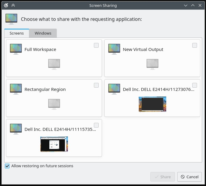
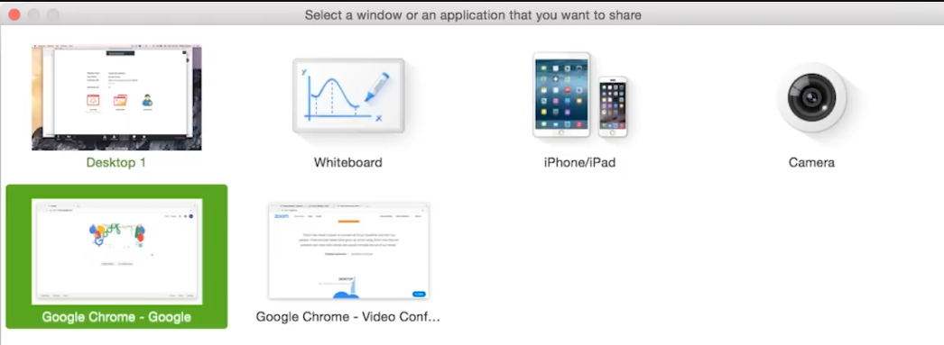
Is it just me or does anyone else find it a bit too complicated? Whey are there so many boxes? This could have easily been a list, no? If I log into an X11 session I am back to the older and simpler menu so I think this is specific to Wayland.
What is strange here?
Looks like you have 2 monitors?
Looks fine to me with all the different options available.
Or which do you find unnecessary?
If it is just a dropdown menu instead of all the different settings you are after, that I might agree with. But the previews of the monitors are pretty neat and would disappear with a dropdown.
It’s not that it is strange but it is a bit overwhelming. It’s a few too many options that I don’t think everyone needs to see. For example, I don’t even know what “New Virtual Output” and “Rectangular Region” do (or if they will work well).
Well, that is what manuals are for.
Or you can just click and see what it does.
If you do not want to share the entirety of everything you see on your desktop, you want to be able to select what part you want to share right? (rectangular region)
Then you have your 2 monitors.
New virtual output is exactly what it sounds like, a new desktop where none of the stuff open on YOUR desktop is visible.
Then under the Windows tab you can select only windows instead of desktops.
Thank you for the descriptions… I kind of guessed that’s what they do but I wasn’t sure.
That said, the sentiment I am trying to express here is that I am not convinced that these are options that are frequently used and whether it is prudent to include them in the UI at the cost of complicating it.
We can always improve the UI of course. But by using a multi-monitor setup you’ve already complicated the UX for yourself, and anything dealing with screens will therefore inherently have more complication as well as a result. NO way around that, I’m afraid.
I understand that. But that’s not the case here. The only difference in my screenshot would be that there will be two less boxes – the “Full Workspace” box and the second monitor box.
It’s possible that I just miss the old and familiar… we will see.
I think one could make an argument that the screens with previews should be listed first, and perhaps get more space assigned with the monitor name to the actual top of their card (same line as the associated checkbox, which is gone in a more recent version of Plasma).
The monitor icon is a little obnoxious and doesn’t really add much value if it doesn’t help much to differentiate the various items. If we really have to keep it (because apparently laptops get a slightly different icon), it would easily fit into the bottom portion of the screen next to the preview.
Perhaps cards without preview could be more compact and thus get de-emphasized vs. the main options that the user is more likely going to pick. I agree that all options should remain, but that doesn’t mean the dialog can’t be improved upon.
Edit: Also, NavigationTabBar for the tabs could be nice! “Full Workspace” could be renamed to “All Screens”, which might be more intuitive than the rather technical “workspace” term. And what does “Allow restoring on future sessions” even mean? Restoring what exactly?
No, because previews (of screens and also windows) need vertical space. With a regular list item, the screen contents in the preview would be indistinguishable from each other because they get squished so hard. Hence we have to make taller items. Taller items make a list very long. To make it fit in a regular window, we instead cut the width in half and put two items next to each other. Tada, you have a dialog with cards/buttons in a grid layout.
I don’t really see a way around this current layout. Smaller previews aren’t a good idea, and with monitor names as long as yours, we can’t really reduce the width much either.
I can see a few things that could be improved in KDE’s screen sharing prompt:
Use icons that convey the meaning of full workspace and rectangular region instead of just reusing the same one (something like preferences-system-windows-effect-fadedesktop for full workspace).
New Virtual Output doesn’t really quite say what it does? Even when you add the description of “a new desktop where none of the stuff open on your desktop is visible” it’s not clear. Does Plasma automatically create a new virtual desktop just to be shared?
Why are we using a generic monitor icon to the left of each title even when it’s not relevant? : D
The checkbox is misaligned.
Also I wonder if New Virtual Output and Rectangular Region could be shoved into a separate tab. This would make the screen sharing prompt less overwhelming when you first open it (I’m guessing the majority of the time you just want to share a single screen or your whole desktop).
I think it would be neat if it were designed like a mini-Spectacle of sorts. You get a view of the area being captured on the left and buttons to change it on the right. The screen sharing dialog needs to be able to select an area of the screen to record/capture, so it makes sense to design it around the tool KDE users are already using for that purpose. Just like how the file chooser dialog looks like a mini-Dolphin.
I agree with these suggestions.
Thinking about it a bit more, I see the value in all of these options even though I almost never use most of them. Moving some of them to a different tab like @Herzenschein suggested would be a welcome change.
I second the change of wording for “Full Workspace” to “All Screens”. I think it is clearer.
The option “Allow restoring on future sessions” is something that I don’t see myself using it. As a user I would like to explicitly select what I want to share every single time. That said, if it can remember which tab and option I chose the last time and focus on that, it would save me some time switching to the tab and clicking on that button.
I wonder if it’s possible (perhaps requiring a new API addition) for the app to specify that it’s not interested in a screen sharing session token for later reuse, and so the majority of apps wouldn’t have to display this checkbox in the first place.