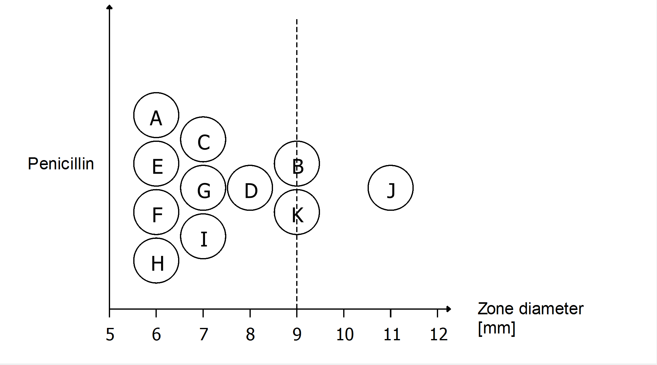
Dear LabPlot colleagues, May I kindly ask if it is possible to generate a graph similar to the visualisation on the screenshot? For one variable (penicillin), I’ve been trying to visualise the results of measurements from different laboratories. Thank you already in advance. Best, Michael
P.S.: Would be nice to have the designation of laboratories (A-K) included in the graph (either in the symbols as in my visualisation, or alternatively next to them), but this is optional.
P.P.S.: The scientific context is antimicrobial susceptibility testing, i.e. if a bacterium is susceptible and can thus be treated by the antibiotic (indicated by a big zone diameter, measured in millimeters [mm]) or resistant (small zone diameter).

P.S.: Data behind the visualisation on the screenshot (in comma (![]() separated format (csv)):
separated format (csv)):
laboratory (A-K);zone diameter [mm]
A;6
E;6
F;6
H;6
C;7
G;7
I;7
D;8
B;9
K;9
J;11