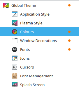
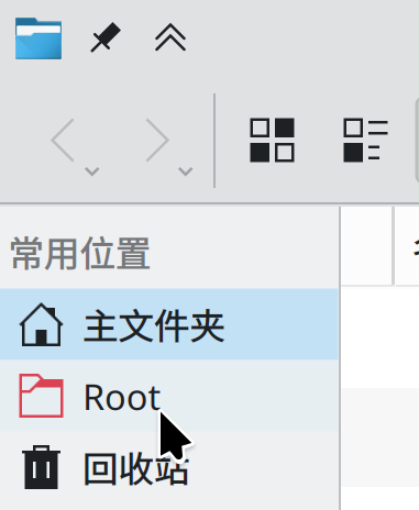
Currently selected list items appear as a block colour with inverted text/icon colour. Example:
Personally I find this makes the list item difficult to read. Maybe there low contrast between the text and the background colour?
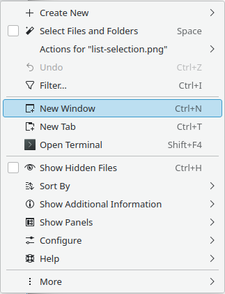
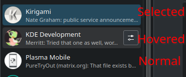
Compare this to the menu selection style, which just adds a semi-transparent background to the item (and a border):
I think that list items would be more legible if they followed the menu style of using a non-opaque background with good contrast with respect to the text colour.
I can reproduce the inverted text on my tumbleweed plasma 5 session.
On my Arch system I don’t have it in neither a plasma 5 or 6 session (see my edit). Likely fixed with plasma 6, but maybe my config is just screwed up.
Part of the problem is that the lighter blue is already used for the hover effect.
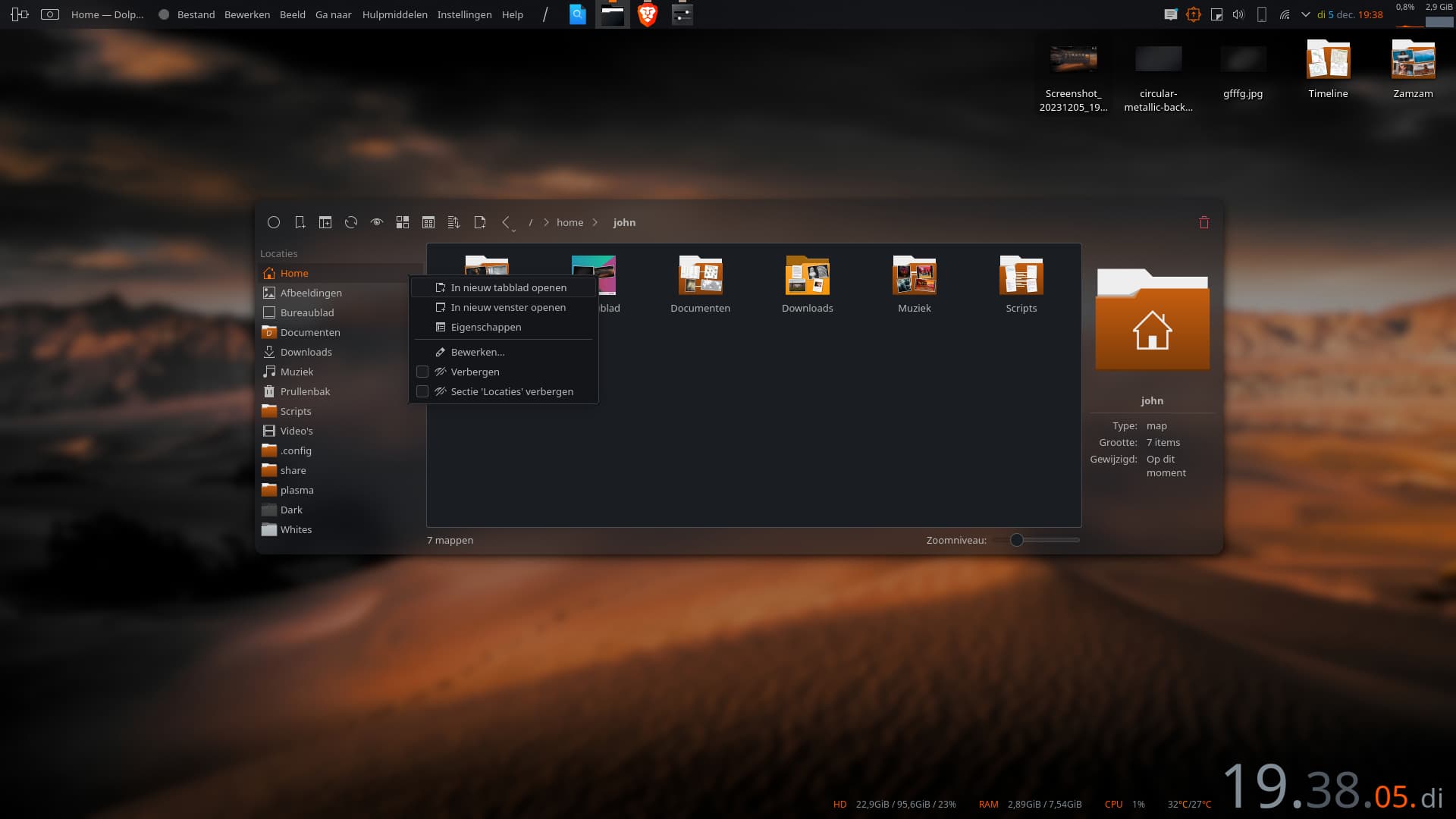
The Places panel in Dolphin 24.02 does what you suggest. It uses an extremely light, almost invisible blue for the hover effect. I’m not sure if that’s the way to go…
It’s all about preserving adequate contrast. If we want to stop inverting the text color in our selections, we need to desaturate or lighten the highlight color behind it.
This is doable by changing the Breeze color scheme. We also probably need to change the Breeze QStyle to change the menu selection style so that it uses the exact highlight color for selections, rather than a lightened version of it. That way the color scheme is always in charge.
NeoChat uses custom list delegates, a relic from the time before ItemDelegate had a rounded highlight style. Apps using that custom delegate need to be ported to use ItemDelegate or its subclasses, and any visual improvements it still retains should to be added to the standard stuff so everyone can benefit.
This is provided by the colour scheme so probably best to leave it alone.
However something related: for Klassy, I wrote a custom function that draws automatically either black or white foregrounds depending on which would give best contrast. This is user-selectable. Posting in-case it is of interest for reuse.
Slightly off-topic, but I also wrote a function that tints any symbolic-style image/icon with a custom colour far better than anything that I could find in the KColorUtils or Qt effects libraries. (unless someone else knows of something else available, I think this would be a valuable addition to KColorUtils)
The tint functions in the KColorUtils and Qt effects libraries tint by replacing the colour black with your desired tint colour. This only works well in some cases.
My convertAlphaToColor function instead uses the alpha mask of the source image and paints in your tint colour per-pixel using that alpha mask:

