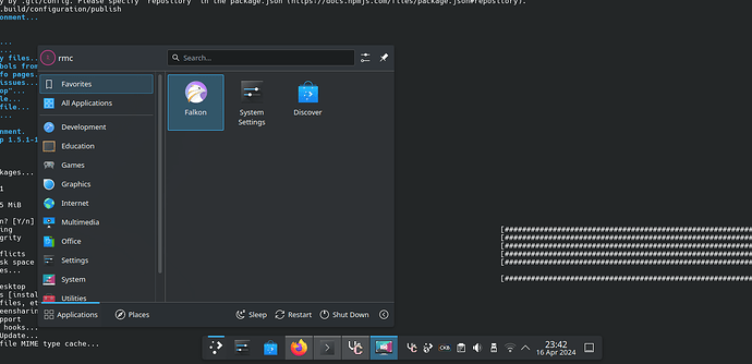
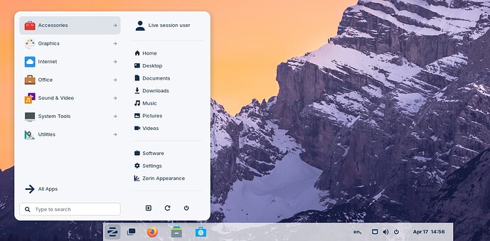
I feel it should be centered when using a centered task bar view as it is confusing when it’s centered on the icon compared to other Desktop Environments Such as windows 11’s
I prefer it this way, there’s a lot of horizontal space in today’s monitors and items in Favorites as well as the OS control buttons are accessible (almost) directly in the vertical.
Even Zorin OS which is promoted by many as the easiest entry point for Linux noobs coming from Microsoft Windoze is like that
and please, who cares about f* Winblows 11 ![]()
The only thing that I could imagine being added imo is maybe a “more connecting” visual cue indicating that it’s indeed coming from the button below or something else like the panel “supporting” the weight of the above “item”, in the form of a circle, a cone, a triangle, or a bearing (like those in the bridges), which on the other hand doesn’t make much sense with a vertical panel.
To be honest, centering it is vastly better from a ux standpoint: it will be in the exact same spot each time, which increases usability
Wouldn’t it be better to add an option so the user can decide where it should be aligned? I’m sure that some people may prefer it centered.
Now, I agree that Windows 11 is considered horrible by most people (and rightfully so) but in my personal opinion, I think it’s helpful to be more open towards possible future users migrating from Windows 11 (as Microsoft continues to destroy their OSes).
This would be a nice option, even though I rarely use it before the update to plasma 6 I used ditto menu as I could have it appear centred in the screen.
Long ago, way before Windows 11, I used to use a different menu just for this exact reason. I can’t recall if it was Simple Menu or Minimal Menu. Both unfortunately dead now, though.

