Hello,
[Intro]
I am using KDE plasma since several years now, both at home and professionally. I have a high-resolution screen and spend most of my time on software development, meaning, having few more lines of code visible at the same time is importante to me (vertical space is good, horizontal is useless).
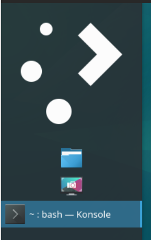
For this reason, I am used to put the taskbar left of my screen. I also like having a wide taskbar where I can easily see many open applications open, and their title (so I can quickly and easily switch between 5-6 konsole):
Here is a screenshot of my current KDE plasma 5.20.5 (200x2160 px)
As you can see, the digital clock and date are already way to big.
[Problematic]
In the latest version of Debian (12) with KDE plasma 5.27.5, several of the elements (Widgets) do not adapt as before to this configuration:
The default application launcher now shows a huge 200x200 pixels KDE button, which is way too big:
(IMAGE2 removed, I am limited to one image)
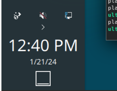
And still the clock/date have a font of almost 40px, which is also way too big (14-16 should be good):
(IMAGE3 removed, I am limited to one image)
This is WAY TOO BIG. I increase the width of the task-bar to see the text, not to have a 200x200 pixels application launcher button or a 200x100 pixel clock/date.
Note: my screen is 4K, but not HDPI, its actually a standard ~96dpi screen.
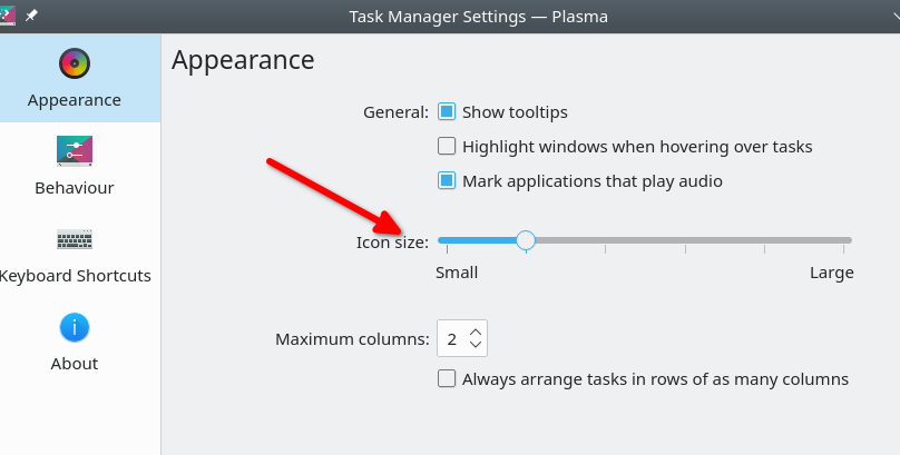
I also miss the configuration in the task manager settings to specify the size of application icons which was present in version 5.20.
(IMAGE4 removed, I am limited to one image)
[Need help]
I wonder if there is now a way to have this taskbar usable in my configuration:
- How to make the application launcher button 30x30 px
- How to make the digital clock and date font smaller
- How to make the Task Manager icons (consequently the rows) smaller (25px or so).
Adrian